

The Animated Process Flow module helps you show a process as a series of connected stages. You can add multiple stages, connect them with animated lines, and control how the flow moves and responds to visitors.
Important Note: Animated Process Flow was introduced in v2.2.0 and is disabled by default. To enable it, go to WordPress Dashboard > DiviMotion > Modules, then enable Animated Process Flow.
Here is an overview of the Animated Process Flow module settings.
Content Tab
The Content tab lets you add and manage pipeline stages, configure how the pipeline works, and control its motion behavior.
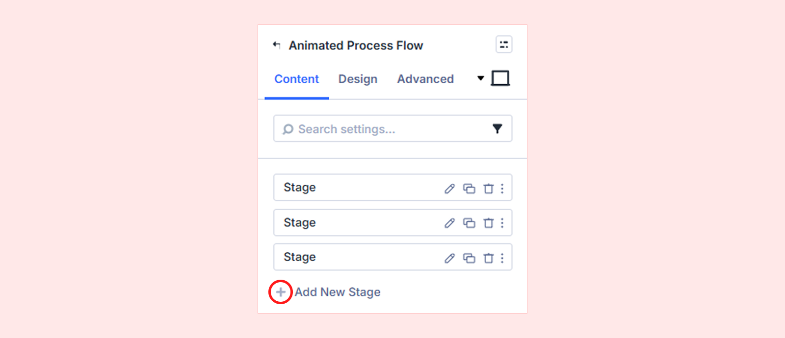
Add New Stage
By default, the module includes three stage items that you can edit or delete. Click Add New Stage to add another stage. Each stage has its own settings. For details, see the Animated Process Flow Child Item Settings section below.
Pipeline
Use the Pipeline settings to control how the stages are connected, how the flow is triggered, and how the layout responds on smaller screens.
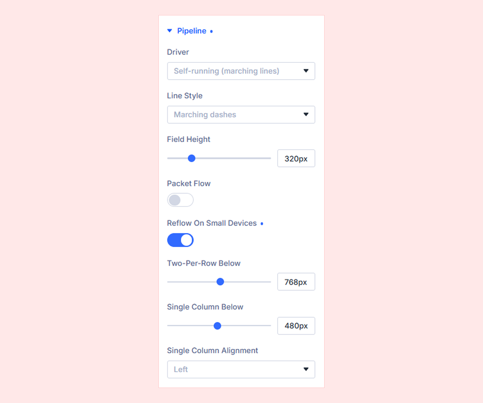
- Driver: Choose what controls the Animated Process Flow behavior. You can choose from four options:
- Self-running (Marching Lines): Runs the flow automatically without visitor input.
- Hover to Inspect (Taut Lines): Changes or highlights the flow when visitors hover over a stage.
- Click to Set Stage (Ink Draw): Lets visitors click a stage to make it active and update the flow.
- Scroll Scrub (Wave): Moves the flow animation forward or backward based on page scrolling.
- Line Style: Set the style of the line connecting the stages. You can choose from these:
- Marching dashes
- Rubber band
- Wet ink
- Travelling wave
- Field Height: Set the height of the pipeline area.
- Packet Flow: Show or hide the small animated indicators that move along the lines between pipeline stages.
- Reflow On Small Devices: Control how pipeline stages rearrange on smaller screens.
- Two-Per-Row Below: Set the breakpoint where stages switch to two items per row.
- Single Column Below: Set the breakpoint where stages switch to a single-column layout.
- Single Column Alignment: Set the alignment of stages in the single-column layout. You can choose from left, center and right.
Motion
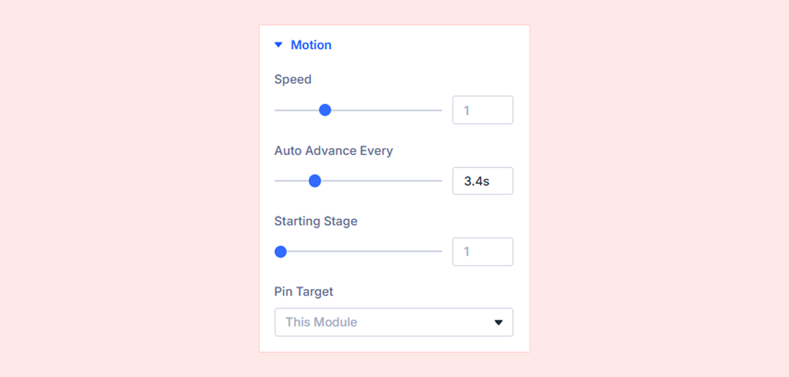
- Speed: Control the animation speed. (Available with Self-running, Hover to Inspect, and Click to Set Stage.)
- Auto Advance Every: Set how often the pipeline automatically moves to the next stage. (Available with Self-running.)
- Starting Stage: Choose which stage is active when the pipeline starts. (Available with Self-running, Hover to Inspect, and Click to Set Stage.)
- Scrub Start: Set where the scroll-based animation begins. (Available with Scroll Scrub.)
- Scrub End: Set where the scroll-based animation ends. (Available with Scroll Scrub.)
- Pin While Scrubbing: Keep the Animated Process Flow fixed while the scroll scrub runs. (Available with Scroll Scrub.)
- Pin Position: Set where the module is pinned in the viewport.
- Pin Length: Set how much scrolling completes the scrub. 100% equals one full screen of scrolling.
- Pin Target: Choose what stays fixed while the pipeline scrubs.
- This Module: Pin only the Animated Process Flow module.
- Parent Row: Pin the entire row, including other content inside it.
- Parent Section: Pin the entire section, including all content inside it.
Advanced

- Respect Reduced Motion: Respect the visitor’s reduced-motion preference by reducing or disabling motion effects in the Animated Process Flow.
Background: Add a background color, gradient, image, video, pattern, or mask to the module.
Element Label: Add an internal label to identify the module more easily inside the Divi Builder.
Design Tab
The Design tab lets you customize the appearance, typography, spacing, and other visual properties of the Animated Process Flow module.
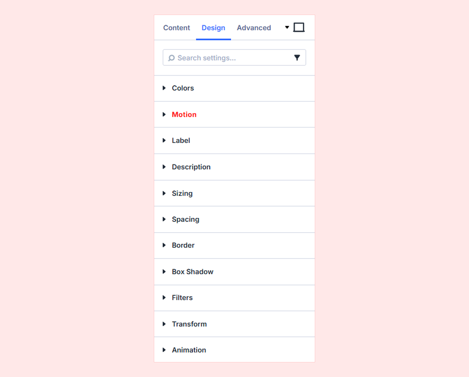
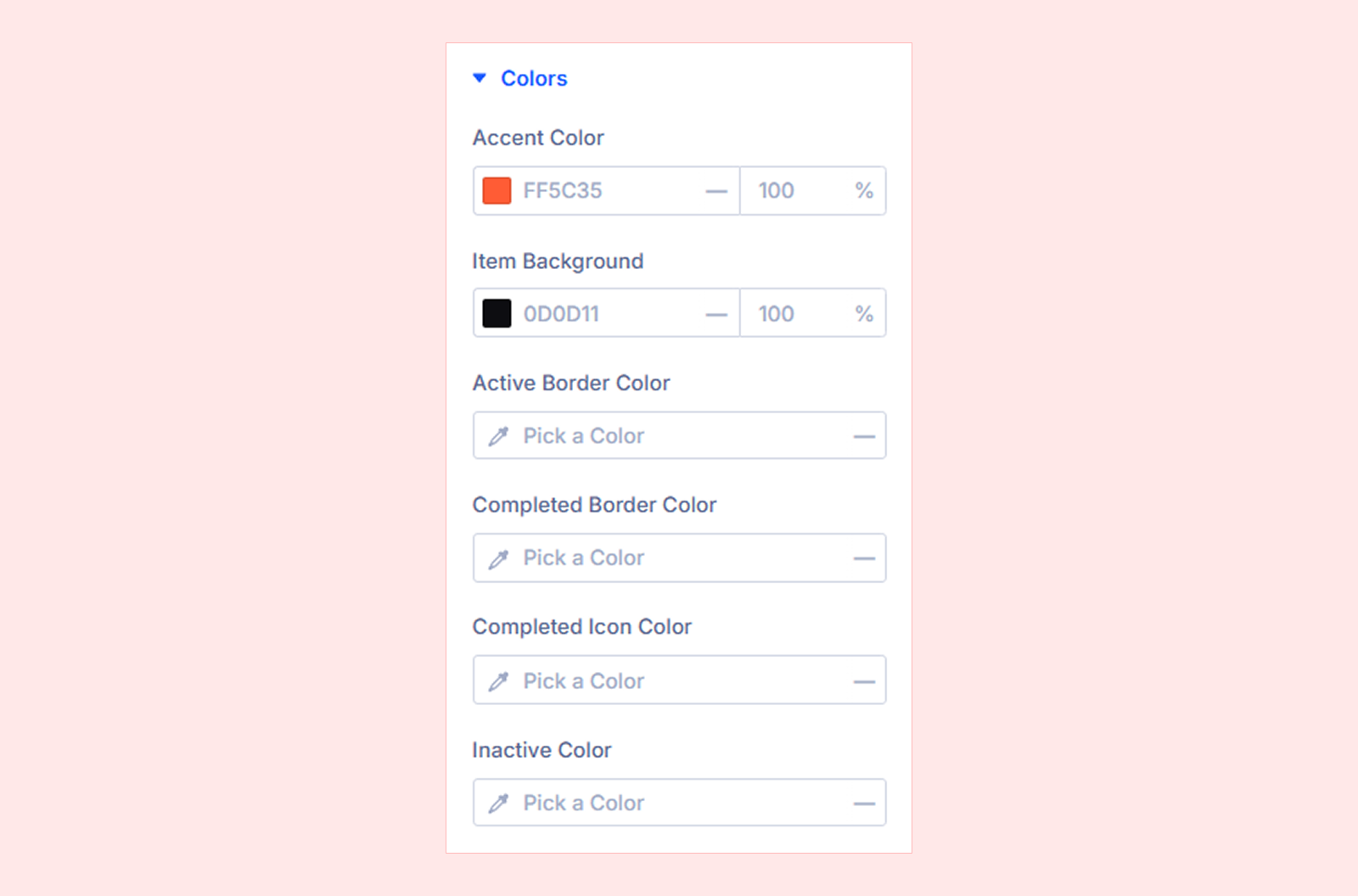
Colors
- Accent Color: Set the main accent color used throughout the pipeline.
- Item Background: Set the background color of each pipeline item.
- Active Border Color: Set the border color for the currently active stage.
- Completed Border Color: Set the border color for completed stages.
- Completed Icon Color: Set the icon color for completed stages.
- Inactive Color: Set the color used for inactive stages.
Motion: Configure interaction and animation settings for the module.
Label: Customize the typography and styling of the stage labels.
Description: Customize the typography and styling of the stage descriptions.
Sizing: Adjust the module's width, height, and alignment.
Spacing: Configure the module's margin and padding.
Border: Customize the border radius, style, width, and color.
Box Shadow: Add a shadow around the module.
Filters: Apply visual effects such as opacity, brightness, and contrast.
Transform: Scale, rotate, move, or skew the module.
Animation: Apply Divi's built-in entrance animations to the entire Animated Process Flow module.
Advanced Tab
The Advanced tab provides Divi’s standard controls for custom CSS, visibility conditions, transitions, attributes, positioning, and other advanced settings.
Animated Process Flow Child Item Settings
Each child item represents one stage in the Animated Process Flow and includes its own settings for customizing that stage.
Content Tab
Stage
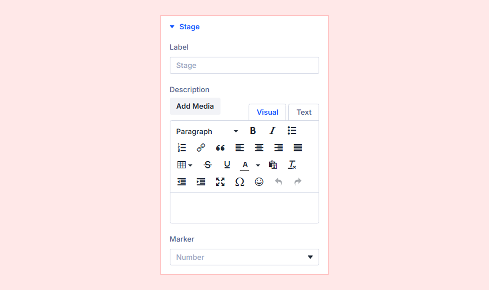
- Label: Enter the name or title of the stage.
- Description: Add supporting text for the stage.
- Marker: Choose the marker displayed for the stage.
You will also find Background and Element Label settings to customize the stage background and add an internal label for easier identification in the Divi Builder.
Design Tab
The child item’s Design tab includes many of the same visual controls as the parent Animated Process Flow module, including motion, spacing, border, and other design settings.
Advanced Tab
Use the Advanced tab to access Divi’s standard advanced controls for the individual Animated Process Flow item.
Need Help?
If you have any questions or need assistance, contact our support team: [email protected]


