

Horizontal Scroll (introduced in DiviMotion 1.1.0) is a scroll effect for Divi 5 that turns content inside a Section, Row, or Column into a horizontal scrolling layout. As the user scrolls, the section stays fixed on the screen while the inner content moves from left to right. You can also add an optional progress bar to show how much of the content has been viewed.
How to Enable Horizontal Scroll
To use the extension, you have to enable it first:
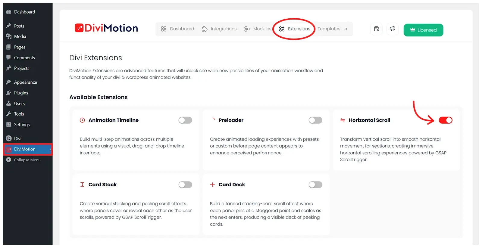
- Go to your WordPress Dashboard.
- Navigate to DiviMotion > Extensions.
- Toggle on Horizontal Scroll.
How to Use Horizontal Scroll
After enabling the extension, you can apply the horizontal scroll effect to any parent container, like Section, Row, or Column.
Here is how to use it:
- Open existing or create a new one using the Divi Visual Builder
- Click on any element’s (section, row, column or module) setting
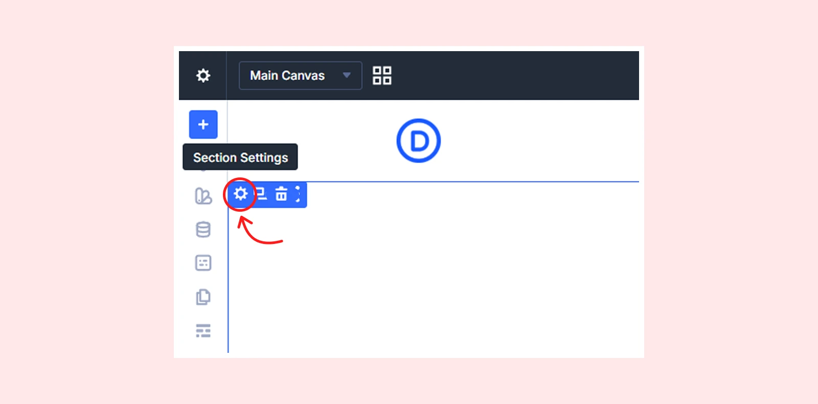
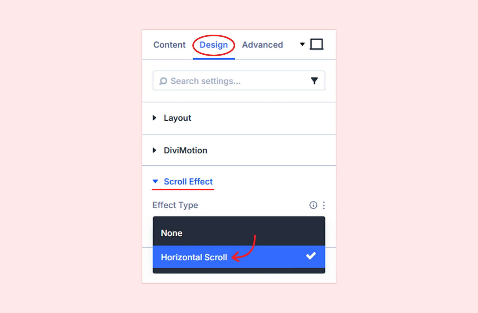
- Go to the Design tab > Scroll Effect.
- From Effect Type, select Horizontal Scroll.
Horizontal Scroll Settings
Here are the settings you will find after selecting Horizontal Scroll as your effect type:
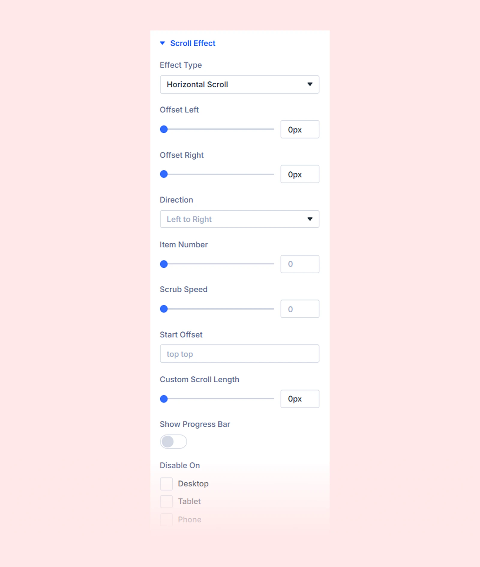
1. Offset Left
Add space on the left side of your horizontal scroll content. This will keep the first item from sticking too close to the edge of the container. The section stays fixed on the screen, and this space is included in the scrolling movement.

| Note: Use units like px, %, or vw to control the spacing size. |
2. Offset Right
Add space on the right side of the horizontal scroll content. This keeps the last item from touching the edge of the container. It creates a small gap before the section ends and the page goes back to normal vertical scrolling.

| Note: Use units like px, %, or vw to control the spacing size. |
3. Direction
Choose which direction the content will scroll for all devices.
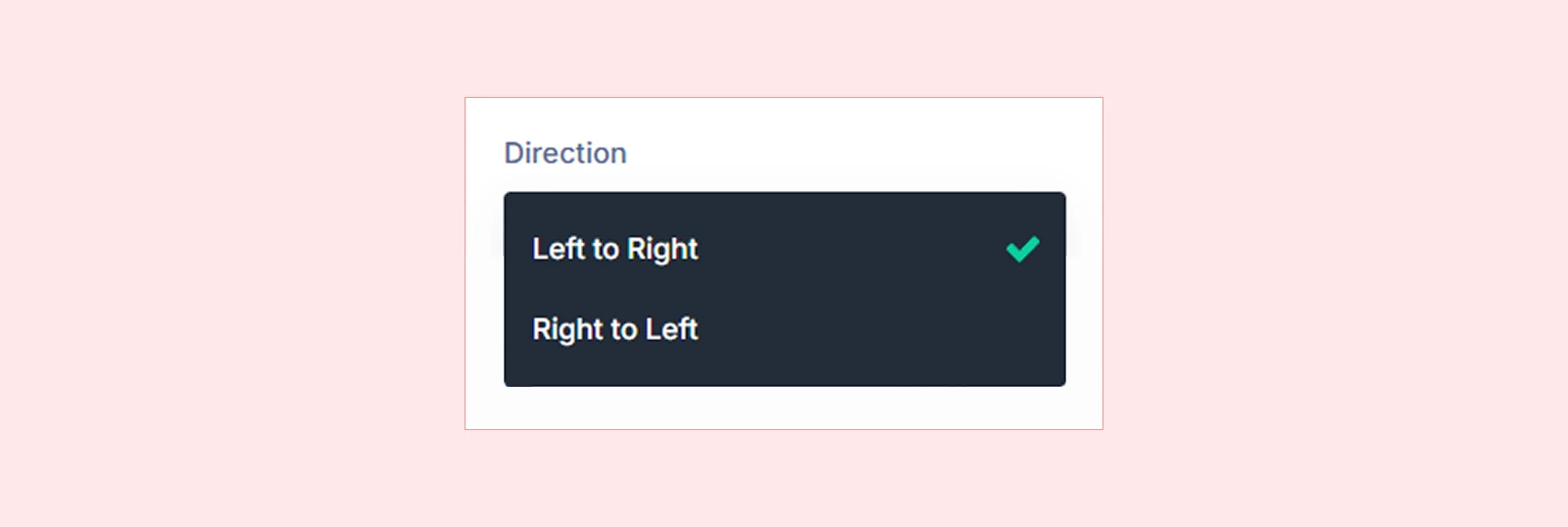
| Option | What It Does |
| Left to Right | Content moves toward the right |
| Right to Left | Content moves toward the left |
| Pro tip: If you use more than one horizontal section in a page, make them move in opposite directions for a more engaging layout. |
4. Item Number
Set how many items you want to show in the horizontal scroll area. Based on the number you choose, all items will automatically resize into equal-width columns so they fit evenly in the visible area.

| Example: If you have 5 items and set the Item Number to 3, only 3 items will be visible at a time, and each item will adjust to an equal width. |
5. Scrub Speed
Controls how smoothly the horizontal movement follows the user’s scrolling.

- Lower value will make the animation move faster relative to the user's scroll.
- Higher value will make the animation move more slowly and feel smoother.
| Note: Use a value between 0.1 and 5 to control how fast or smooth the animation follows the scroll. |
6. Start Offset
Set where the horizontal scroll effect begins. You have to set two values: one for the section position and one for the viewport position. When the section reaches the chosen position in the viewport, the animation will start.

Common examples are:
| Setting | When the Animation Starts |
| Top Top | When the top of the section reaches the top of the browser viewport |
| Top Center | When the top of the section reaches the middle of the viewport |
| Bottom Center | When the bottom of the section reaches the middle of the viewport |
| Top 20% | When the section reaches about 20% from the top of the viewport |
7. Custom Scroll Length
Set how far the user needs to scroll for the horizontal animation to complete. By default, Divi calculates this automatically based on the total width of all items. If you set a custom value, it will override the default scroll length.

- Smaller value will finish the animation quickly.
- Larger value will make the animation take longer to complete.
| Pro tip: You can set different values for desktop, tablet, and mobile to control how the animation behaves on each device. Use px, %, or vw for more precise control. |
8. Show Progress Bar
Enable a progress bar that shows how much of the horizontal section has been viewed and how much is left. This helps users understand their scrolling progress.

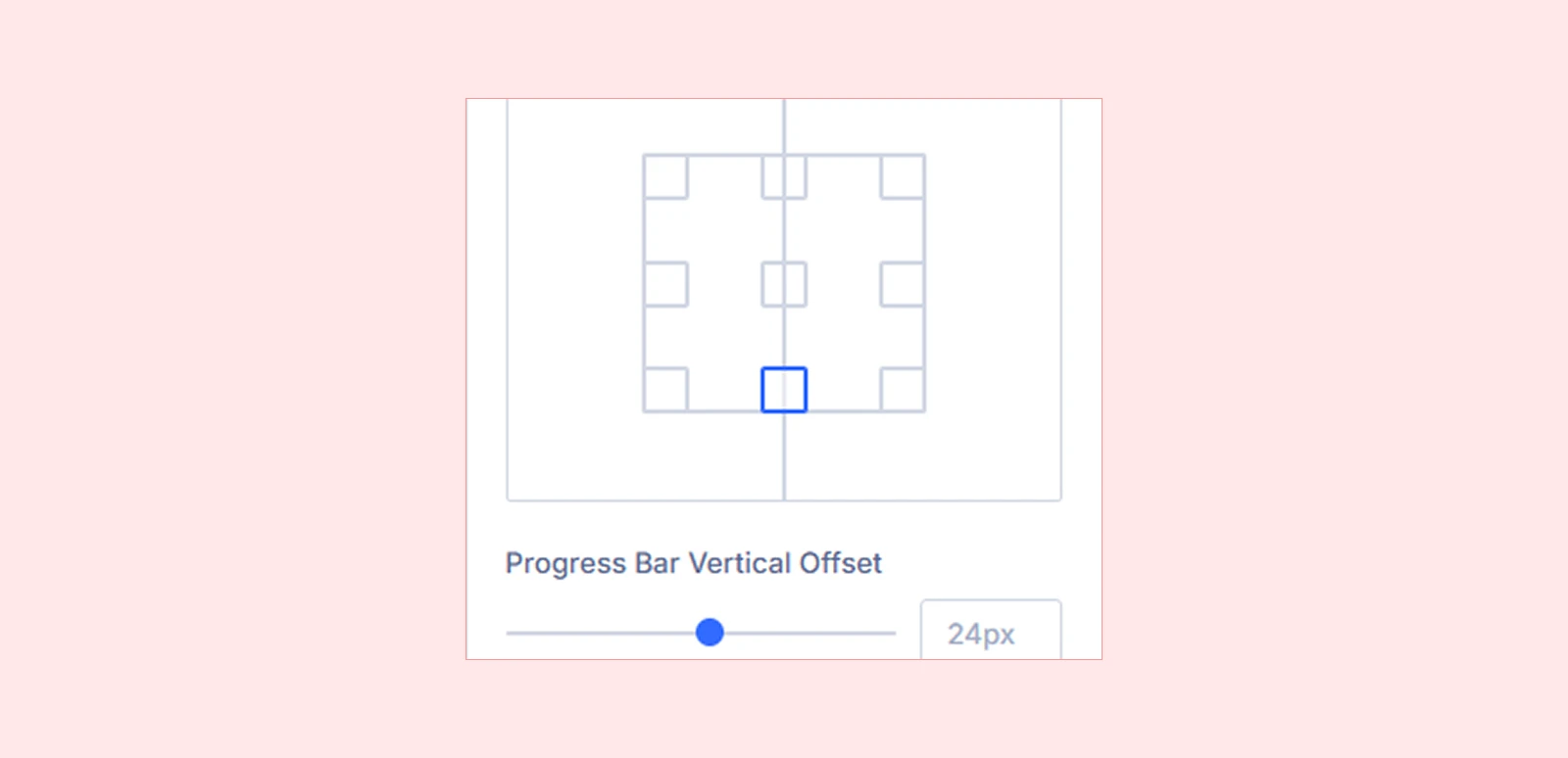
9. Progress Bar Position
Choose where to place the progress bar so it is easy to see while scrolling. You can position it at the top, bottom, left, or right of the section. (9 positions available)
10. Progress Bar Vertical Offset
Move the progress bar up or down inside the section. Use it to place the bar where it fits best in your design. It controls how far the bar sits from the top or bottom edge of the section.

| Note: Use px, %, or vw to precisely control the vertical position of the progress bar. |
11. Progress Bar Horizontal Offset
Move the progress bar left or right inside its container to adjust its position. It helps you fine-tune alignment in your layout by controlling how far the bar sits from the left or right edge of the section. (Not available for the middle center position.)

| Note: Use px, %, or vw to precisely control the horizontal position of the progress bar. |
12. Progress Bar Width
Set the width of the progress bar. A higher value makes it stretch wider across the section, while a lower value keeps it shorter and more compact.

| Note: Use a value between 40 and 600px. You can use%, or vw to control how the progress bar scales across the screen. |
13. Progress Bar Height
Set the thickness of the progress bar. A higher value makes it thicker and more visible, while a lower value makes it thin and minimal. The bar always has rounded ends.

| Note: Use a value between 2 and 32px to control the thickness of the progress bar. |
14. Progress Bar Fill Color
Choose the color of the progress bar that fills as the user scrolls. It starts empty and gradually fills as they move through the horizontal content.

| Example: Think of a bar at the bottom of a section. When you scroll halfway, the bar is half filled. When you reach the end, it is fully filled. |
15. Progress Bar Track Color
Set the background color of the progress bar track. This is the base color of the bar, while the fill color moves over it as the user scrolls through the section.

16. Disable On
Disable the Horizontal Scroll effect on specific devices. And the available options are:
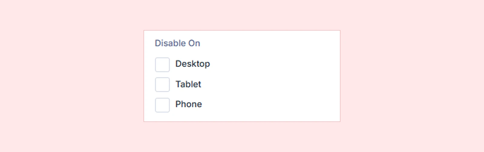
- Desktop
- Tablet
- Mobile
| Note: If you disable the Horizontal Scroll animation on a specific device, the content will display in a normal layout without animation on that device. |
What's Next?
Now that you understand the Horizontal Scroll extension, you can start creating more interactive side-scrolling layouts instead of traditional vertical ones. Try enabling the extension, apply it to a section, row, or column, and start experimenting with different settings to build engaging layouts.


