

Hover Trigger lets you create animations that activate when users move their mouse over elements. Unlike Click Triggers that require a tap or Scroll Triggers that respond to page position, Hover Triggers provide instant visual feedback as users explore your interface.
This guide covers everything you need to know about hover-based animations, from basic setup to advanced techniques like mouse enter/leave controls and multi-target animations.
How to Access Hover Trigger
To create a hover-based animation:
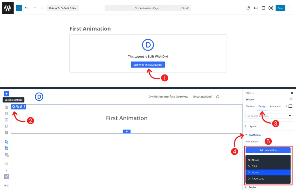
- Open your page in the Divi Visual Builder
- Click the settings icon (gear) on any section, row, column or module
- Go to the Design tab → scroll to DiviMotion and expand it
- Click + Add Interaction
- Choose hover trigger type
You're now ready to configure which element triggers the hover and what happens when users interact with it. Click the Trigger Settings icon on the interaction card to open the Hover Trigger Settings panel on the left side.
Hover Trigger Settings
Hover Trigger settings let you define which element users hover over, what element animates, and what actions occur on mouse enter and mouse leave.
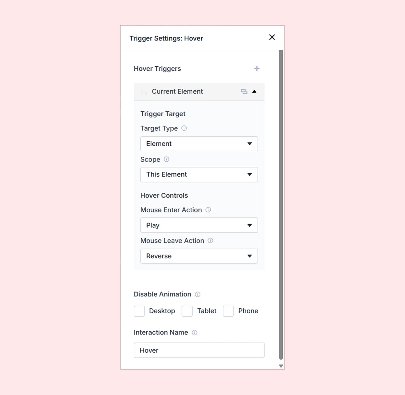
Trigger Target
These settings define which element users hover over to trigger the animation and what element gets animated.
Target Type
Choose what element should detect the hover:
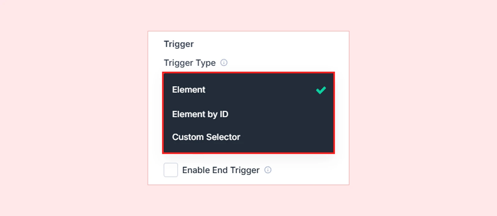
Element (Default): Targets the current element you're currently editing (section, row, or column).
Example: You're editing a button and want that button to scale up when users hover over it.
Element by ID: Targets a specific element on the page by selecting it from a dropdown list. This lets you choose any module, section, row, or column.
Example: You're editing a section but want a specific image module to be the hoverable trigger.
Pro tip: Rename elements using the Admin Label feature to make them easier to find in the dropdown.
Custom Selector: Targets elements using CSS selectors like .class-name or #id-name. This allows you to:
- Target elements outside the current context
- Animate multiple elements with the same class
Example: Use .card to animate all elements with the "card" class at once.
| Note: When using Custom Selector: - Use . prefix for class selectors (e.g., .my-class) - Use # prefix for ID selectors (e.g., #my-id) |
Scope
Scope determines which related elements can be hovered to trigger the animation. It's especially important when using Custom Selector or targeting multiple hoverable elements.
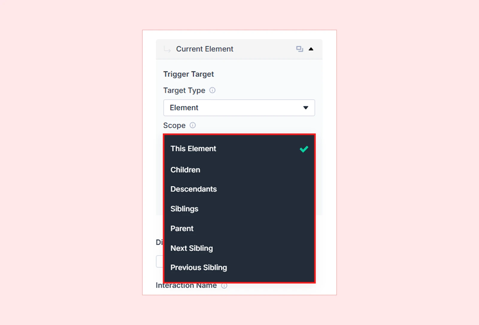
| Scope Option | What It Targets | Example Use Case |
| This Element | Only the selected element | A single card scales on hover |
| All Matching Elements | Every element matching the selector | Animate all .card elements on the page |
| Children | Direct children of the trigger | Child icons animate when parent is hovered |
| Descendants | Any nested element (with HTML tag selector) | Animate all <img> tags inside a hovered section |
| Siblings | Elements with the same parent | Animate other columns in the same row |
| Parent | The container holding the trigger | Animate the card when a child is hover |
| Next Sibling | The element immediately after | Hover to preview next slide |
| Previous Sibling | The element immediately before | Hover to show previous testimonial |
Hover Controls
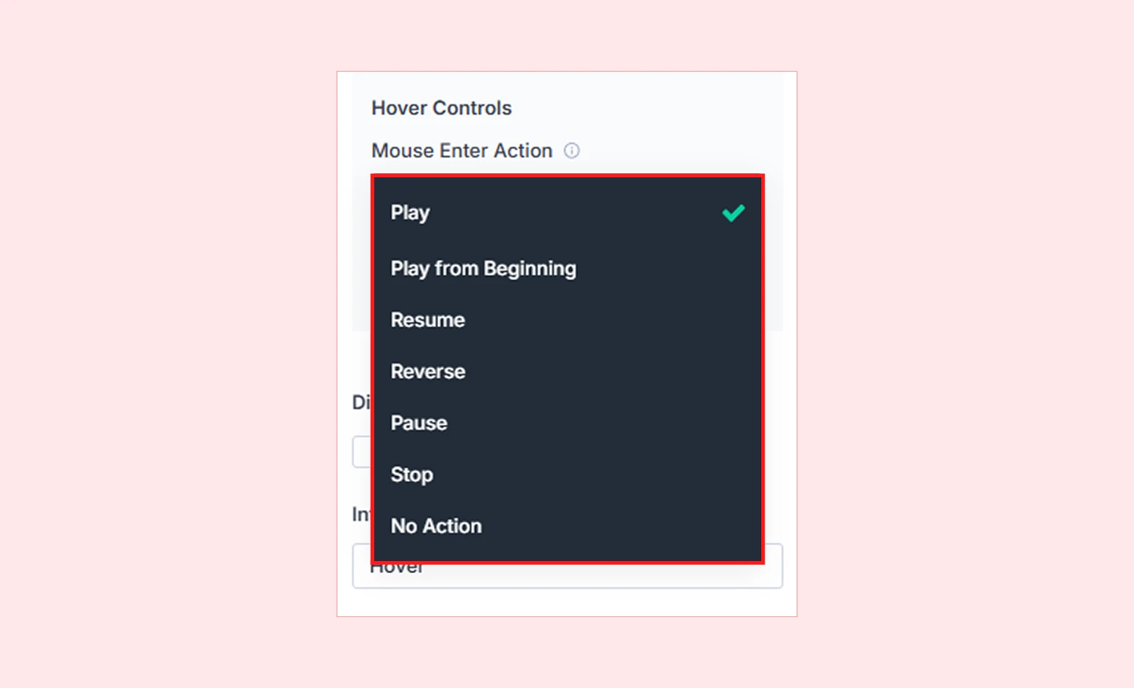
Hover Controls define what happens when users move their mouse over and away from the targeted element. Hover animations can include two states:
- Mouse Enter Action: This defines what happens when the user moves the mouse over the element (hover in).
- Mouse Leave Action: This defines what happens when the user moves the mouse away from the element (hover out).
For each state, choose one of these actions:
| Action | Behavior |
| Play | Plays animation from current position |
| Play from beginning | Always starts animation fresh |
| Resume | Continues from where paused |
| Reverse | Plays animation backward |
| Pause | Pauses animation at current frame |
| Stop | Stops animation and resets |
| No action | Hover does nothing |
Target Multiple Elements
DiviMotion lets you add multiple targets to a single hover interaction.
| Example: Hover over a product card to scale the image AND slide in a "Quick View" button—both triggered by one hover. |
How to Add Multiple Targets
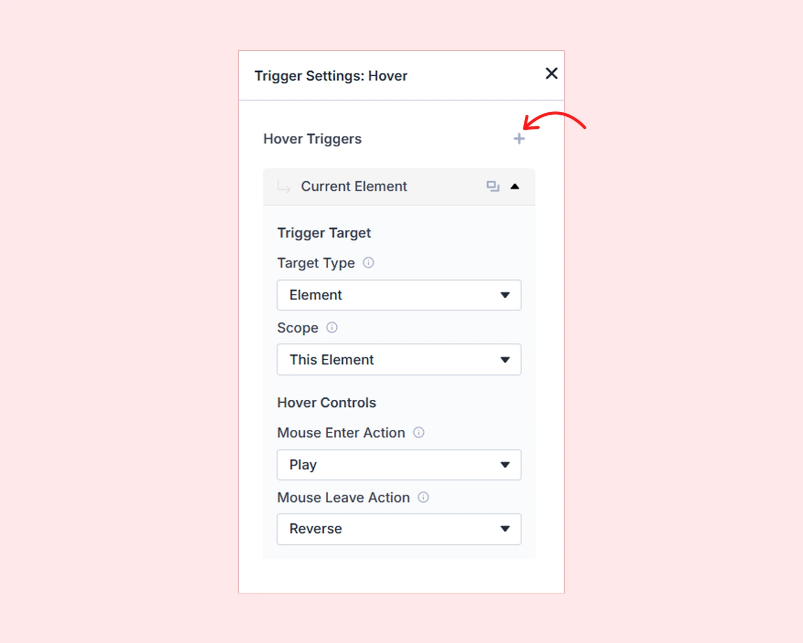
- Configure your first hover target using the settings above
- Click the + icon below the hover controls
- A new target card appears
- Configure the additional target with its own Target Type, Scope, and Hover Controls
Disable Animation
Turn off hover animations for specific devices if needed:

- Desktop
- Tablet
- Phone
| Common use case: Disable hover effects on mobile and tablet since touch devices don't have true hover states. |
Interaction Name
Give your hover trigger a descriptive name for easy identification.

What's Next?
Now that you understand Hover Triggers, you’re ready to add interactive hover effects to your site.
Open the Visual Builder, try combining hover triggers to buttons, images, cards, and start hovering!


