

Set Properties lets you instantly apply CSS values to an element the moment an interaction triggers. Unlike Custom Actions and Action Presets, this action type has no duration, no easing, and no motion — it simply sets the selected properties to their defined values immediately.
Use Set Properties when you need to change an element’s state rather than animate it. Common uses include hiding an element before a scroll animation begins, fixing a stacking order for an overlay, locking overflow on a container, or toggling a CSS class to fire a custom transition.
This guide covers everything you need to know about set css properties, from basic setup to advanced techniques.
How to Set CSS Properties
After adding an interaction to an element, follow these steps:
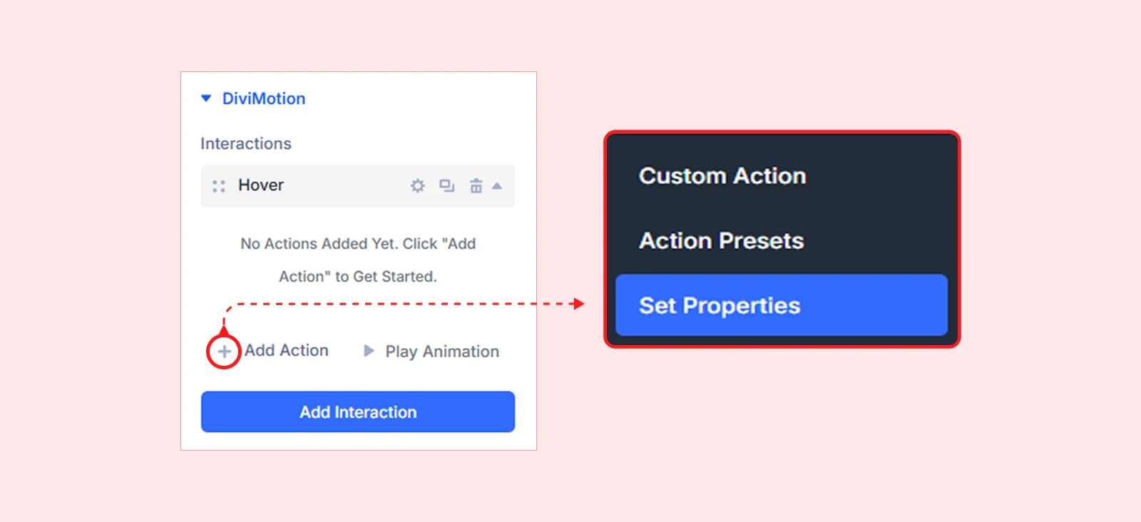
- In the interaction card, click the + Add Action button.
- Select set properties from the dropdown
- Select one or more CSS properties to apply, then enter their values
Pro tip: Set Properties works best when paired with Custom Actions or Action Presets. Use it as the first action in a sequence to prepare an element’s state — for example, setting opacity to 0 before a Fade In action plays on scroll.
Action Target Settings
Action Target
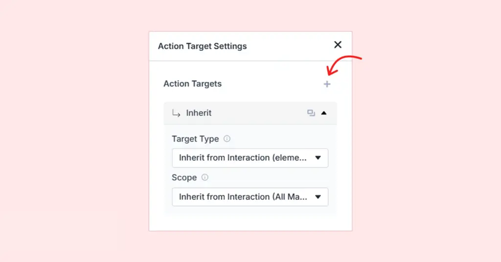
Action Targets define which element receives the CSS property change when the interaction fires. By default, the action inherits the target from the interaction, so you don’t need to configure anything for most setups. When you need Set Properties to affect a different element, expand the target settings and configure them here.
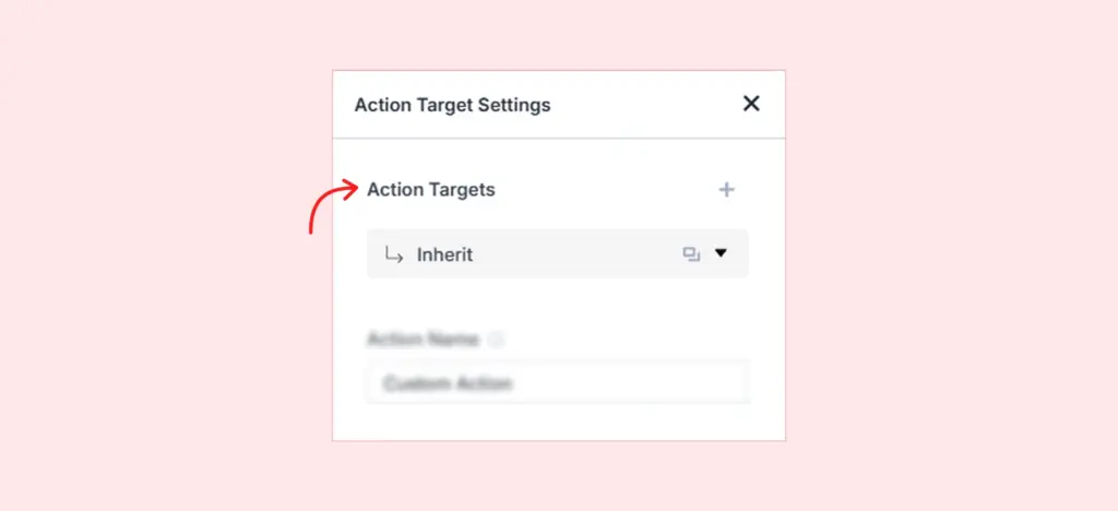
Target Type
Choose which element this action should apply its CSS properties to:
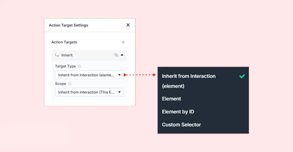
Inherit from Interaction (Default): Applies to the same element selected for the interaction. The safest starting point for most animations.
Element: Applies to the element you are currently editing — a section, row, or column.
Element by ID: Applies to a specific element anywhere on the page, selected from a dropdown. Useful when the animated element is different from the one you’re editing.
Pro tip: Rename elements using the Admin Label feature to make them easier to find in the dropdown.
Custom Selector: Applies to any element using a CSS class or ID selector. This lets you animate elements outside the current context or animate multiple elements sharing the same class.
Scope
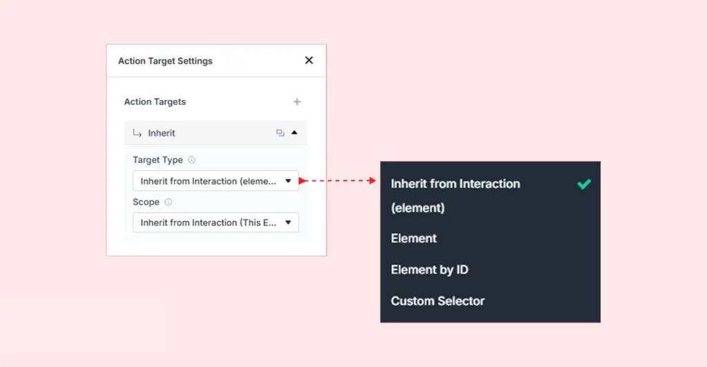
Scope controls which related elements receive the CSS property change. This is especially important when using Custom Selector or targeting groups of elements.
| Scope Option | What It Targets | Example Use Case |
| Inherit from Interaction (This Element) | Same element used in the interaction | Default for most use cases |
| All Matching Elements | Every element matching the CSS selector | Apply overflow:hidden to all .card elements |
| This Element | Only the currently selected element | Set z-index on a single section |
| Children | Direct children of the selected element | Set opacity on columns inside a row |
| Descendants | Any nested element (with HTML tag selector) | Target all <img> tags inside a section |
| Siblings | Elements with the same parent | Apply a class to other columns in the same row |
| Parent | The container holding the selected element | Set position on the card wrapping a button |
| Next Sibling | The element immediately after | Show the element immediately below |
| Previous Sibling | The element immediately before | Reveal the element immediately above |
Target Multiple Elements
A single Set Properties action can target more than one element simultaneously.
| Example: On page load, use a single Set Properties action to set opacity to 0 on both a headline and a decorative image at once. Then trigger each fade-in separately with individual Custom Actions on scroll. |
To add an additional target, click the + icon below the current target settings. A new target card will appear where you can configure its own Target Type and Scope independently.
Action Name
Assign a descriptive name to your action for easy identification. This is especially helpful when working with multiple actions inside the same interaction.

| Example: “Reset Overflow” or “Set Initial Opacity” makes it easy to locate and edit specific actions later. |
Available CSS Properties
Click the + CSS Properties button inside the action card to open the property picker. Properties are grouped into four categories. Select one or more — each selected property reveals a value field where you define what it should be set to.
General
These properties control an element’s layout, size, and positioning. They are most commonly used to prepare elements before animations play, correct layout issues caused by transforms, or reposition elements during click or scroll interactions.
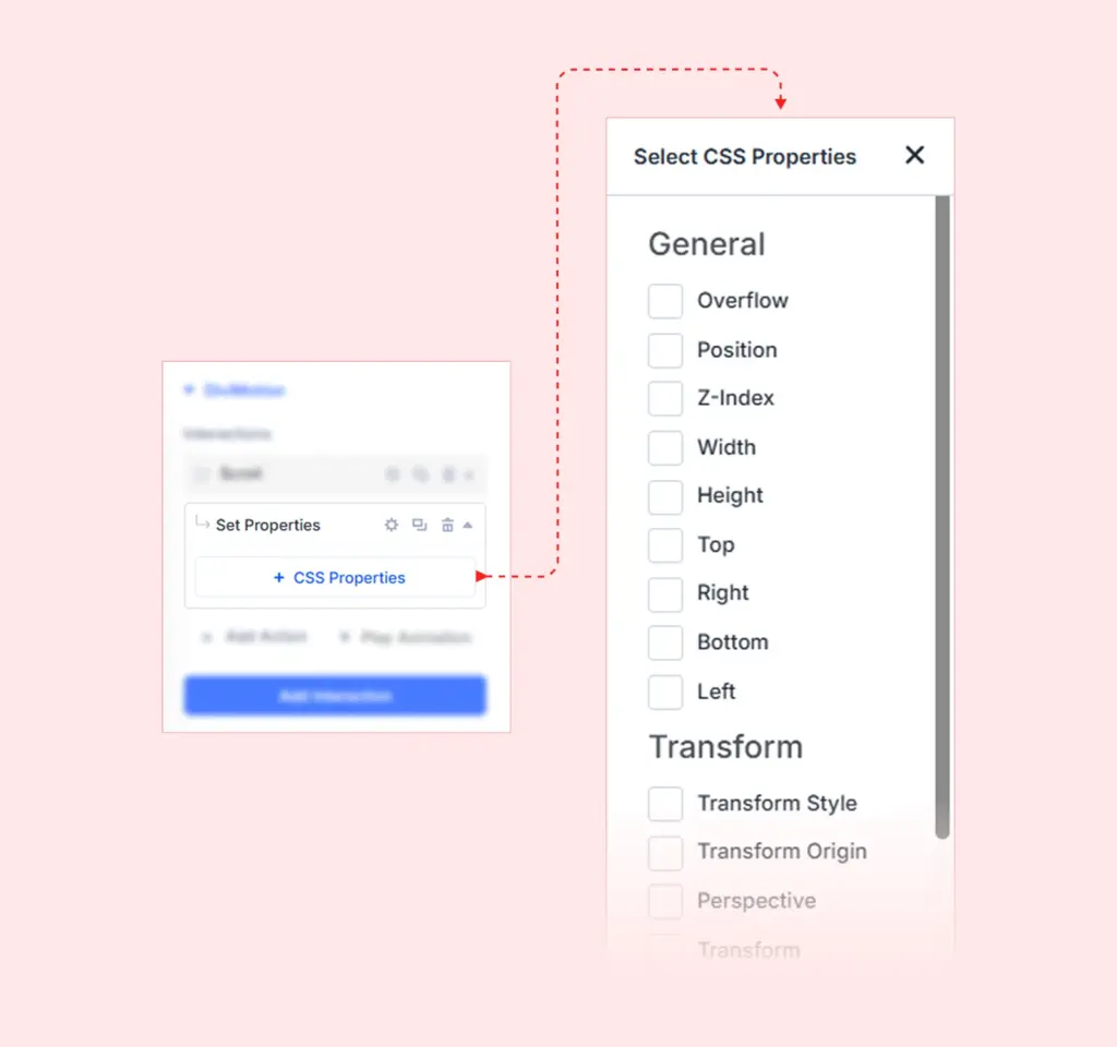
| Property | What It Controls | Example Values |
| Overflow | Whether content extending beyond an element's bounds is shown or clipped | hidden, visible, scroll, auto |
| Position | How the element is positioned in the document flow | static, relative, absolute, fixed, sticky |
| Z-Index | The stacking order relative to other elements on the page | 1, 10, 999, -1 |
| Width | The horizontal size of the element | 100%, 300px, auto, 50vw |
| Height | The vertical size of the element | 100%, 200px, auto, 50vh |
| Top | Vertical offset from the top edge (requires non-static position) | 0, 20px, 50% |
| Right | Horizontal offset from the right edge (requires non-static position) | 0, 20px, auto |
| Bottom | Vertical offset from the bottom edge (requires non-static position) | 0, 20px, auto |
| Left | Horizontal offset from the left edge (requires non-static position) | 0, 20px, 50% |
| Example: Set Overflow to hidden on a card container before a Slide In animation plays. This prevents the animating element from appearing outside the card boundaries during the effect. |
| Pro tip: Position and the offset properties (Top, Right, Bottom, Left) work together. You must set Position to absolute, fixed, or sticky before offset values take effect. |
Transform
These properties control how an element is oriented and placed in 2D or 3D space. Use them to establish a transform context before a Custom Action animates within it, or to resolve perspective and origin issues on 3D effects.
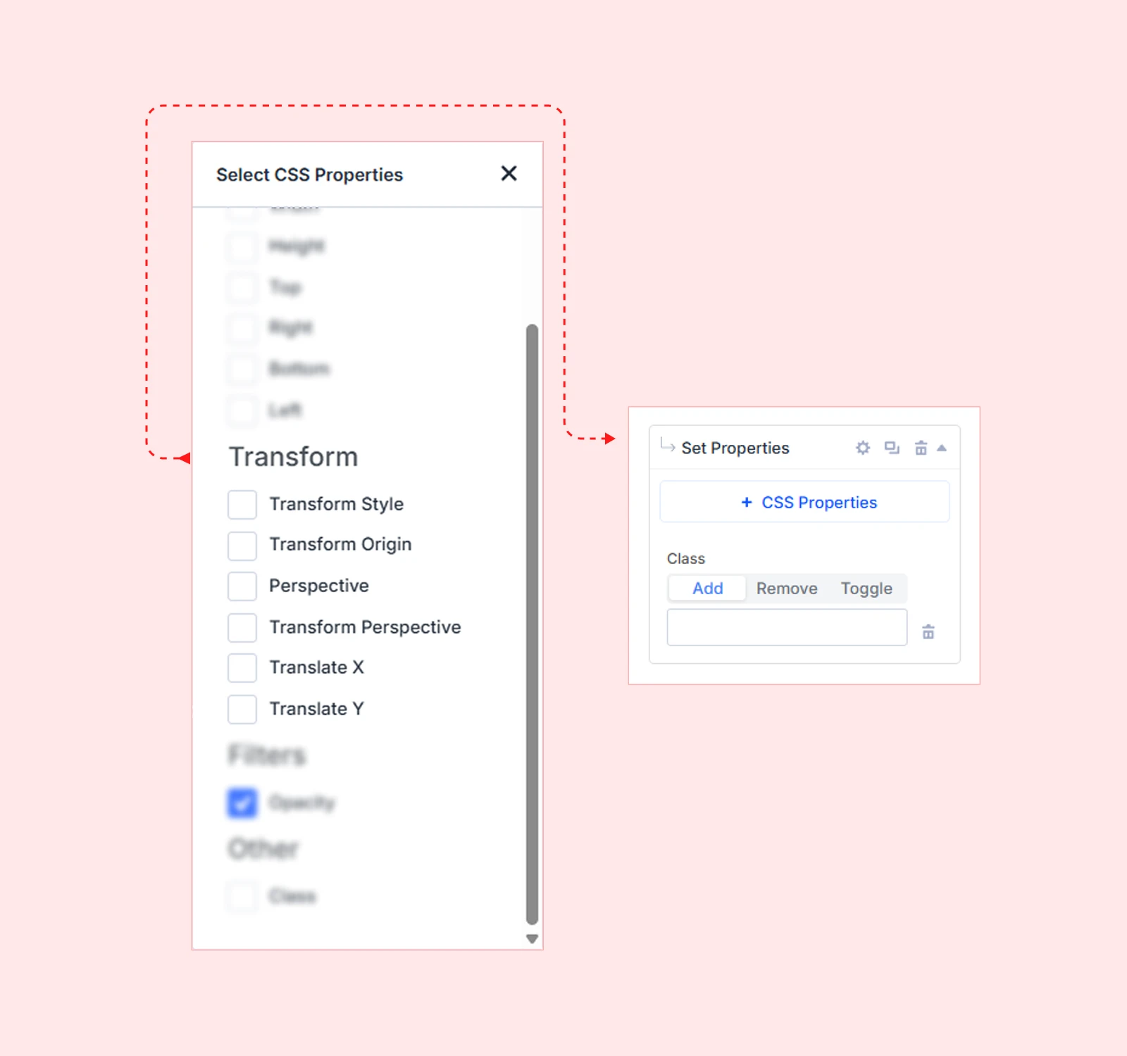
| Property | What It Controls | Example Values |
| Transform Style | Whether child elements render in 2D or 3D space | flat, preserve-3d |
| Transform Origin | The pivot point for transform operations on the element | center, top left, 50% 50%, 0 0 |
| Perspective | The depth of the 3D view applied to child elements | 500px, 1000px, none |
| Transform | A combined transform shorthand applied all at once | rotate(45deg), scale(1.5), translateX(20px) |
| Translate X | Moves the element horizontally from its current position | 50px, -20px, 10% |
| Translate Y | Moves the element vertically from its current position | 50px, -20px, 10% |
| Example: Set Transform Origin to top center before a Scale animation plays. The element will grow downward from its top edge instead of scaling from its center — a common technique for dropdown-style reveals. |
| Note: Transform Style: preserve-3d is required for child elements to participate in 3D space. Without it, 3D transforms applied to children are flattened into the parent’s 2D plane, making rotations and depth effects appear broken. |
Filters
This category currently includes Opacity, which sets how transparent an element appears. Setting opacity via Set Properties changes the element’s visual state instantly and without motion — unlike animating opacity in a Custom Action or Preset, which transitions it over time.
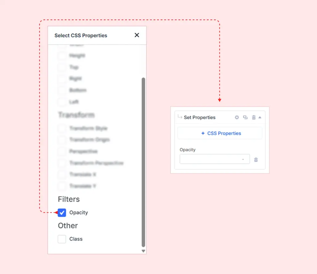
| Property | What It Controls | Example Values |
| Opacity | The transparency of the element, from fully invisible to fully visible | 0 (invisible), 0.5 (semi-transparent), 1 (fully visible) |
| Example: Add a Set Properties action on Page Load that sets Opacity to 0. Then add a Scroll Trigger Custom Action that animates Opacity to 1. The element stays hidden on load and fades in only when the user scrolls to it — a clean, reliable pattern for scroll-triggered entrances. |
| Pro tip: Setting opacity to 0 via Set Properties is more reliable than using CSS visibility or display for pre-animation hiding. It keeps the element in the document flow, preventing layout shifts when the animation plays. |
CSS Class
The CSS Class property is the most flexible option in Set Properties. Instead of applying a CSS value directly, it adds or updates a class on the target element. You control what that class does through your own stylesheet — DiviMotion simply handles when it gets applied.
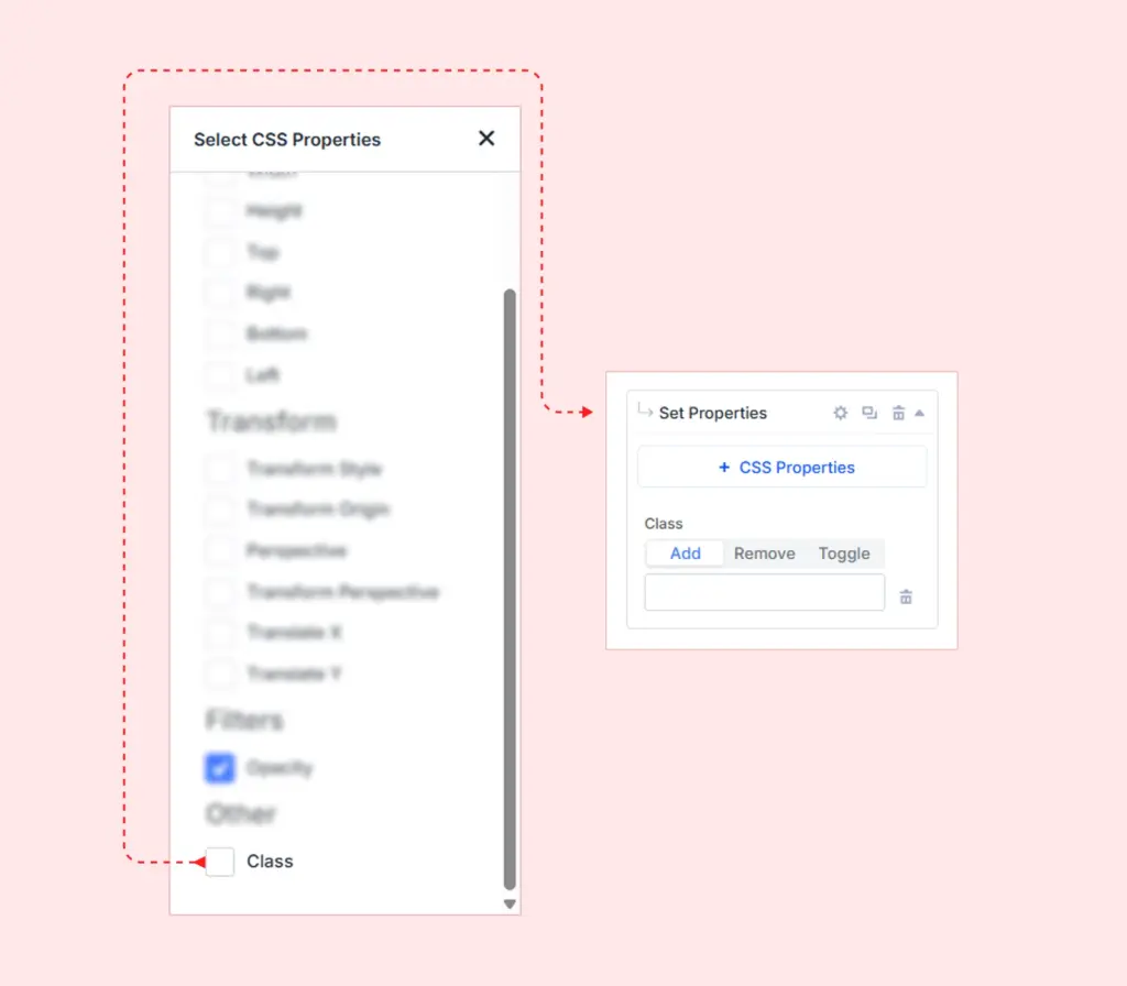
This makes CSS Class the right choice when you need to:
• Toggle visual states defined entirely in your CSS
• Fire CSS transitions or @keyframes animations on demand
• Control active, open, hidden, or expanded states without building an animation timeline
• Integrate DiviMotion interactions with JavaScript that listens for specific class names
| Note: Do not include the dot (.) prefix when entering a class name. Enter the class name only — for example: is-visible, not .is-visible. |
Common Use Cases
| Use Case | How It Works |
| Toggle visibility | Add a class like is-visible that sets display:block via CSS. Remove it to hide the element. |
| Toggle expanded state | Add is-open to a collapsed panel. Your CSS handles the height or max-height transition. |
| Trigger CSS animations | Add a class that fires a @keyframes animation defined in your theme or custom CSS. |
| Control active states | Add is-active to a nav item to change its color, weight, or underline through your stylesheet. |
| Integrate with JavaScript | Add a data-attribute class that your own JavaScript listens for to trigger additional behavior. |
| Example: Build a click-triggered accordion without a DiviMotion animation timeline: add a Set Properties action with CSS Class set to is-open on a content panel. In your stylesheet, define .is-open { max-height: 500px; transition: max-height 0.4s ease; }. The panel expands smoothly on click, driven entirely by CSS. |
| Pro tip: Combine CSS Class with Click Trigger’s Toggle play/reverse control for fully reversible interactions — the class is added on the first click and removed on the next, toggling the element between two CSS-defined states with no extra logic required. |
What's Next?
Now that you understand Set Properties, you have a powerful state-management tool to complement your Custom Actions and Action Presets.
The most effective DiviMotion workflows use all three action types together: Set Properties to prepare initial states, Action Presets or Custom Actions to animate, and Set Properties again to clean up or reset after the animation completes.


