

The Elastic Cards module lets you create a fanned, overlapping card layout where each card will smoothly move to the front with an elastic effect on hover or tap.
Important Note: Elastic Cards module is disabled by default. To enable it, go to WordPress Dashboard > DiviMotion > Modules, then enable Elastic Cards.
Let’s take a quick look at the available settings and how they work.
Content Tab
The Content tab contains the essential settings for adding cards, adjusting their layout, and controlling their interactions.
Add New Card
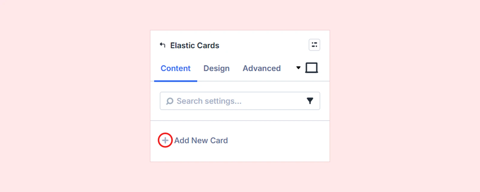
Click Add New Card to create a new card. You can add and arrange any Divi elements inside the card, including images, headings, text, buttons, icons, and more. For settings specific to each card, see the Elastic Cards Child Item Settings section below.
Cards Layout
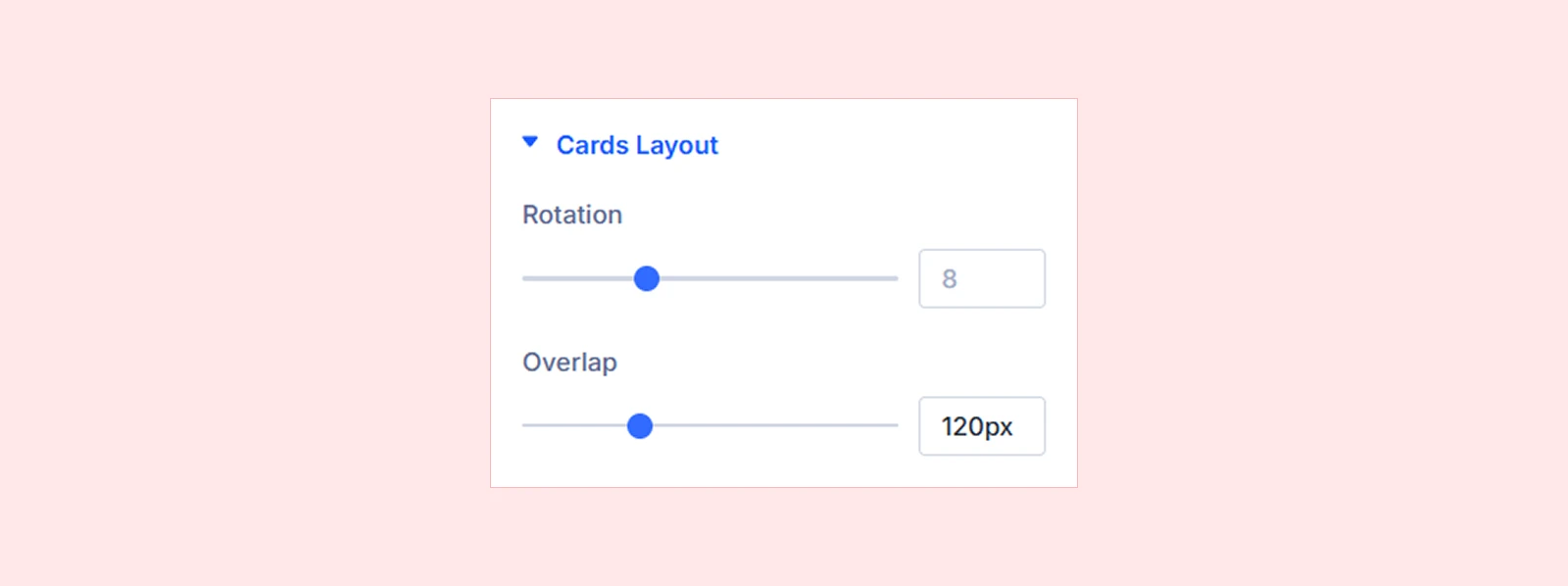
- Rotation: Set the tilt angle for the cards. The active card will remain straight at 0°
- Overlap: Control how much each card overlaps the previous one. (Higher values create more overlap, while lower values spread the cards further apart.)
Interaction
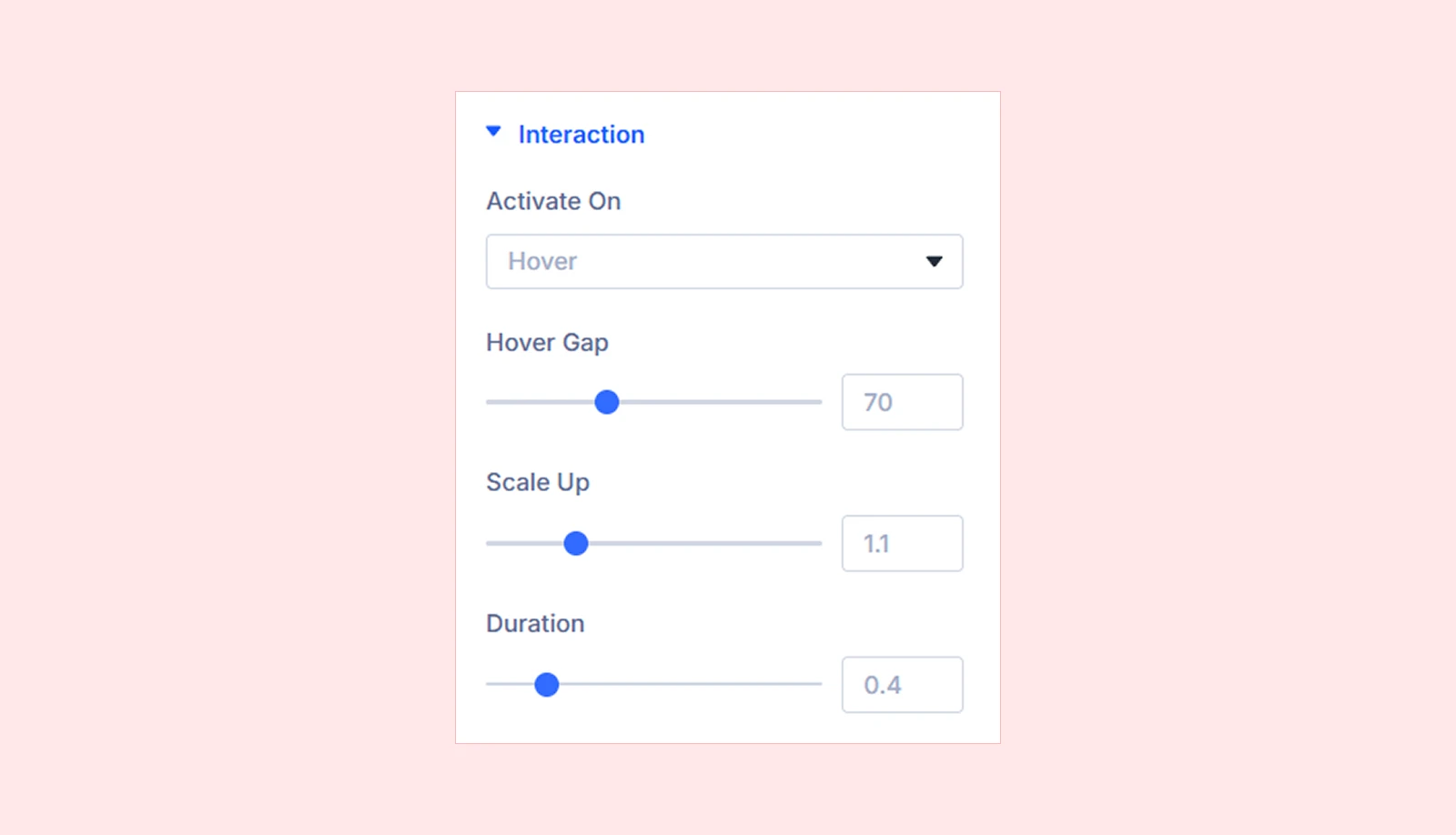
- Activate On: Choose whether a card moves to the front on Hover or Click / Tap. (Touch devices will always use tap, no matter what you select.)
- Hover Gap: Set how far the other cards move away when a card comes to the front.
- Scale Up: Set how much the active card grows when it comes to the front.
- Duration: Set the duration of the transition animation as the card moves to the front and settles into place.
Advanced

- Respect Reduced Motion: Keep the cards static for visitors who have enabled reduced-motion preferences on their device.
- Disable On This Breakpoint: Disable the Elastic Cards effect on specific devices, such as Desktop, Tablet, or Phone.
Background: Add a background color, gradient, image, video, pattern, or mask to the module.
Element Label: Rename the module for easier identification inside the Divi Builder. (Visible only to you.)
Design Tab
The Design tab includes settings for customizing the appearance, size, spacing, and animation of the Elastic Cards module.
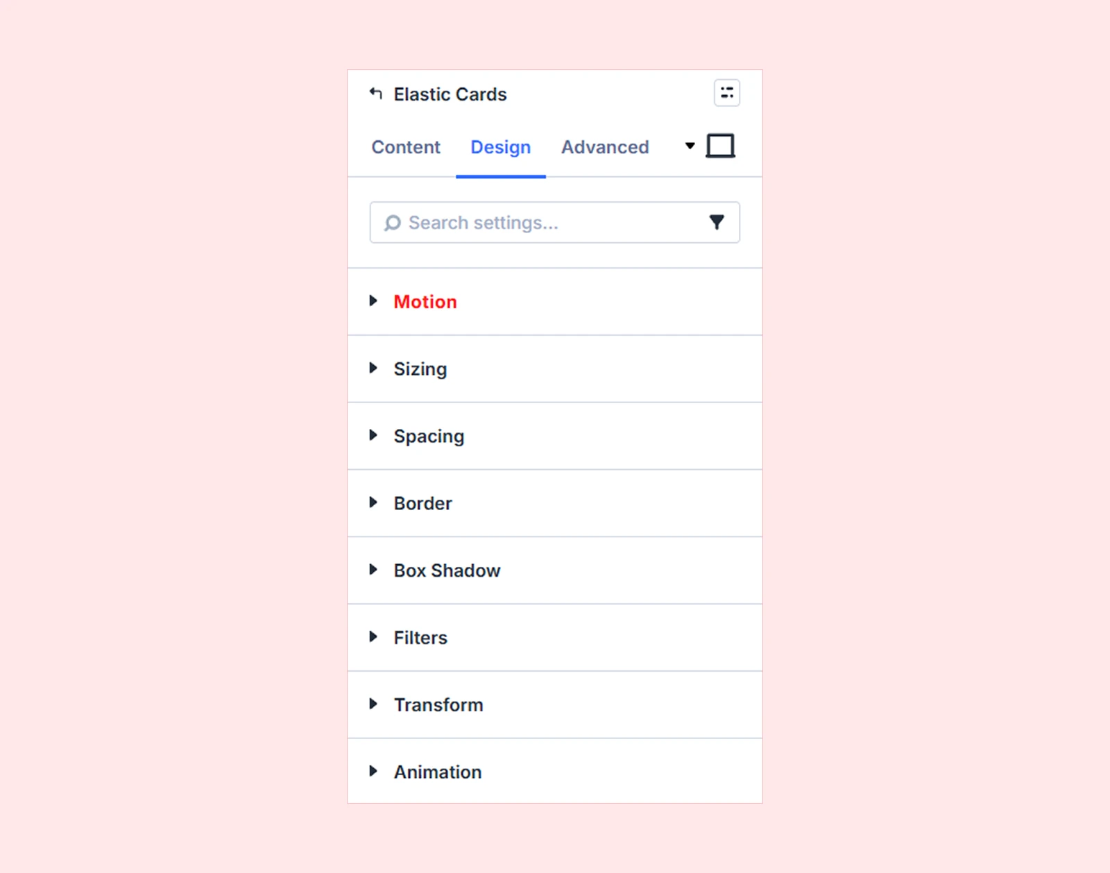
Motion: Add and customize DiviMotion’s interactions and actions within this module.
Sizing: Adjust the Elastic Cards module's width, height, and alignment.
Spacing: Configure the Elastic Cards module's margin and padding.
Border: Customize the Elastic Cards module's border radius, style, width, and color.
Box Shadow: Add shadow effects to the Elastic Cards module.
Filters: Apply visual effects to the Elastic Cards module.
Transform: Scale, rotate, move, or skew the Elastic Cards module.
Animation: Apply Divi's built-in entrance animations to the Elastic Cards module.
Advanced Tab
The Advanced tab includes standard Divi options for custom CSS, visibility, transitions, attributes, positioning, and other advanced settings.
Elastic Cards Child Item Settings
Each Elastic Card has its own Content, Design, and Advanced tabs. These settings let you customize each card individually.
Content Tab
The Content tab includes settings for configuring the content and behavior of an individual card.
Element: Add and manage Divi elements inside the card.
Link: Add a custom link to the card.
Background: Customize the background of the individual card.
Loop: Configure loop-related settings where supported.
Order: Control the order or position of the card within the Elastic Cards stack.
Meta: Configure additional item information and rename the card for easier identification inside the Divi Builder.
Design Tab
The Design tab lets you customize the appearance, layout, and motion of an individual Elastic Card.
Layout: Control the layout and positioning of the individual card and its content.
There you will also find all design options available in the main module settings, such as Motion, Sizing, Spacing, Border and more.
Advanced Tab
The Advanced tab provides standard Divi controls for custom CSS, display conditions, transitions, attributes, visibility, positioning, and other advanced settings.
Need Help?
If you have any questions or need assistance, contact our support team: [email protected]


