

In DiviMotion, an interaction defines when your animation should begin. It's the “start signal” that tells DiviMotion to animate an element based on user behavior like scrolling, hovering, clicking, or loading the page.
This guide explains how interactions work, the four trigger types available, and how to add them to your Divi elements.
What Is an Interaction?
Every animation in DiviMotion follows a simple three-step workflow:
When → What → How = Interaction → Action → Properties
Interactions answer the "When" question:
- When should the animation start?
- What user behavior triggers it?
- Which element listens for the trigger?
Interactions define the trigger. Once you've set an interaction, you'll add actions to specify what happens, and properties to control how it looks.
Understanding Trigger vs. Target
Before exploring the four interaction types, it's important to understand the relationship between triggers and targets.
Trigger Element
The element that listens for the interaction (scrolling, clicking, hovering, or page load). When you open the DiviMotion panel on a section, row, column or module, that element becomes the trigger by default.
Target Element
The element that will animate. If you don't change anything, the trigger animates itself. However, you can target other sections, rows, columns, or modules anywhere on the page using dropdowns from the trigger settings panel.
Example:
A button (trigger) is clicked → DiviMotion detects the click → A hidden text module (target) fades in
Key Concept: Trigger = listens. Target = animates.
A single trigger can animate multiple targets. Just make sure your selector matches all the elements you intend. You can also add multiple interactions to the same element. Each trigger/target pair is controlled by the Scope setting, which determines where DiviMotion looks for target elements.
Understanding Scope
Scope controls how DiviMotion finds the target elements relative to the trigger. This is especially important when targeting child elements or using the same animation across multiple items.
| Scope Option | Where It Searches | Example Use Case |
| This Element | Only the selected element | Animate only the currently selected element |
| Children | Direct children of the trigger | Animate nested items (icons inside a card) |
| Siblings | Elements with the same parent | Tabs, accordions, side-by-side columns |
| Parent | The trigger's parent element | Highlight an entire wrapper |
| Next Sibling | Element immediately after trigger | Sequential reveals (top to bottom) |
| Previous Sibling | Element immediately before trigger | Reverse sequential effects |
The Four Interaction Types
DiviMotion supports four trigger types. Each defines a different way an animation can begin.
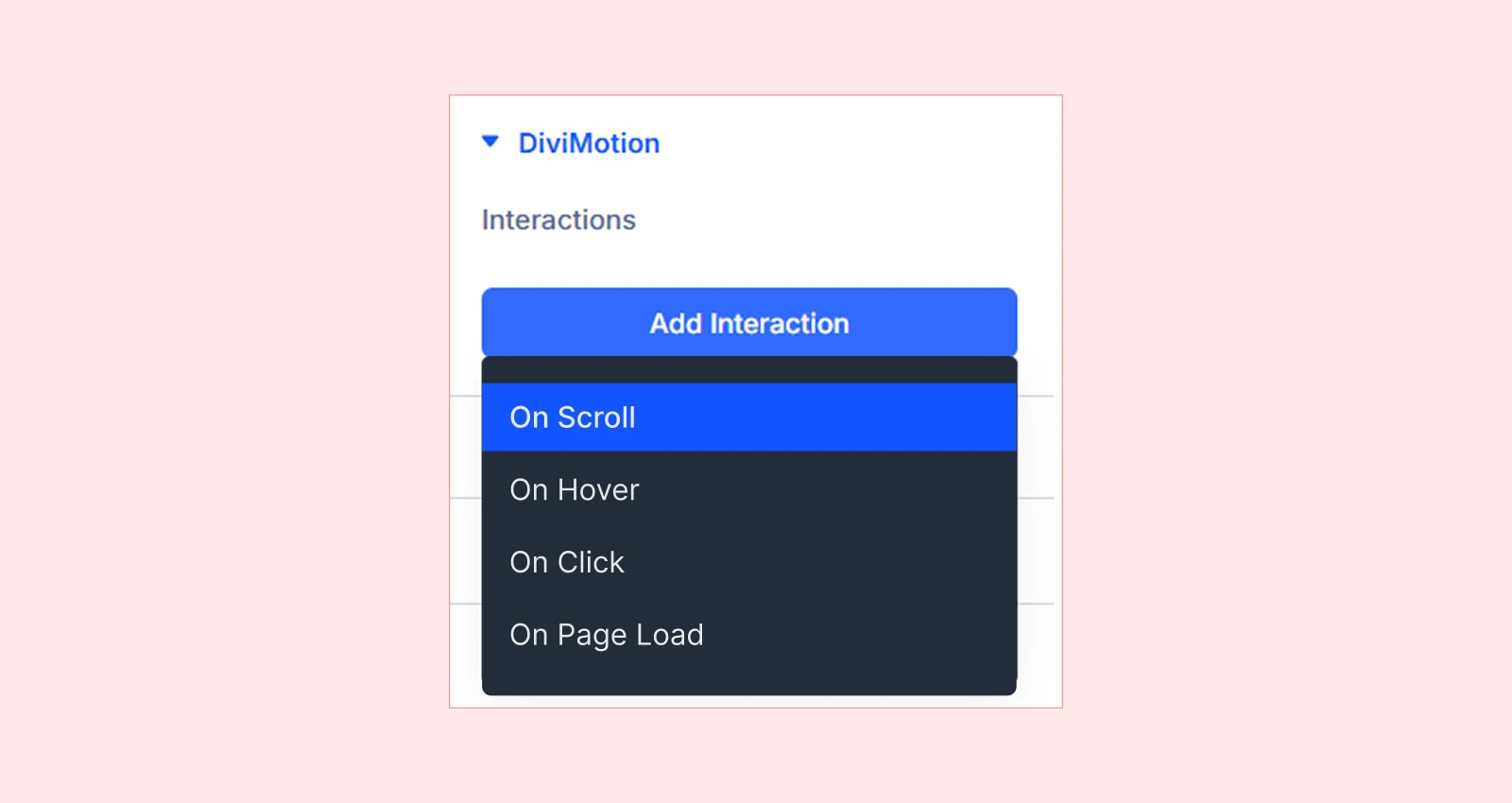
1. Scroll Trigger
Animations that fire based on scroll position. For example when an element enters, exits, or reaches a specific position in the viewport.
Use Cases:
- Fade-in content on scroll
- Pin sections
- Scroll-triggered progress bars
- Parallax effects
Learn more: Scroll Trigger Interaction Overview
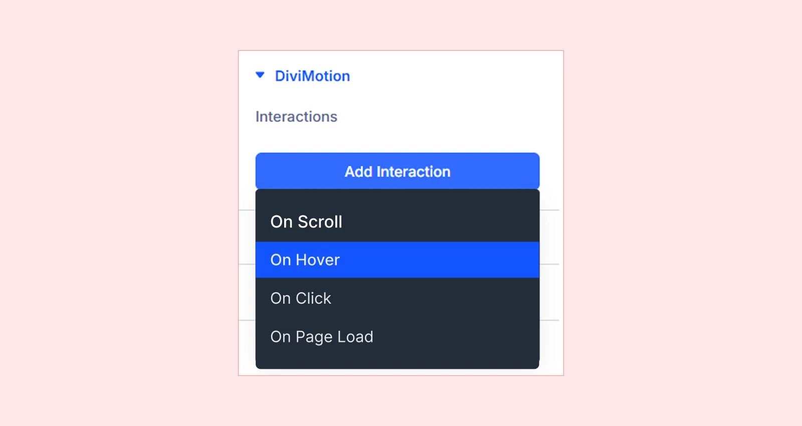
2. Hover Trigger
Animations that activate when users hover their mouse over an element.
Use Cases:
- Button scale/color effects
- Image zoom on hover
- Card lift or scale
- Interactive menu or navigation
Learn more: Hover Trigger Interaction Overview
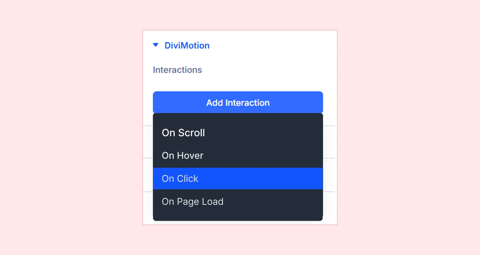
3. Click Trigger
Animations triggered when an element is clicked.
Use Cases:
- Menu/panel slide-ins
- Accordion-style expand/collapse
- Modal/popup reveals
- Toggle button states
Learn more: Click Trigger Interaction Overview
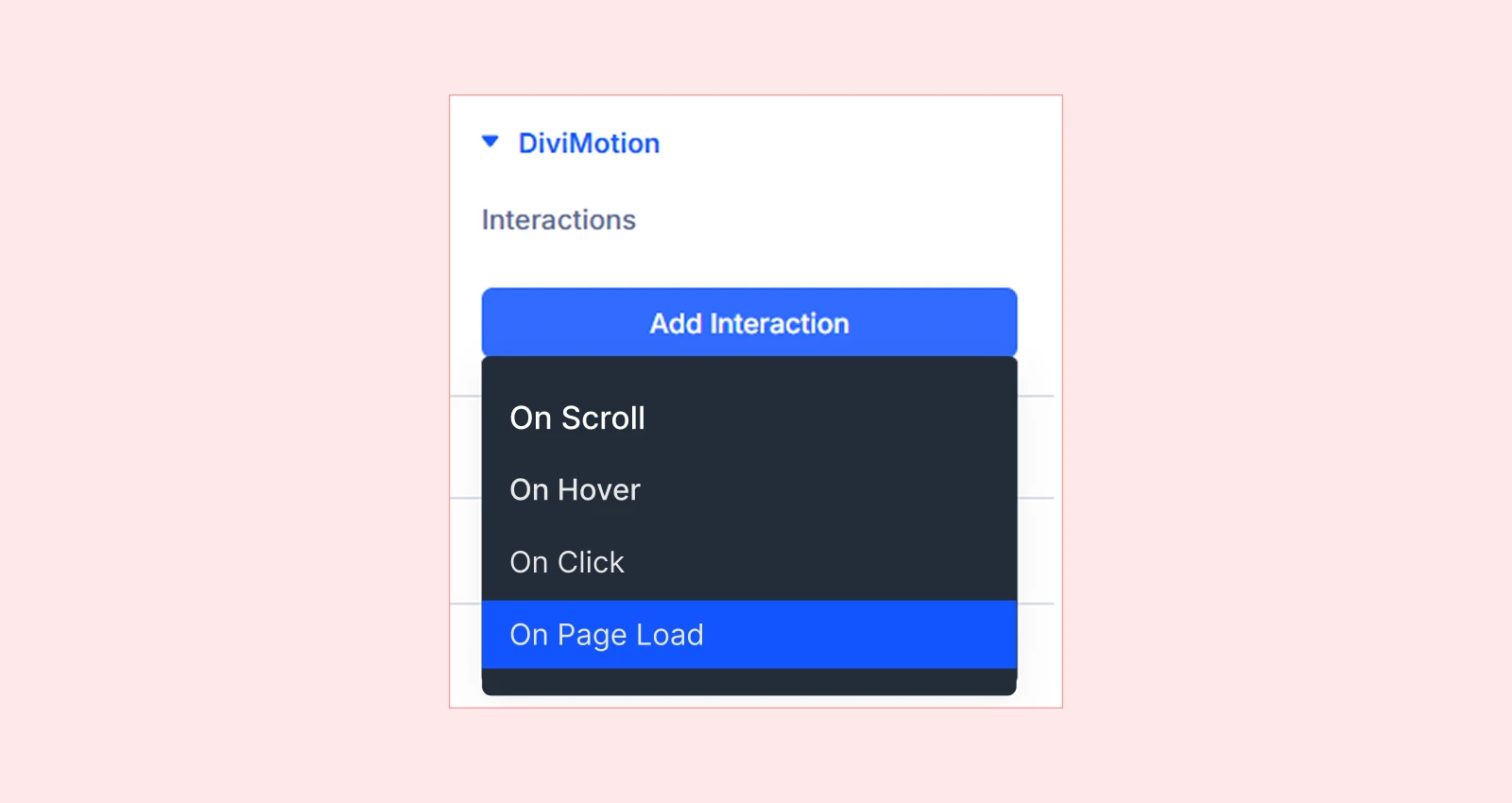
4. On Load Trigger
Animations that play automatically when the page loads.
Use Cases:
- Hero section entrance effects
- Logo reveals
- Staggered content loading
- Splash screen effects
Learn more: Load Trigger Interaction Overview
How to Add an Interaction
Adding interactions to your Divi elements with DiviMotion is straightforward:
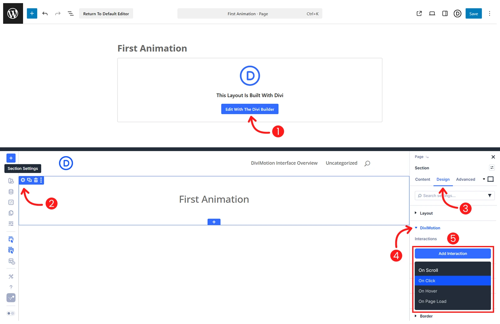
- Open your page in the Divi Visual Builder
- Click the settings icon (gear) on any section, row, or column
- Go to the Design tab → scroll to DiviMotion and expand it
- Click + Add Interaction
- Choose a trigger type (Scroll, Click, Hover, On Load)
You’ll now see an Interaction Card inside the DiviMotion panel.
Interaction Card Overview
Each interaction appears as a collapsible card. It includes several controls for managing your animation:
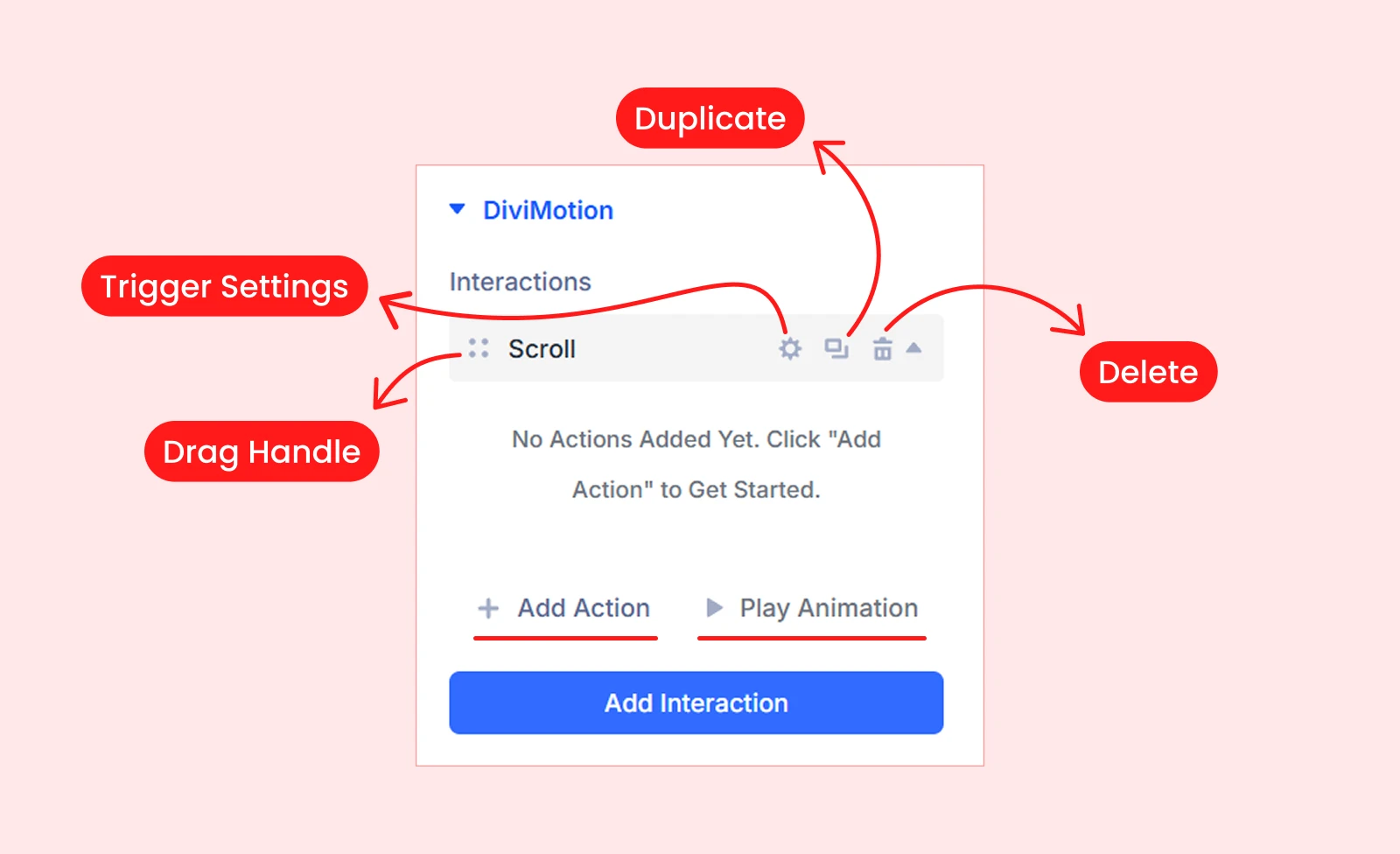
- Drag Handle – Reorder multiple interactions
- Trigger Settings – Opens a detailed modal with trigger-specific options
- Duplicate – Copy the interaction
- Delete – Remove the interaction
- Add Action – Define what happens when the interaction triggers
- Play Animation – Preview the animation inside the Visual Builder
Each interaction card can include multiple actions with their own target, duration, easing, and animation properties.
What's Next?
Now that you understand how interactions work, pick a trigger type above and dive into the detailed guide.


