

The DiviMotion Image Hover List module lets you create interactive lists that reveal images when visitors hover over or select an item. It offers four image reveal styles.
Important Note: The Image Hover List module is disabled by default. Enable it under Divi Motion > Modules.
Let's see the settings in brief and how to make better use of them.
Content Tab
The Content tab includes the essential settings for managing items, choosing reveal styles, and adjusting the list layout.
Add New Item

Add New Item: Add, rearrange, edit, or remove individual reveal items. Each item has its own content and design settings. For details, see Image Hover List Item Settings below.
Reveal

- Reveal Style: Choose how each item's image appears. Available styles include:
- Cursor Follow: Display a floating image preview that follows the cursor and changes with the hovered item.
- Tumble: Display the item's image beside its row with a tumbling animation.
- Side Preview: Show the active item's image in a fixed preview frame beside or above/below the list.
- Inline Expand: Expand an image strip beneath the active item.
- Follow Speed: Control how quickly the preview follows the cursor. Lower values respond faster. (Available when Cursor Follow is selected.)
- Preview Side: Position the preview frame on the Right, Left, Top, or Bottom of the list. (Available when Side Preview is selected.)
Layout
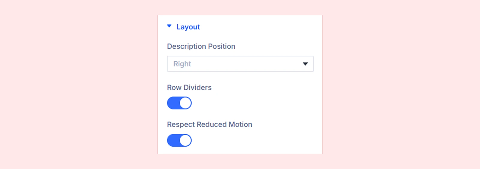
- Description Position: Choose where item descriptions appear:
- Right
- Below Title
- Row Dividers: Show or hide dividing lines between items.
- Respect Reduced Motion: Show image previews without animated fades or movement for visitors who prefer reduced motion.
Background: Customize the module background using Divi's standard settings.
Element Label: Set a custom label to identify the module in the Divi Builder.
Design Tab
The Design tab lets you customize colors, motion, inactive items, icons, images, text, and other appearance settings.
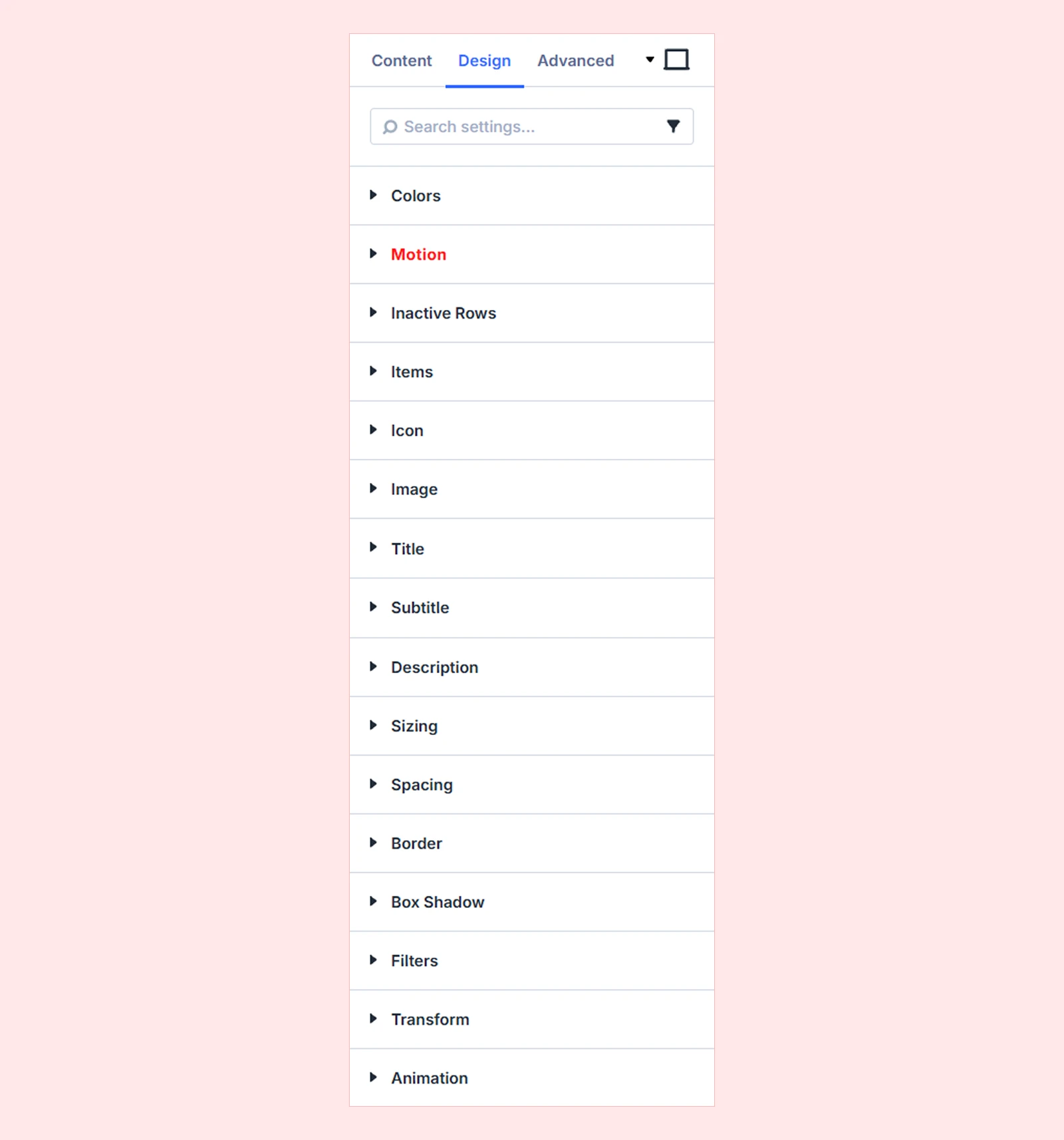
Colors

- Active Title Color: Set the title color of the active item, including when hovered, tapped, or focused.
- Divider Color: Set the color of the lines between items. (Applies when Row Dividers is enabled.)
Motion: Configure custom interactions for the module using triggers and actions.
Inactive Rows
Customize how other rows appear while one item is active.
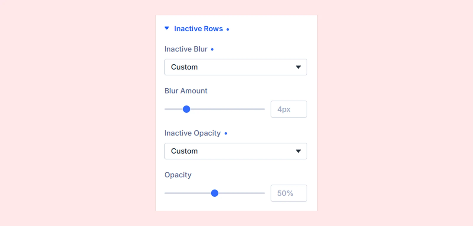
- Inactive Blur: Choose Style Default, None, or Custom to control blur on inactive rows.
- Blur Amount: Set the blur intensity. (Available when Inactive Blur is set to Custom.)
- Inactive Opacity: Choose Style Default, None, or Custom to control the visibility of inactive rows.
- Opacity: Adjust how visible the inactive rows remain. (Available when Inactive Opacity is set to Custom.)
Items: Customize the background, spacing, border, and box shadow of all list items. Background and border settings can also be customized for the hover state.
Icon
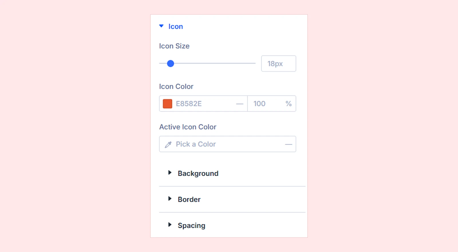
- Icon Size: Adjust the size of item icons.
- Icon Color: Set the default icon color.
- Active Icon Color: Set the icon color of the active item. Leave empty to keep the default icon color.
You can also customize icon backgrounds, borders, and spacing using Divi's standard design settings.
Image
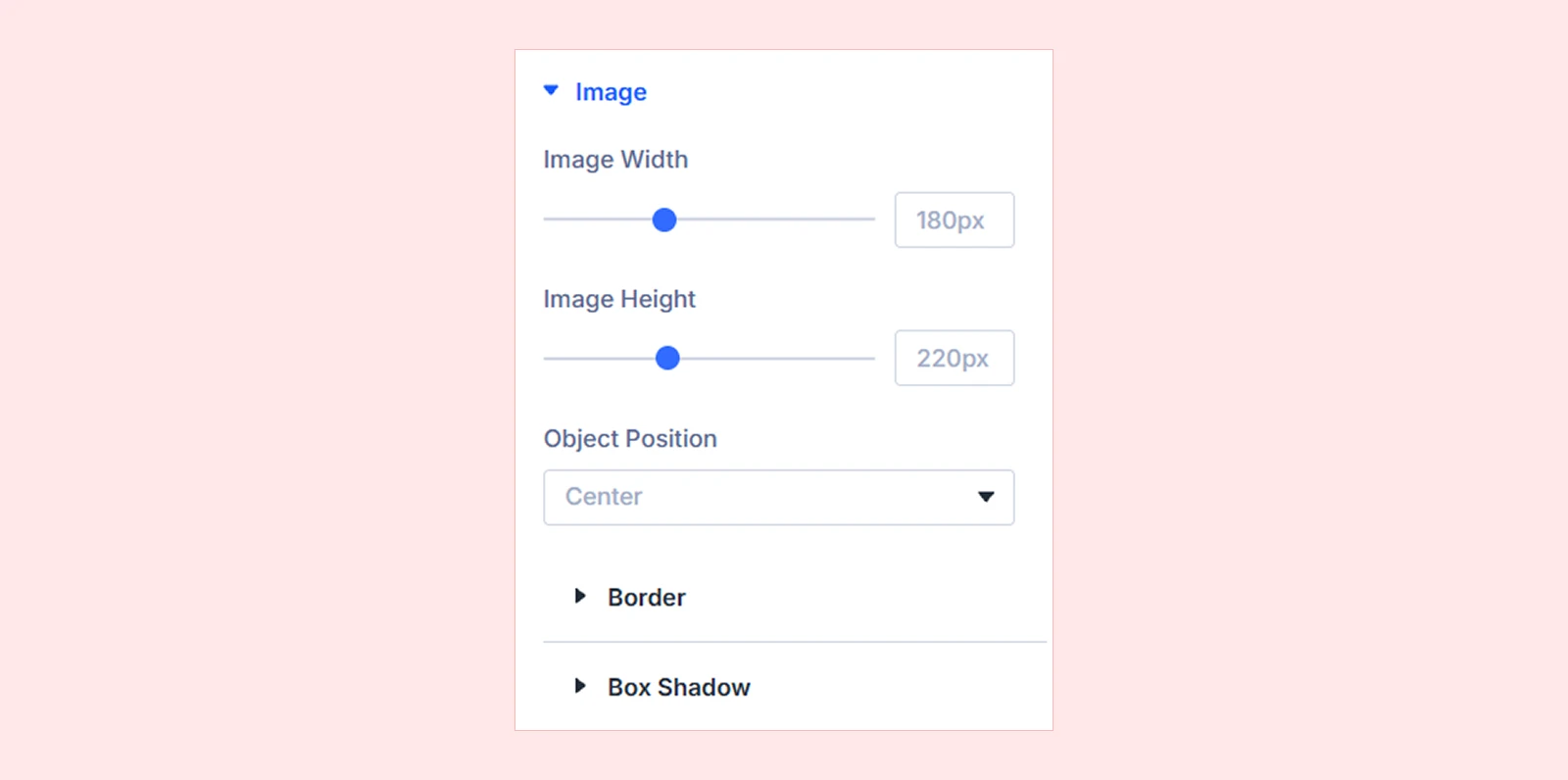
- Image Width: Set the width of revealed images. (Available for Cursor Follow and Tumble.)
- Image Height: Set the height of revealed images. (Available for Cursor Follow and Tumble.)
- Strip Height: Adjust the height of the expanding image strip. (Available for Inline Expand only.)
- Preview Width: Set the width of the fixed image preview. (Available for Side Preview only.)
- Preview Height: Set the height of the preview frame. Leave empty to use its automatic proportions. (Available for Side Preview only.)
- Object Position: Choose which part of the image stays visible when cropped. Options include Center, edges, and corners.
You can also customize the image border and box shadow using Divi's standard design settings.
Title: Customize the typography and spacing of item titles.
Subtitle: Customize the typography and spacing of item subtitles.
Description: Customize the typography and spacing of item descriptions.
Sizing: Adjust the module's width, height, and alignment. The list is centered at 480px wide by default.
Spacing: Set custom margin and padding for the module.
Border: Customize border style, width, color, and rounded corners.
Box Shadow: Add and customize shadow effects.
Filters: Adjust effects such as brightness, contrast, saturation, and opacity.
Transform: Scale, rotate, move, or skew the module.
Animation: Customize Divi's standard animation effects, timing, and delay.
Advanced Tab
The Advanced tab lets you control the module's visibility, positioning, and scroll effects, along with custom CSS and other standard Divi settings.
Image Hover List Item Settings
Each item contains its own text, image, and optional link. Its settings apply only to that item.
Content Tab
Item
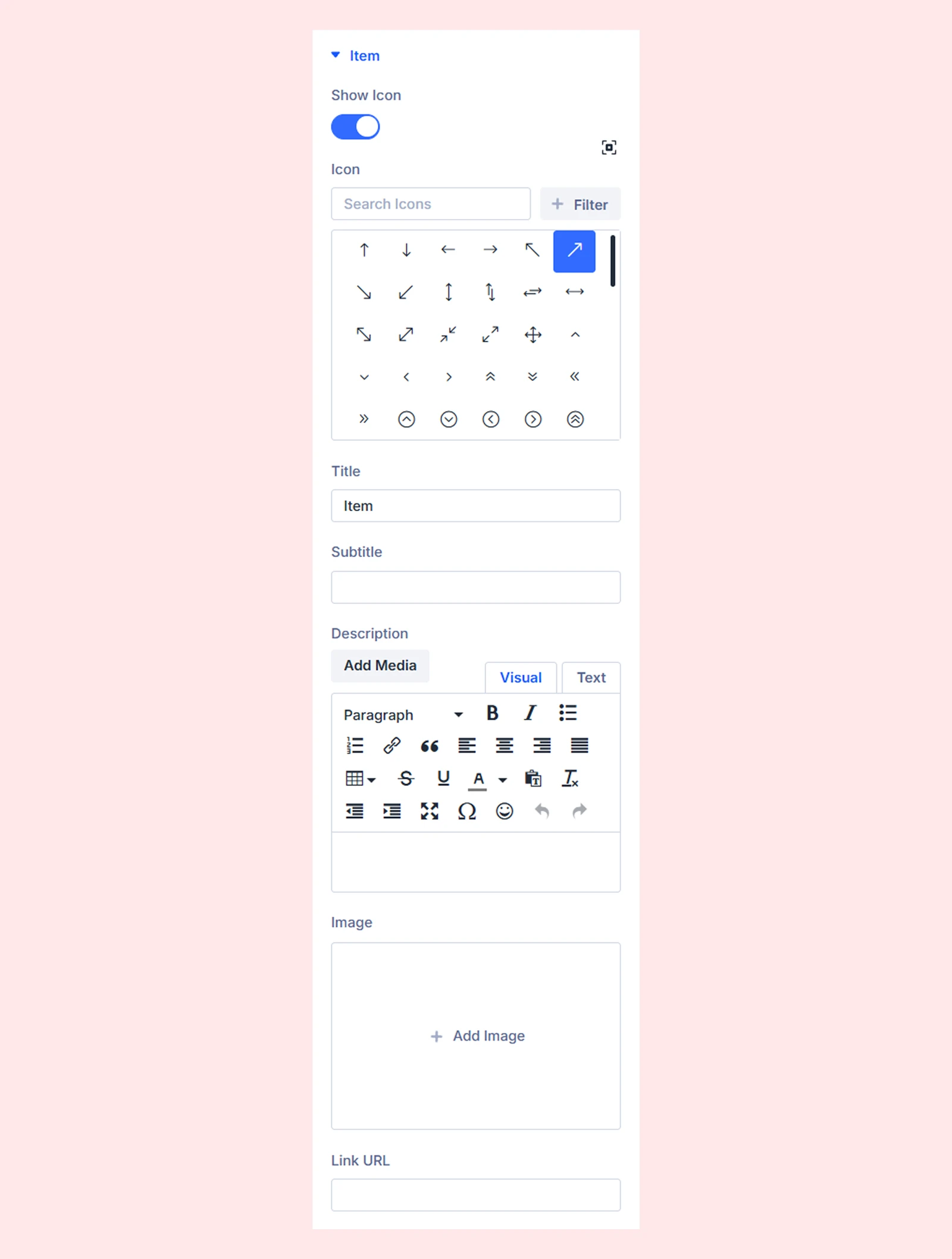
- Show Icon: Show or hide the item's icon.
- Icon: Choose an icon from the available library.
- Title: Enter the item's title.
- Subtitle: Add optional text below the title.
- Description: Enter additional text about the item. (Its position depends on the Description Position setting in the parent module.)
- Image: Select the image that appears when visitors hover over or activate the item.
- Link URL: Add an optional link to the entire item.
Note: On touch devices, the first tap reveals a linked item's image and the second tap follows its link.
Elements

Add Element: Add other Divi modules within an item. They appear below the description and keep their own settings and links.
Design Tab
Customize the individual item's background, spacing, border, box shadow, filters, and transform. Item-level styling takes priority over the parent module's Items settings.
Advanced Tab
Use Divi's standard advanced settings to manage the item's visibility, attributes, and other controls.
Need Help?
If you have any questions or need assistance, contact our support team: [email protected]


