

Scroll Trigger is the most powerful and versatile interaction type in DiviMotion. It lets you create animations that respond to user scrolling—from simple fade-ins as content enters the viewport to complex storytelling effects with pinned sections and scrubbed timelines.
This guide covers everything you need to know about scroll-based animations, from basic setup to advanced techniques like pinning, scrubbing, and action controls.
How to Access Scroll Trigger
To create a scroll-based animation:
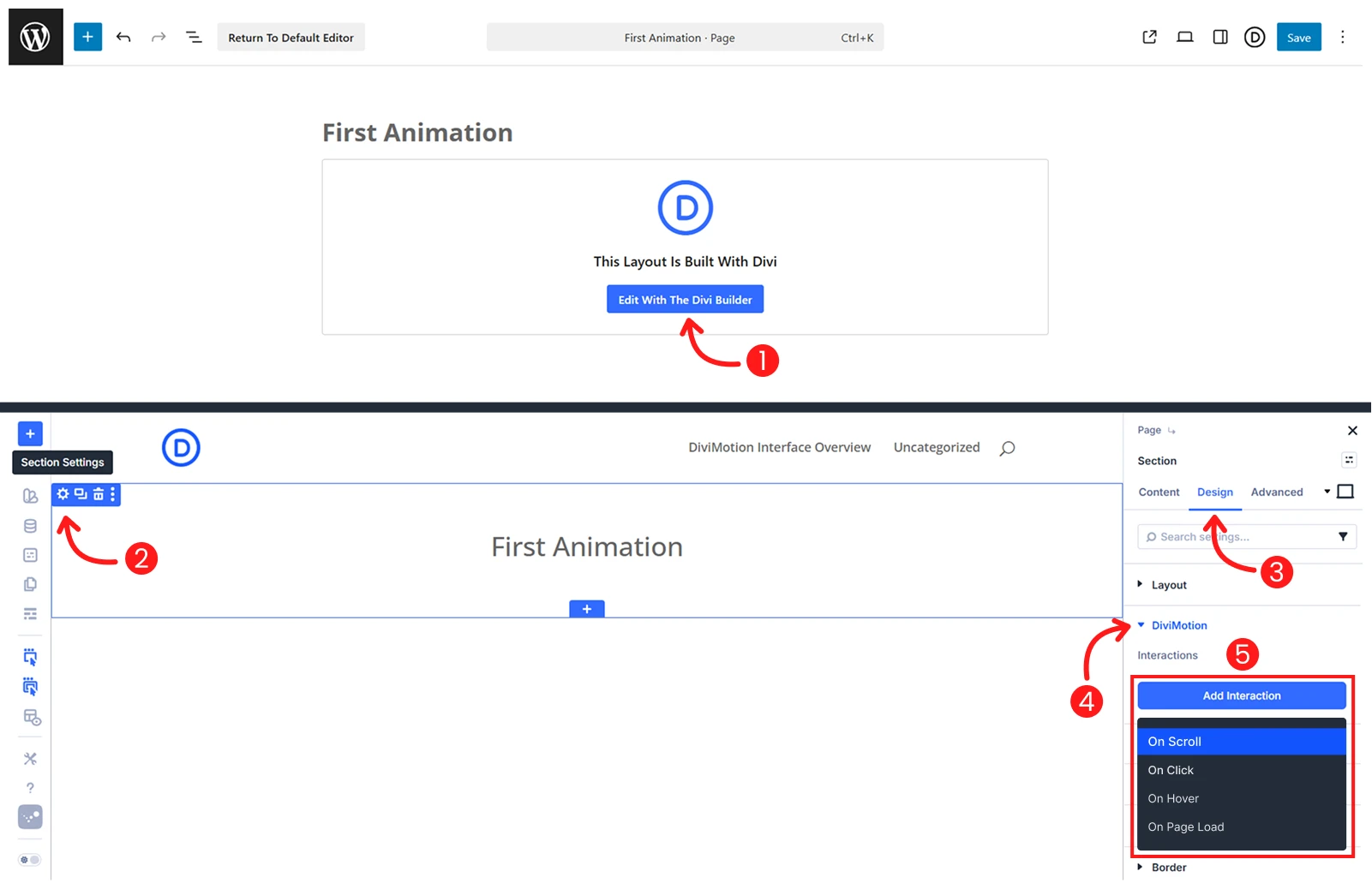
- Open your page in the Divi Visual Builder
- Click the settings icon (gear) on any section, row, column or module
- Go to the Design tab → scroll to DiviMotion and expand it
- Click + Add Interaction
- Choose Scroll trigger type
You're now ready to configure when and how your scroll animation behaves. Click the Trigger Settings icon on the interaction card to open the Scroll Trigger Settings panel on the left side.
Scroll Trigger Settings
Scroll Trigger settings are grouped into logical sections so you can precisely control what triggers the animation, when it starts and ends, and how it behaves during scrolling.

Trigger
These settings define which element triggers the animation and what element gets animated.
Target Type
Choose how the trigger element is selected:

Element (Default): Targets the current element you're currently editing (section, row, or column).
Example: You're editing a section and want that section to fade in.
Element by ID: Targets a specific element on the page by selecting it from a dropdown list.
Example: You're editing a section but want to animate a specific module inside it.
Pro tip: Rename elements using the Admin Label feature to make them easier to find in the dropdown.
Custom Selector: Targets elements using CSS selectors like .class-name or #id-name. This allows you to:
- Target elements outside the current context
- Animate multiple elements with the same class
Example: Use .card to animate all elements with the "card" class at once.
| Note: When using Custom Selector: - Use . prefix for class selectors (e.g., .my-class) - Use # prefix for ID selectors (e.g., #my-id) |
Scope
Scope determines which related elements should be animated. It's important when using Custom Selector or targeting multiple items.
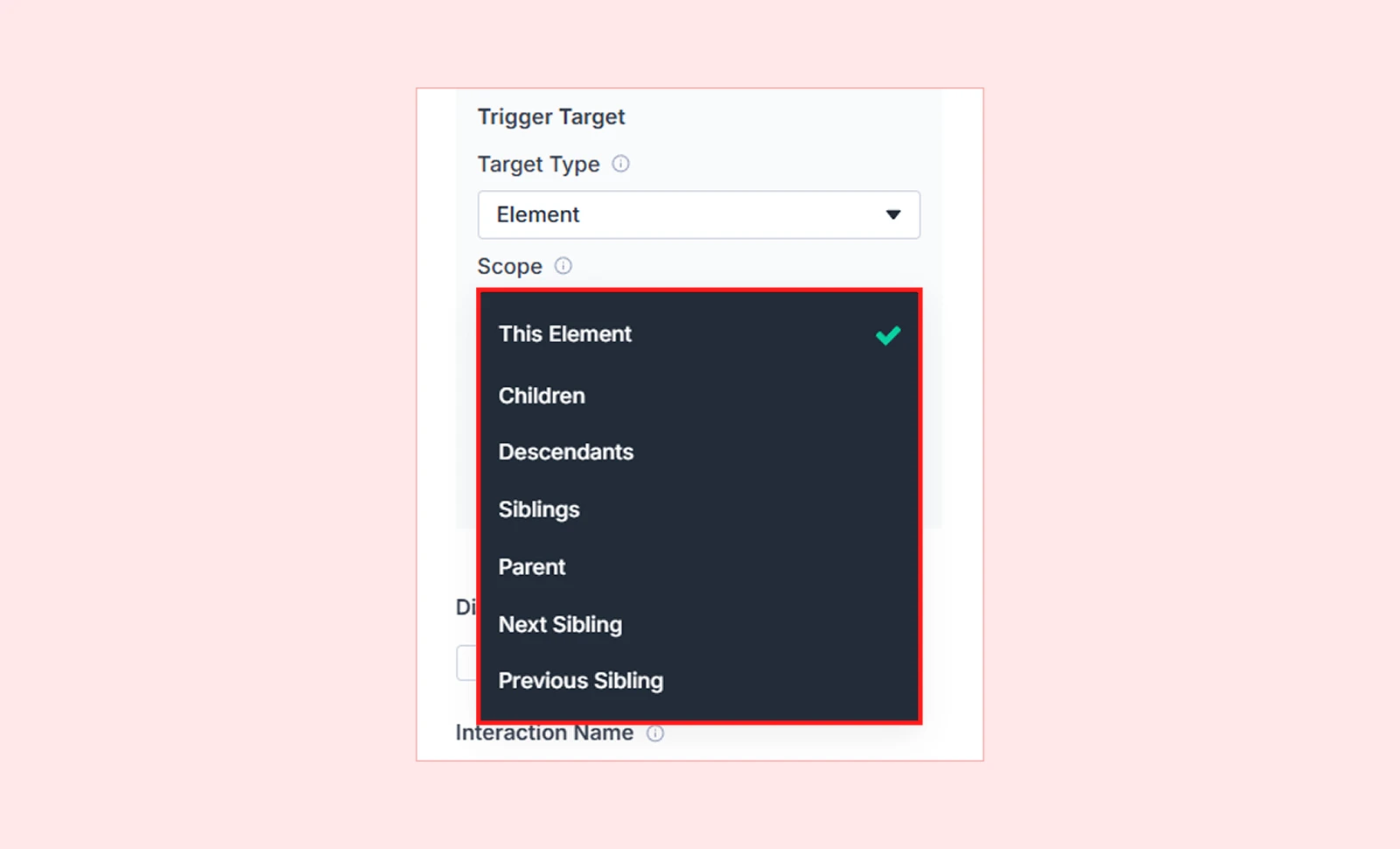
| Scope Option | What It Targets | Example Use Case |
| This Element | Only the selected element | Animate a single section |
| All Matching Elements | Every element matching the selector | Animate all .card elements on the page |
| Children | Direct children of the trigger | Animate columns inside a row |
| Descendants | Any nested element (with HTML tag selector) | Animate all <img> tags inside a section |
| Siblings | Elements with the same parent | Animate other columns in the same row |
| Parent | The container holding the trigger | Animate the row containing a column |
| Next Sibling | The element immediately after | Sequential reveals (top to bottom) |
| Previous Sibling | The element immediately before | Reverse sequential reveals |
End Trigger
By default, animations use the same element for start and end positions. End Trigger lets you use a different element as the endpoint.
When to use:
- Animation should continue beyond the triggering element
- Creating complex multi-section effects
- Pinning one element while another scrolls past
Enable End Trigger
When enabled, following options appear:
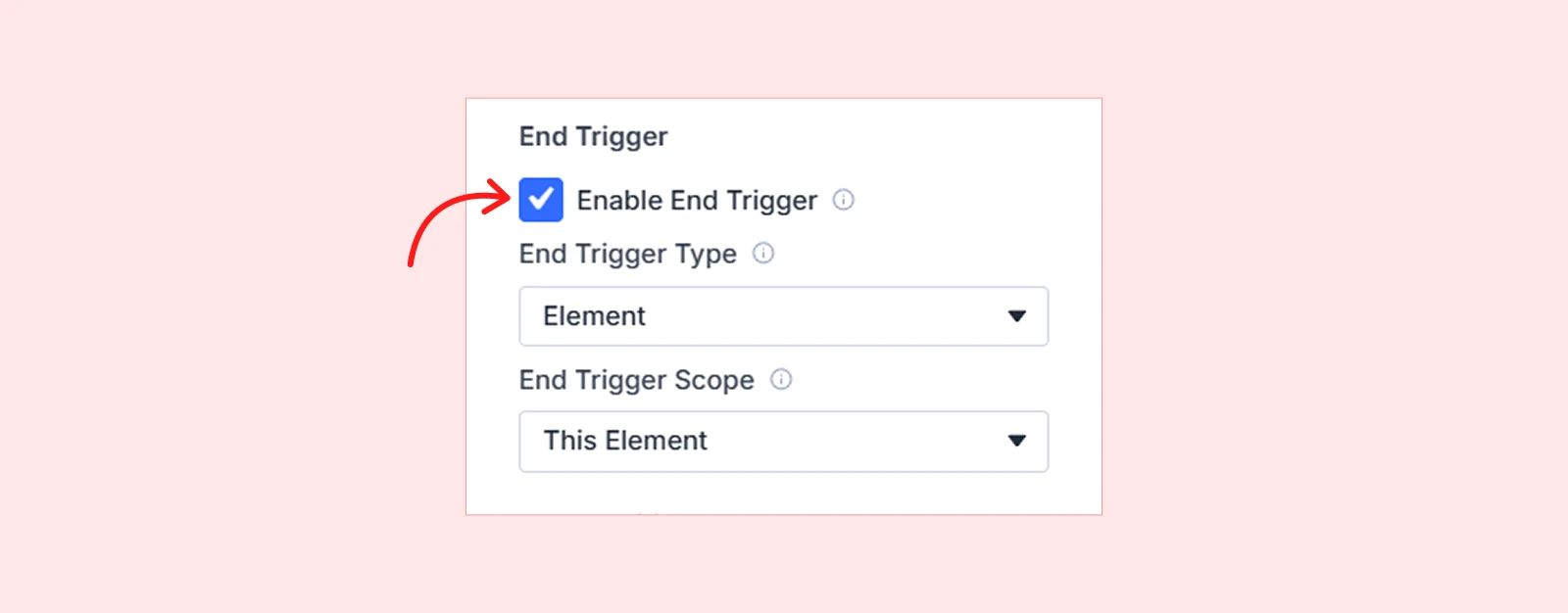
- End Trigger Type — Choose which element controls the end position. Same options as Target Type (Element, Element by ID, Custom Selector).
- End Trigger Scope — Choose which part of that element is used to determine the end point. Same scope options as the main trigger.
Start Position
Start Position defines when the animation begins as the user scrolls. You control this using two reference points:
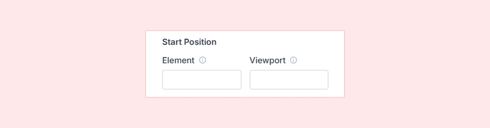
- Element: Choose which part of the element triggers the animation (Top, Center, Bottom, or a percentage e.g., 25%, 75%)
- Viewport: Choose where on the screen the trigger activates (Top, Center, Bottom, or a percentage e.g., 25%, 75% )
| Example: Element (bottom) + Viewport (center) = Animation starts when the bottom of your element reaches the center of the screen. |
End Position
End Position defines when the animation finishes during scrolling. It works exactly like Start Position, but defines the finish point.
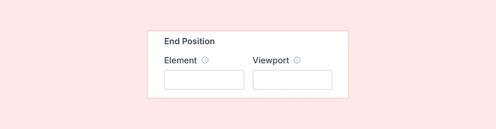
| Example: Element (top) + Viewport (top) = Animation finishes when the top of your element reaches the top of the screen. |
Scrub on Scroll
These settings control how the animation responds to scrolling.
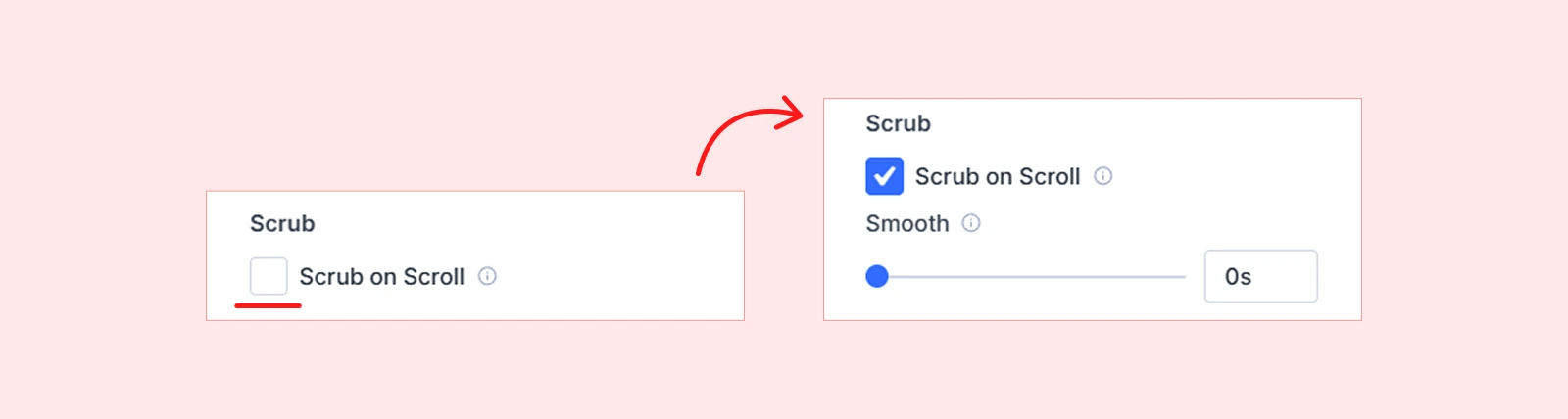
When OFF (Default): Animation plays like a normal timeline when triggered. Use Action Controls to define behavior.
When ON: Scroll position controls animation progress—scroll down plays forward, scroll up plays backward.
Smooth (appears when Scrub is ON): Adds easing to the scrub effect. Higher values create smoother, more fluid motion.
- 0s — Animation follows scroll instantly (tight coupling)
- 0.5s — Slight smoothing
- 1s+ — Loose, fluid connection
| Note: ScrollTrigger integration must be activated in the Dashboard to use Scrub. Enabling Scrub disables Action Controls since animation is scroll-driven, not event-driven. |
Action Controls
It’s available when Scrub on Scroll is OFF. Action Controls let you decide what happens at four key scroll moments:
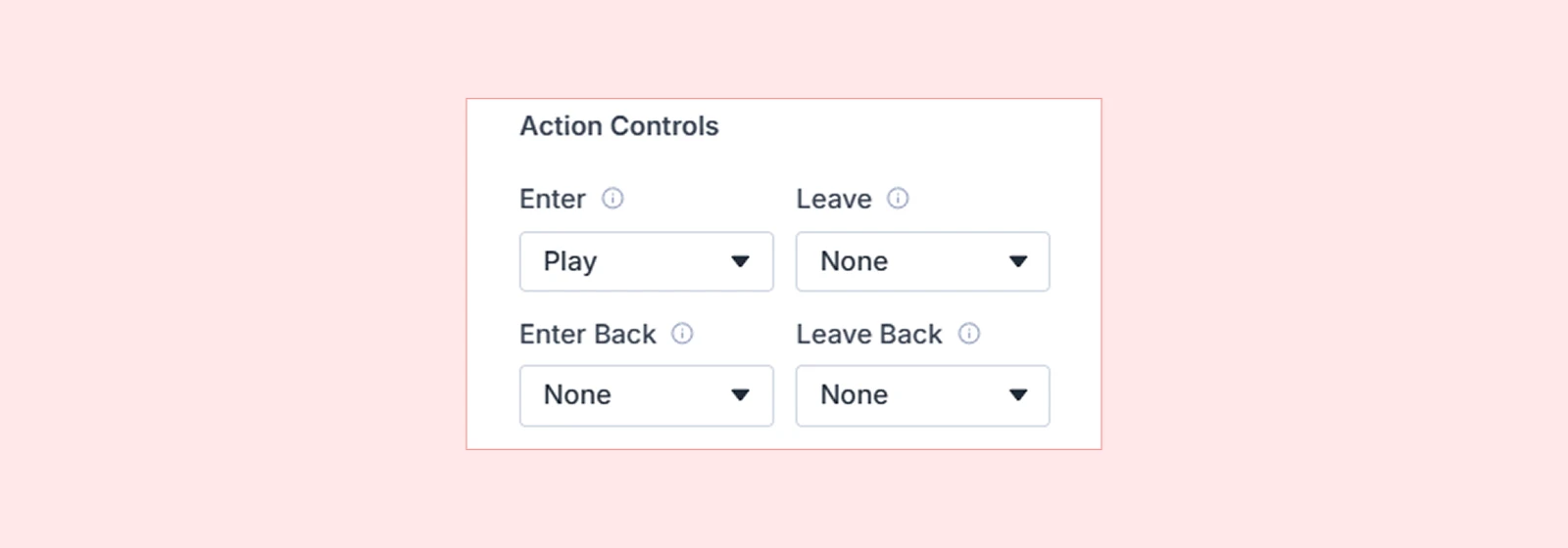
- Enter – When the element enters the trigger zone (scrolling down)
- Leave – When the element exits the trigger zone (scrolling down)
- Enter Back – When the element re-enters from below (scrolling up)
- Leave Back – When the element exits above the trigger zone (scrolling up)
For each event, choose one of these actions:
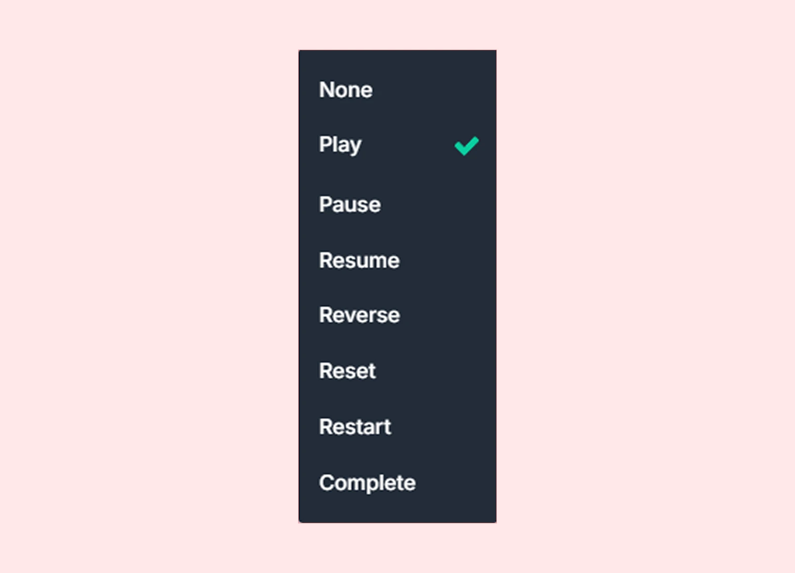
| Action | Behavior |
| None | Do nothing |
| Play | Play the animation |
| Pause | Pause animation mid-playback |
| Resume | Continue from where paused |
| Reverse | Play animation backward |
| Reset | Jump to start instantly (no transition) |
| Restart | Restart animation from beginning |
| Complete | Jump to end instantly (no transition) |
Common pattern: Enter = Play, Leave = Reverse, Enter Back = Play, Leave Back = Reverse
This creates an animation that plays forward when scrolling down and reverses when scrolling back up.
Advanced Options
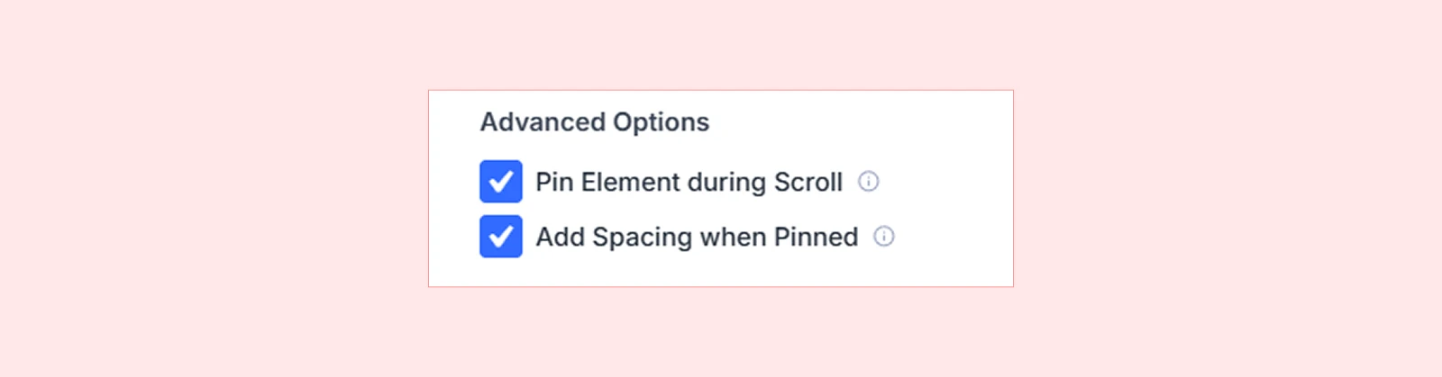
Pin Element During Scroll
Keeps the target element fixed in position while the page continues to scroll around it. Perfect for:
- Sticky storytelling sections
- Pinned headers with scrolling content
- Split-screen effects
- Image reveals alongside text
How it works: The element "pins" at the Start Position and "unpins" at the End Position.
Add Spacing When Pinned
Prevents layout shift by adding space where the pinned element would normally be.
When to enable:
- Turn ON to maintain page flow (recommended for most cases)
- Turn OFF for overlapping/layered effects
Show Scroll Markers
Markers visually display the start and end points of the scroll animation directly on the page. This is useful during setup and debugging to understand how scroll positions affect the animation.
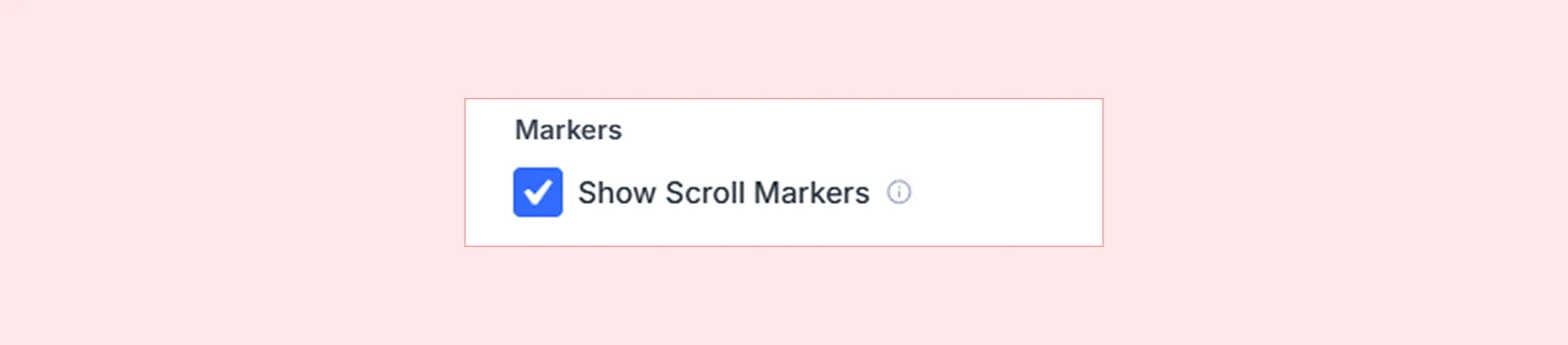
| Pro tip: Turn markers OFF before publishing—they only appear in the Visual Builder. |
Disable Animation
Turn off scroll animations for specific devices if needed:
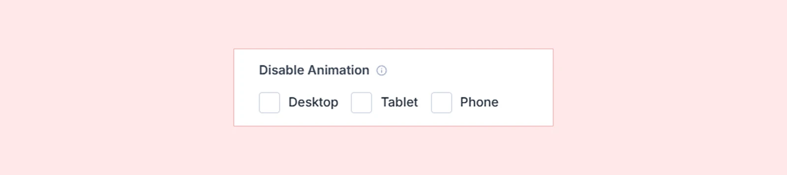
- Desktop
- Tablet
- Phone
| Common use case: Disable complex scroll effects on mobile for better performance. |
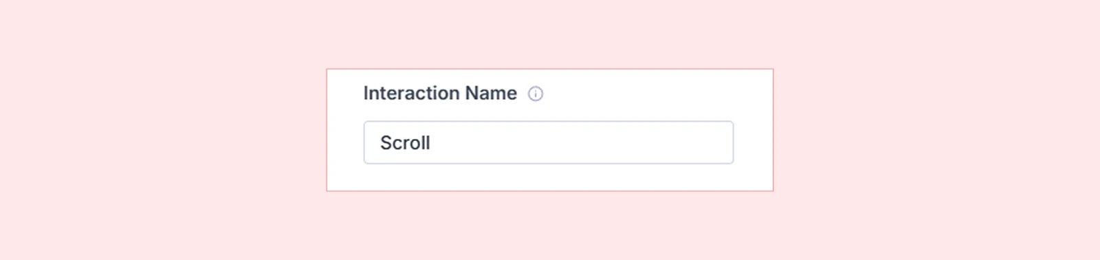
Interaction Name
Give your scroll trigger a descriptive name for easy identification.
What's Next?
Now that you understand Scroll Trigger, you’re ready to add scroll-driven motion to your site.
Open the Visual Builder, experiment with different start/end positions, and combine Scrub, Pinning, and Action Controls to create powerful interactions.


