

In DiviMotion, actions define what happens when an interaction triggers. While interactions determine when animations play (on scroll, click, hover, or page load), actions determine what animates and how it behaves.
Actions sit between the trigger and the visual result. They define which animation type plays and give you control over timing, easing, and sequencing.
This guide covers the three action types available in DiviMotion and how to configure them.
What Is an Action?
Every animation in DiviMotion follows a simple three-step workflow:
When → What → How = Interaction → Action → Properties
Actions answer the "What" question:
- What element animates?
- What effect takes place?
- In what order it animates?
You can add multiple actions to a single interaction to build complex sequences or animate several elements from one trigger.
The Three Action Types
DiviMotion offers three action types, each suited to different animation needs.
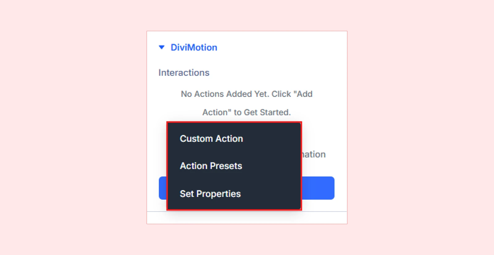
1. Custom Action
Build animations from scratch with complete control over properties, timing, and sequencing. Use Custom Actions when you need fine-tuned motion or layered multi-step effects.
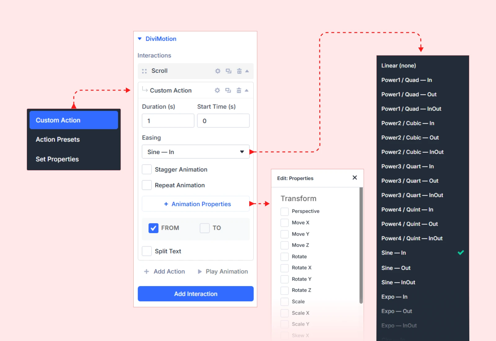
Example: A card that fades in, slides up 50px, and scales to 1.05x over 0.8 seconds.
Learn more: Custom Action Overview
2. Action Presets
Apply ready-made animations with pre-configured properties settings that you can customize further. Use presets when you need quick implementation of common effects.
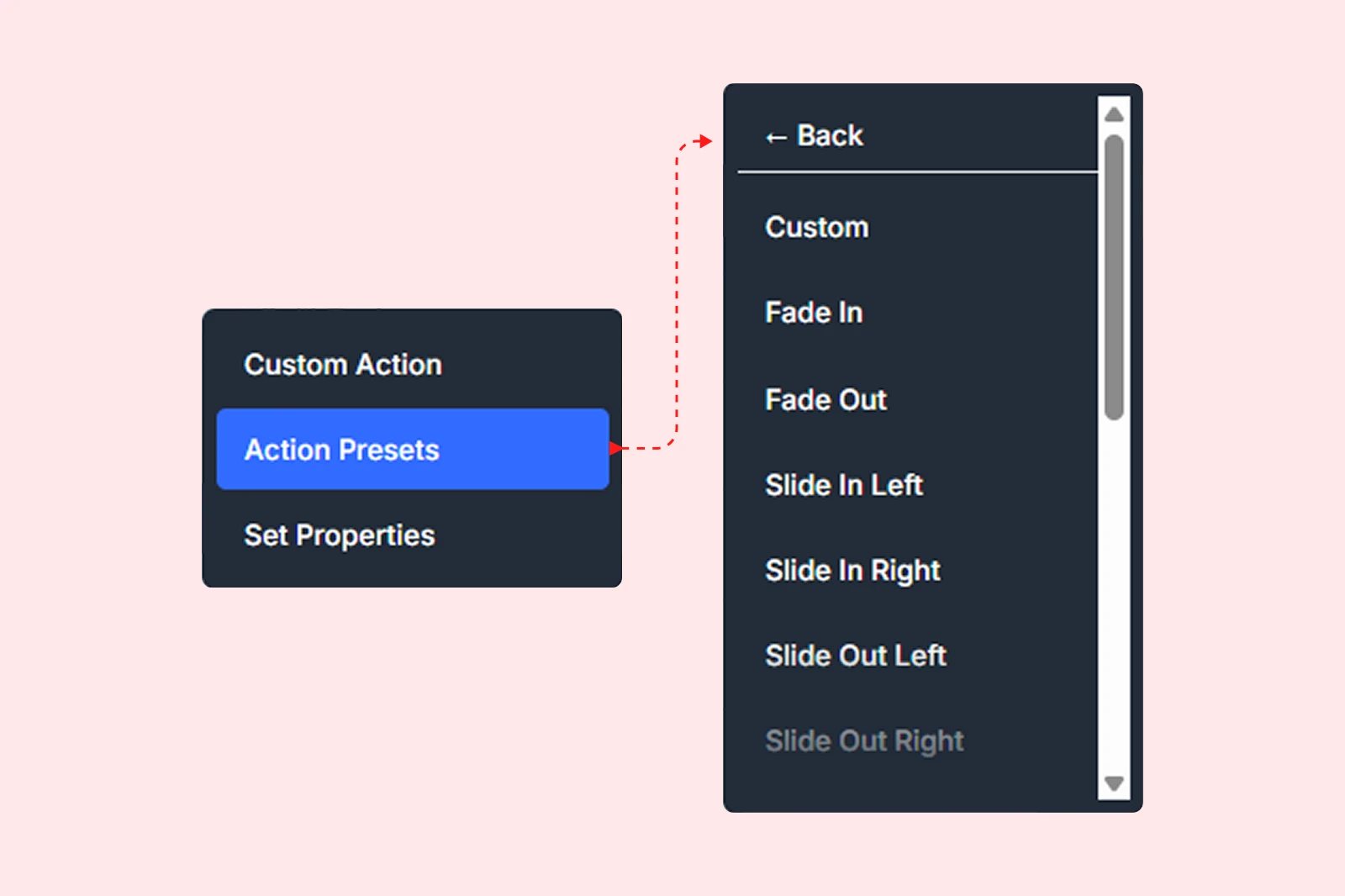
Available presets: Fade In, Fade Out, Slide In Left, Slide In Right, Slide Out Left, Slide Out Right, Slide In Up, Slide In Down, Scale In, Scale Out, Pop In, Rotate In, Bounce In, Blur In
Example: Apply the "Fade In" preset, then increase duration from default 0.5s to 1.2s.
Learn more: Action Presets Overview
3. Set Properties
Use this action to instantly change a CSS property without animating. No duration, no easing, just an immediate visual state change. Useful for toggling visibility, resetting values, or preparing elements before an animation begins.
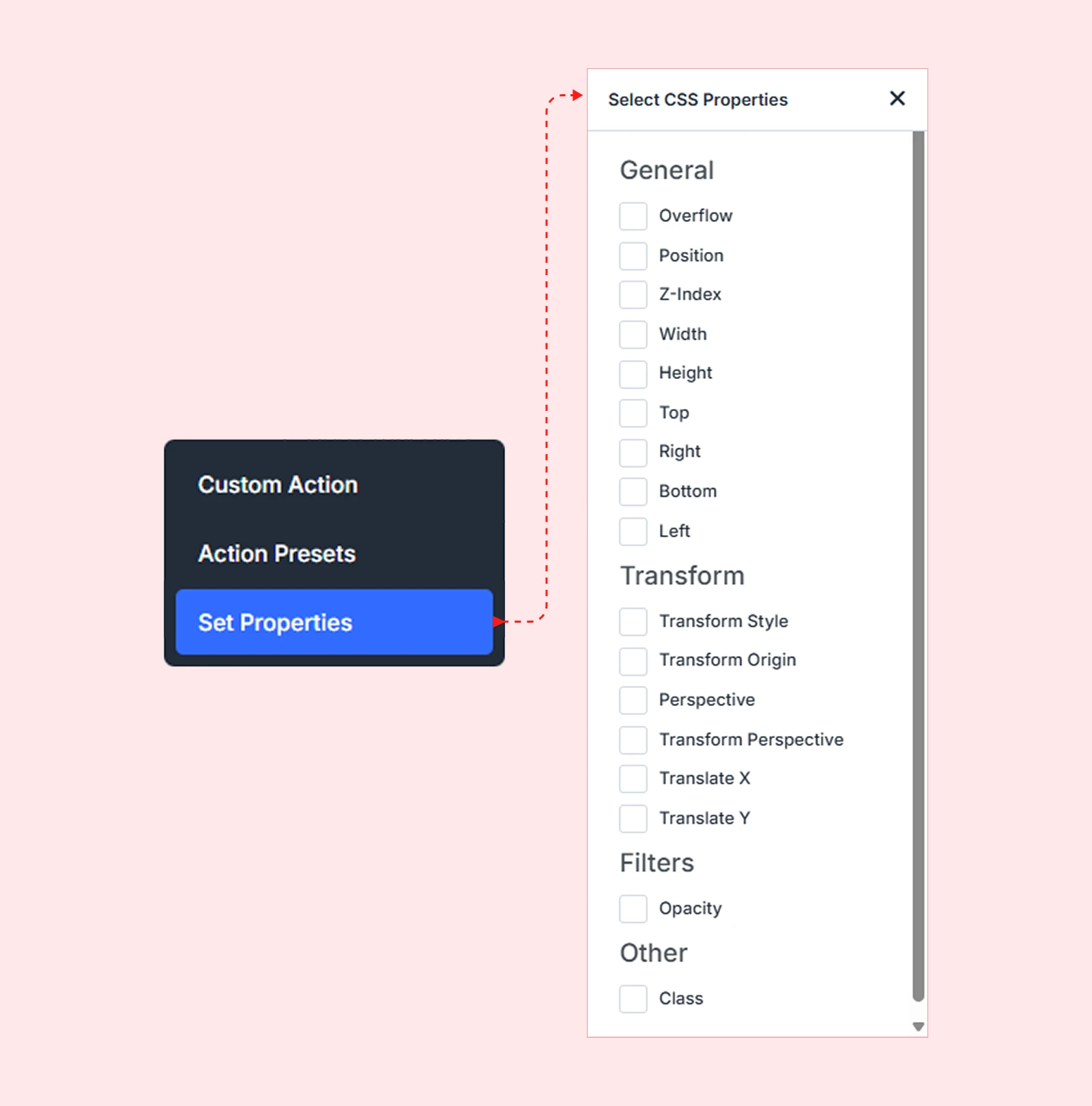
Example: Set opacity to 0 on page load, then use a Custom Action to fade the element in on scroll.
Learn more: CSS Properties Guide
How to Add an Action
After adding an interaction (Scroll, Click, Hover, or Load), follow these steps:
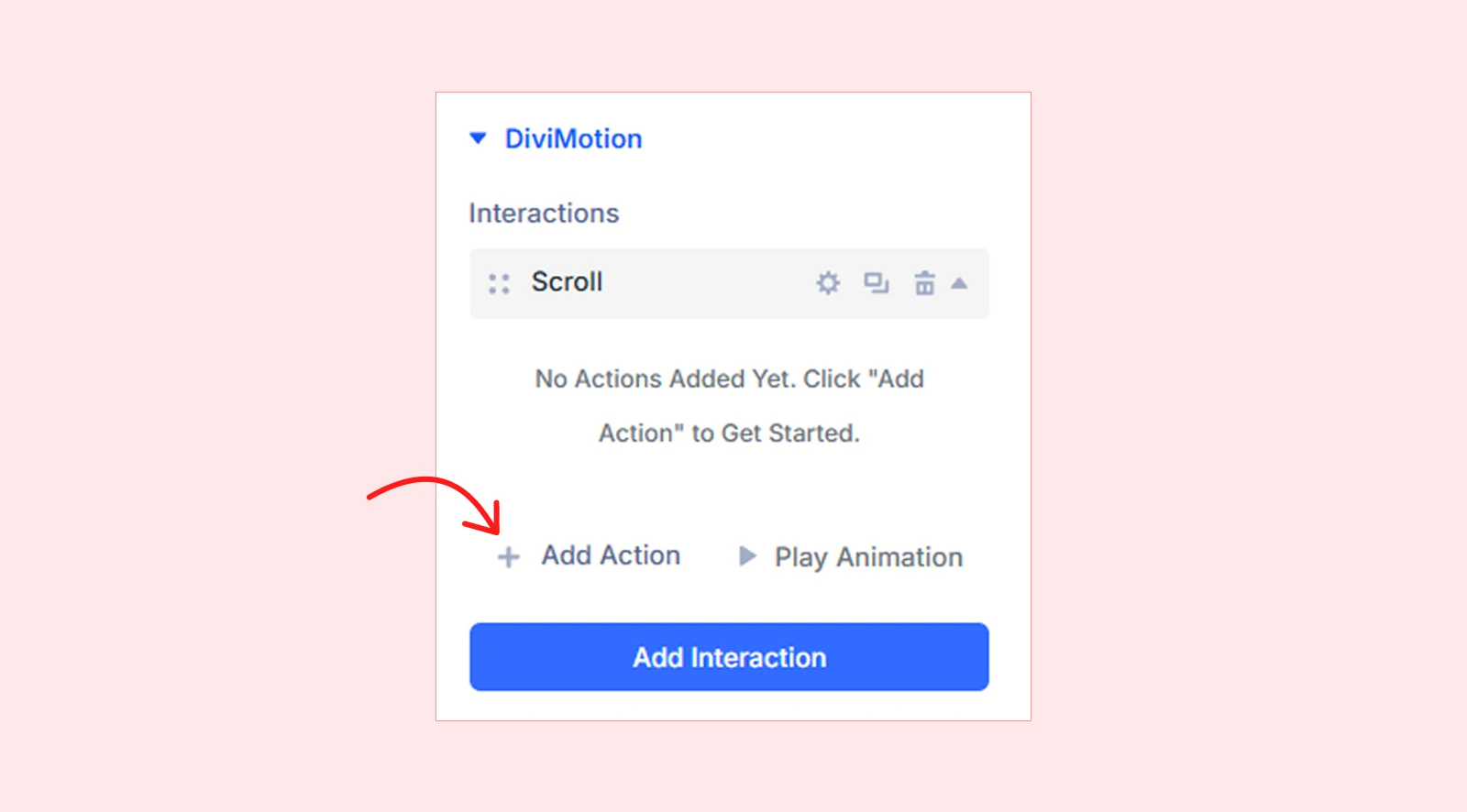
- In the interaction card, click the + Add Action button.
- Select an action type from the dropdown: Custom Action, Action Presets, or Set Properties.
- Configure the action based on the type you selected:
- Custom Action — Set properties, duration, delay, easing, and stagger
- Action Presets — Select a preset, then adjust its settings as needed
- Set Properties — Choose which CSS properties to set and define their values
- Add more actions if needed; they’ll run in sequence or parallel
Each interaction card can include multiple actions with their own target, duration, easing, and animation properties.
Action Card Overview
Once added, each action is displayed as a collapsible card with the following controls:
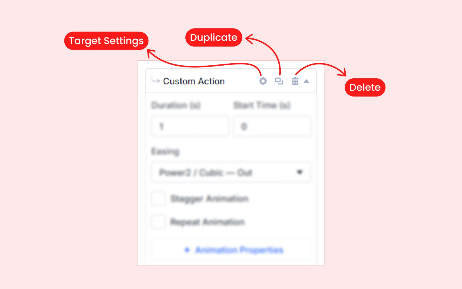
- Target Settings – Opens a detailed modal with target-specific options
- Duplicate – Copy the action with all its settings
- Delete – Remove the action from the interaction
Understanding Action Settings
All action types (except Set Properties) share few common settings that control animation behavior:
Duration
How long the animation takes to complete, measured in seconds (s) or milliseconds (ms).
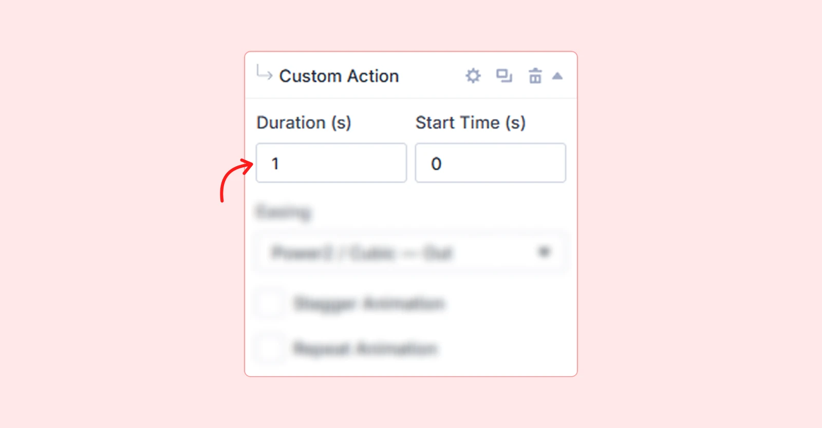
| Example: 1s = animation plays over one full second. |
Start Time(Delay)
How long DiviMotion waits before starting the animation after the trigger fires, measured in seconds (s) or milliseconds (ms).
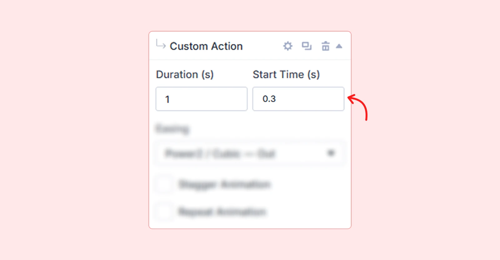
| Example: 0.3s = animation waits 300 milliseconds before playing. |
Easing
The acceleration curve that controls how the animation speeds up and slows down over time.
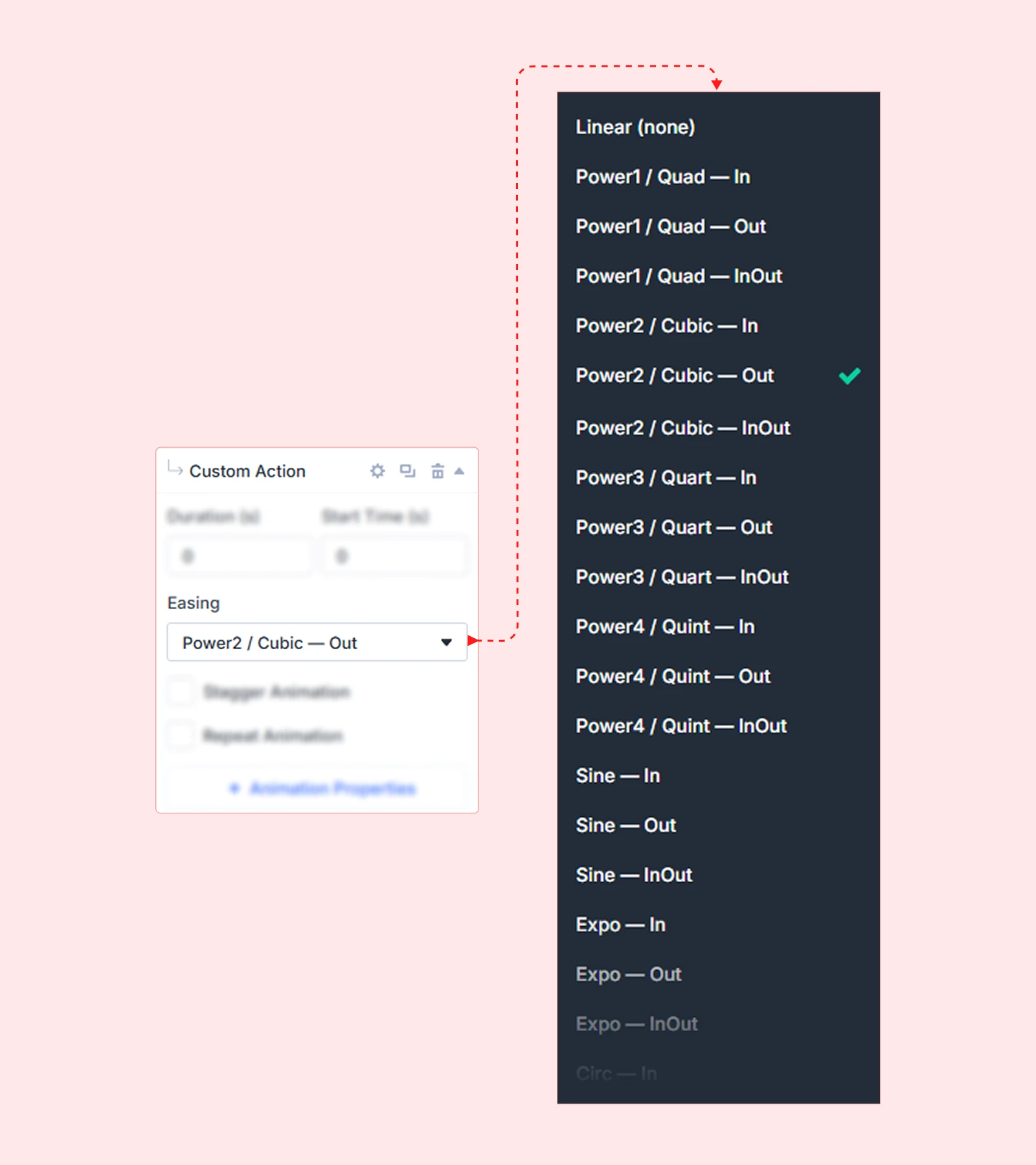
Available easing options: Linear (None), Quad (In, Out), Cubic (In, Out, InOut), Quart (In, Out, InOut), Quint (In, Out, InOut), Sine (In, Out, InOut), Expo (In, Out, InOut), Circ (In, Out, InOut), Back (In, Out, InOut), Elastic (In, Out, InOut), Bounce (In, Out, InOut), Rough, Steps (5), SlowMo
Stagger
Animates multiple child elements sequentially with a delay between each one.
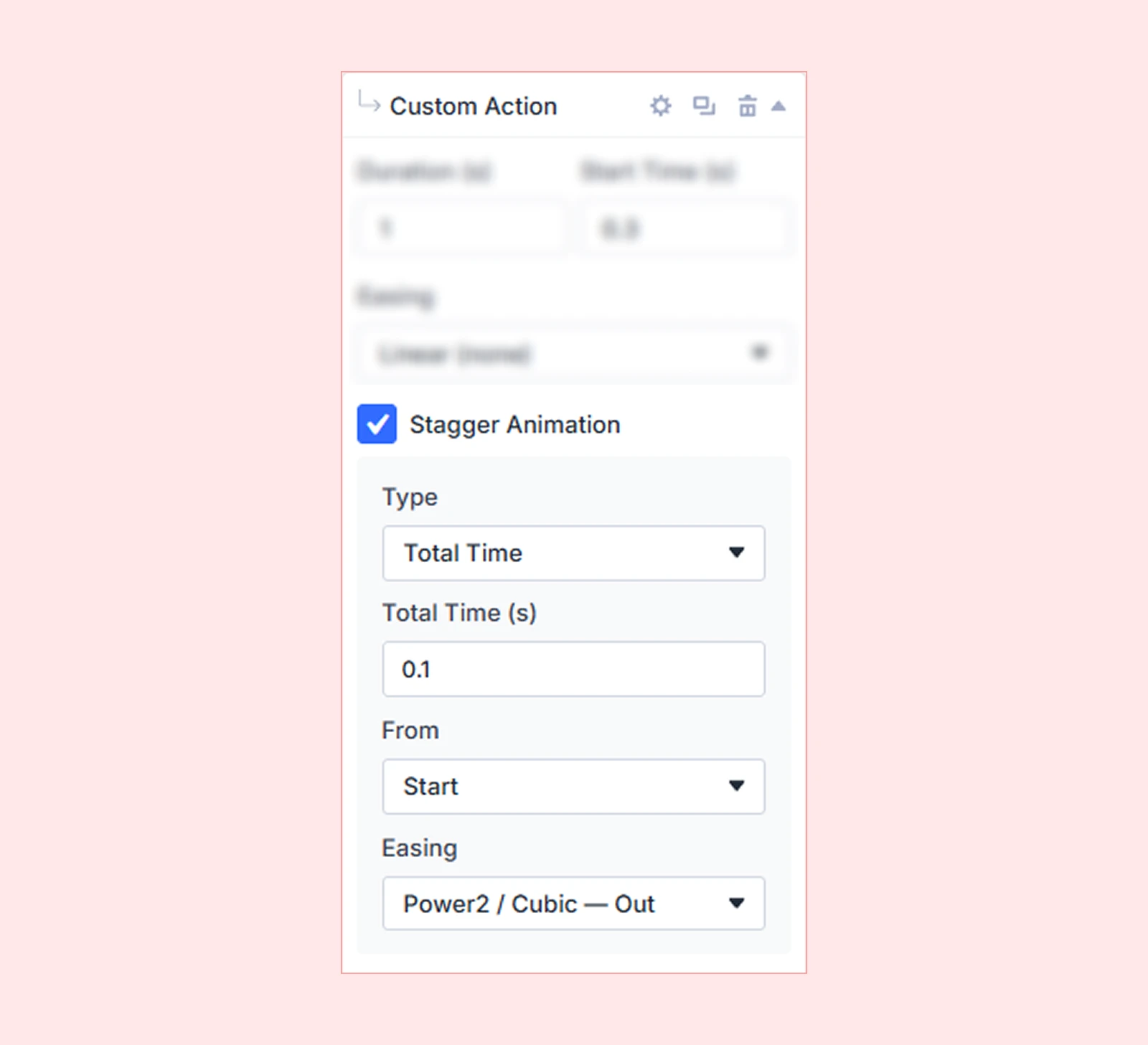
| Example: Cards fade in one after another with 0.1s between each card. |
Repeat
Controls whether and how many times the animation repeats after the initial play.
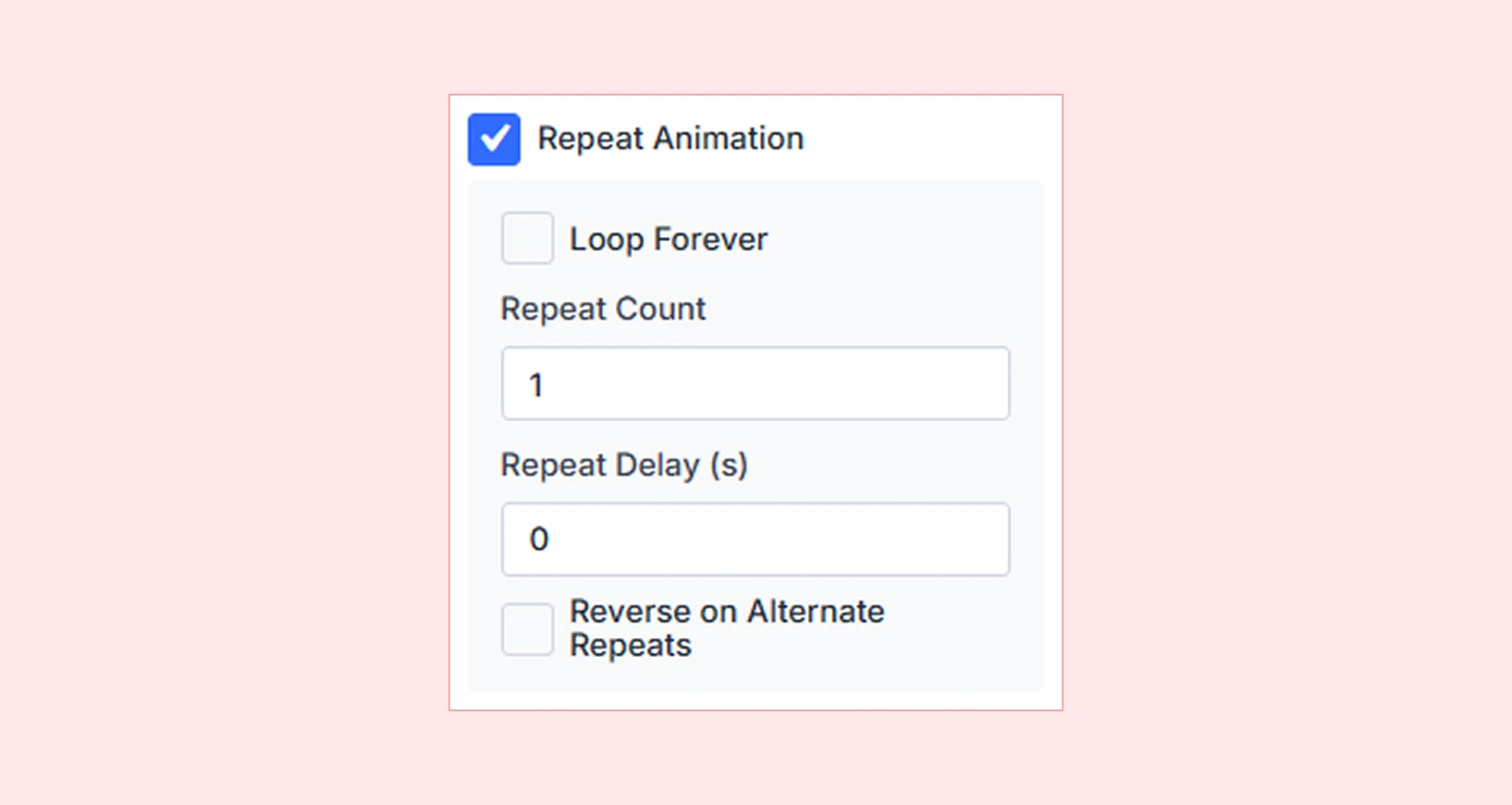
Available Options:
| Value | Behavior |
| 0 | Play once (default) |
| 1, 2, 3… | Repeat a specific number of times |
| -1 | Loop infinitely |
| Yoyo | Reverse the animation on each repeat (plays forward, then backward) |
Animation Properties
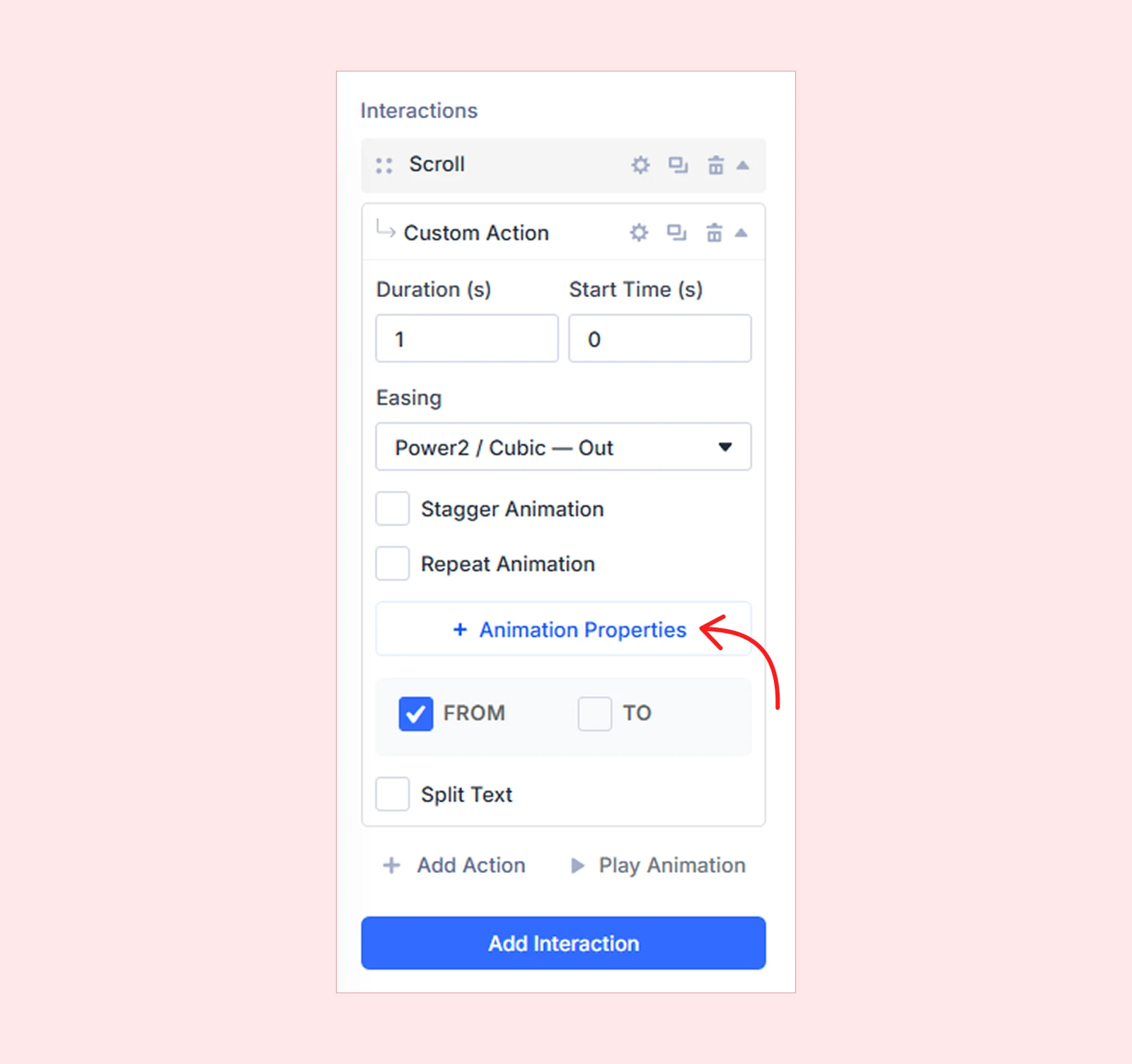
Properties define what visually changes during the animation. They are grouped into three categories: Transform (position, scale, rotation, skew), Filters (opacity, blur, brightness), and General (width, CSS values).
Each selected property appears inside FROM and TO boxes.
FROM TO
Actions animate from a starting value to an ending value. You can set both, or just the TO value and let DiviMotion calculate the FROM state automatically based on the element’s current style.

| Example: TO: Opacity 1 → DiviMotion starts from the current opacity (typically 0 or inherited) and fades the element in. |
Split Text
Split Text lets you animate text element by element. Instead of animating the entire text block at once, you can break it apart and animate by characters, words or lines.
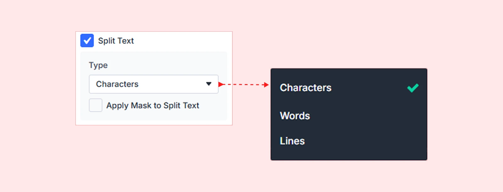
| Note: Split Text requires the SplitText integration to be enabled in your DiviMotion Dashboard under Integrations. |
What's Next?
Now that you understand how actions work, pick the type above that fits your animation goal and dive into its dedicated guide.


