

Custom Action gives you complete control to build animations from scratch. You choose which element animates, define the starting and ending states, fine-tune timing and easing, and layer multiple properties to create exactly the effect you have in mind.
This guide covers everything you need to know about Custom Actions, from basic setup to advanced techniques like stagger, repeat, and Split Text.
How to Add a Custom Action
After adding an interaction to an element, follow these steps:
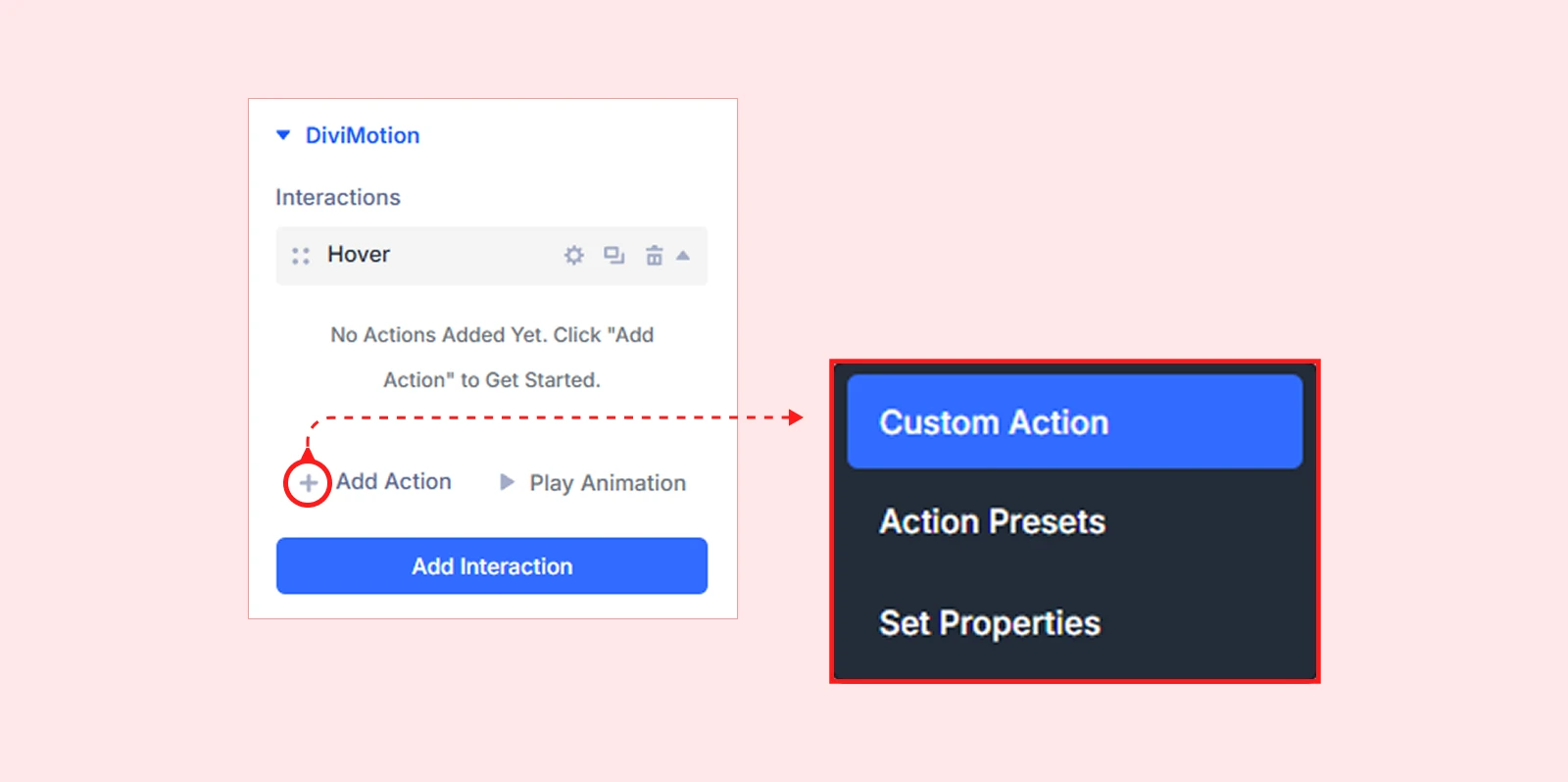
- In the interaction card, click the + Add Action button.
- Select custom action type from the dropdown
You’re now ready to configure your target, timing, easing, and animation properties.
Custom Action Settings
Custom Action settings are grouped into logical sections so you can precisely control what animates, how it moves, and when it plays.
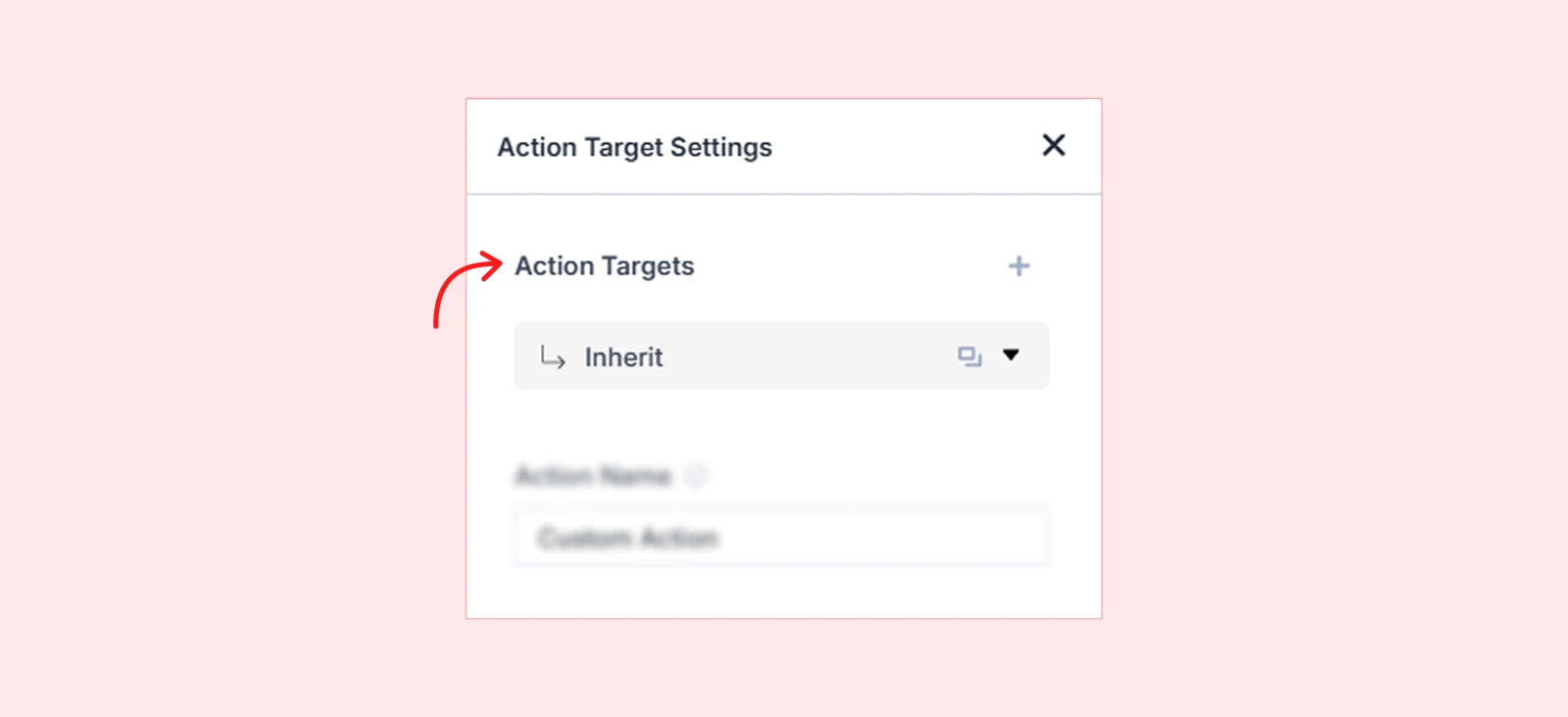
Action Target
These settings define which element gets animated when the interaction fires. By default, the action inherits the target from the interaction — but you can override it here to animate any element on the page.
Target Type
Choose which element the action should animate:
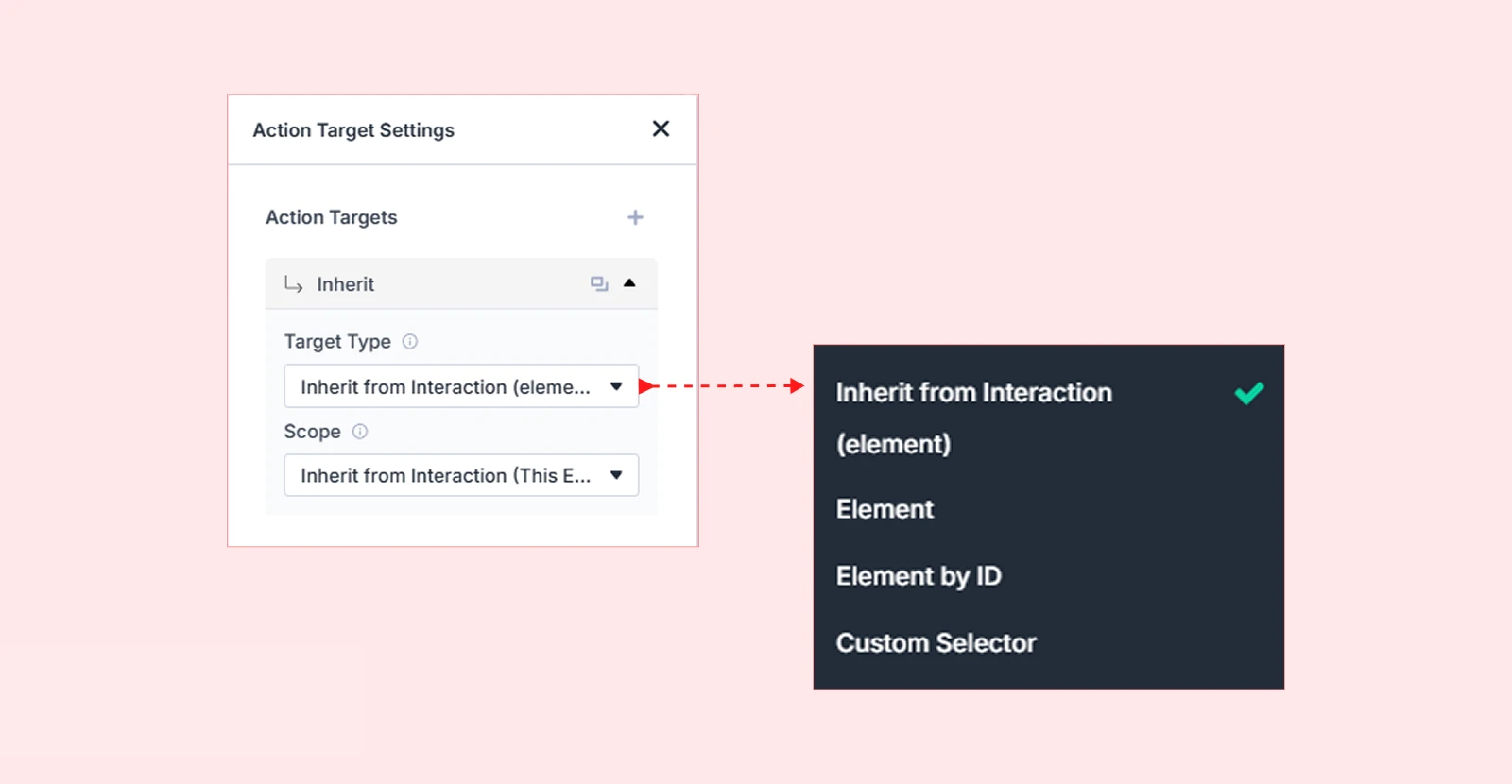
Inherit from Interaction (Default): Uses the same element selected for the interaction. The safest starting point for most animations.
Element: Animates the element you are currently editing — a section, row, or column.
Element by ID: Targets a specific element anywhere on the page, selected from a dropdown. Useful when the animated element is different from the one you’re editing.
Pro tip: Rename elements using the Admin Label feature to make them easier to find in the dropdown.
Custom Selector: Targets any element using a CSS class or ID selector. This lets you animate elements outside the current context or animate multiple elements sharing the same class.
Scope
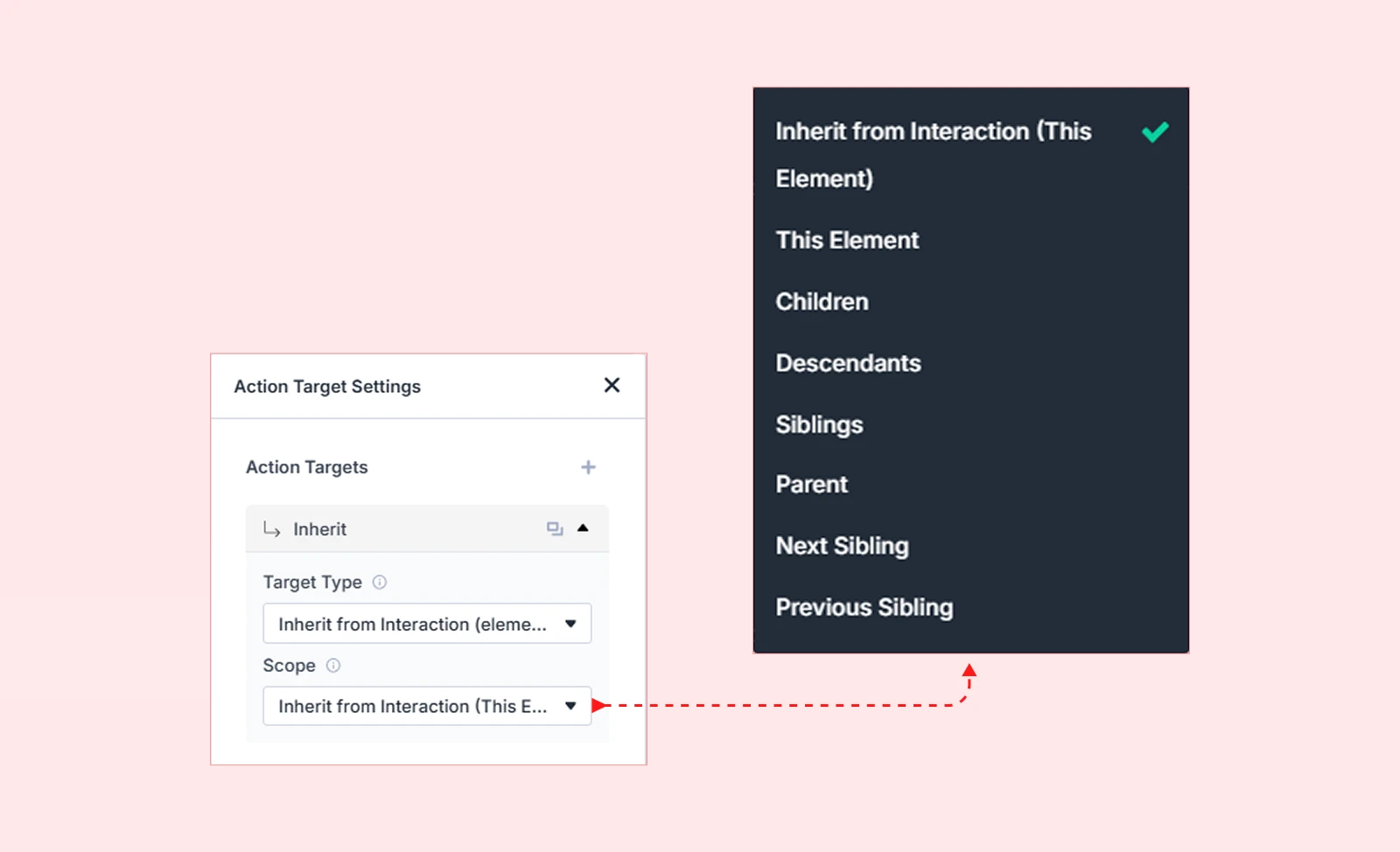
Scope determines which related elements receive the animation. This is especially important when using Custom Selector or targeting groups of elements.
| Scope Option | What It Targets | Example Use Case |
| Inherit from Interaction (This Element) | Same element used in the interaction | Default for most animations |
| All Matching Elements | Every element matching the CSS selector | Animate all .card elements on the page |
| This Element | Only the currently selected element | Animate a single section |
| Children | Direct children of the selected element | Animate columns inside a row |
| Descendants | Any nested element (with HTML tag selector) | Animate all <img> tags inside a section |
| Siblings | Elements with the same parent | Animate other columns in the same row |
| Parent | The container holding the selected element | Animate a card wrapper when a child is targeted |
| Next Sibling | The element immediately after | Reveal the next item in a list |
| Previous Sibling | The element immediately before | Slide in the previous testimonial |
Target Multiple Elements
DiviMotion lets you animate multiple elements from a single Custom Action.
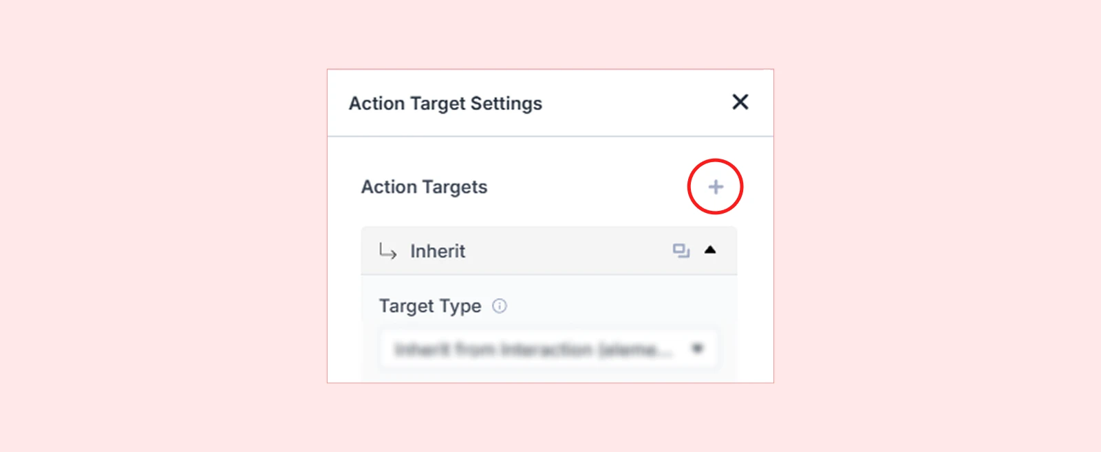
| Example: A single scroll trigger fades in a heading AND slides up a paragraph — both configured inside one action. |
To add an additional target, click the + icon below the current target settings. A new target card will appear where you can configure its own Target Type and Scope independently.
Action Name
Assign a descriptive name to your action for easy identification. This is especially helpful when working with multiple actions inside the same interaction.

| Example: “Hero Fade In” or “Card Slide Up” makes it easy to locate and edit specific actions later. |
Duration (s)
How long the animation takes to complete, measured in seconds (s) or milliseconds (ms). If you use a smaller value, the animation will feel faster. If you use a larger value, it will feel smoother and slower.
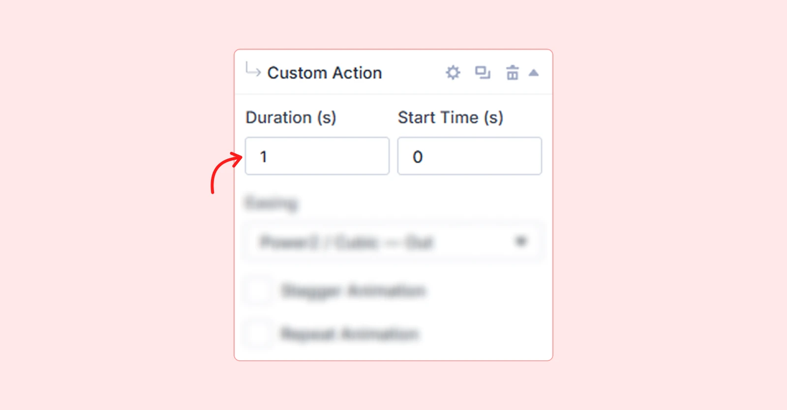
| Example: 1s = animation plays over one full second. |
Start Time (s)
How long DiviMotion waits before starting the animation after the trigger fires, measured in seconds (s) or milliseconds (ms). Set it to 0 to start immediately, or use a positive value to introduce a delay.
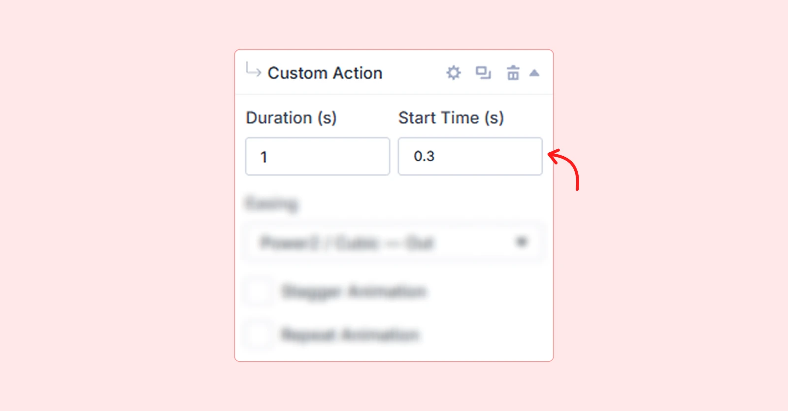
| Example: 0.3s = animation waits 300 milliseconds before playing. |
| Pro tip: Use incremental Start Time values across multiple actions to create staggered entrance sequences. |
Easing
Easing controls the acceleration curve of your animation — how it speeds up and slows down over time. Choosing the right easing gives your animations a natural, professional feel.
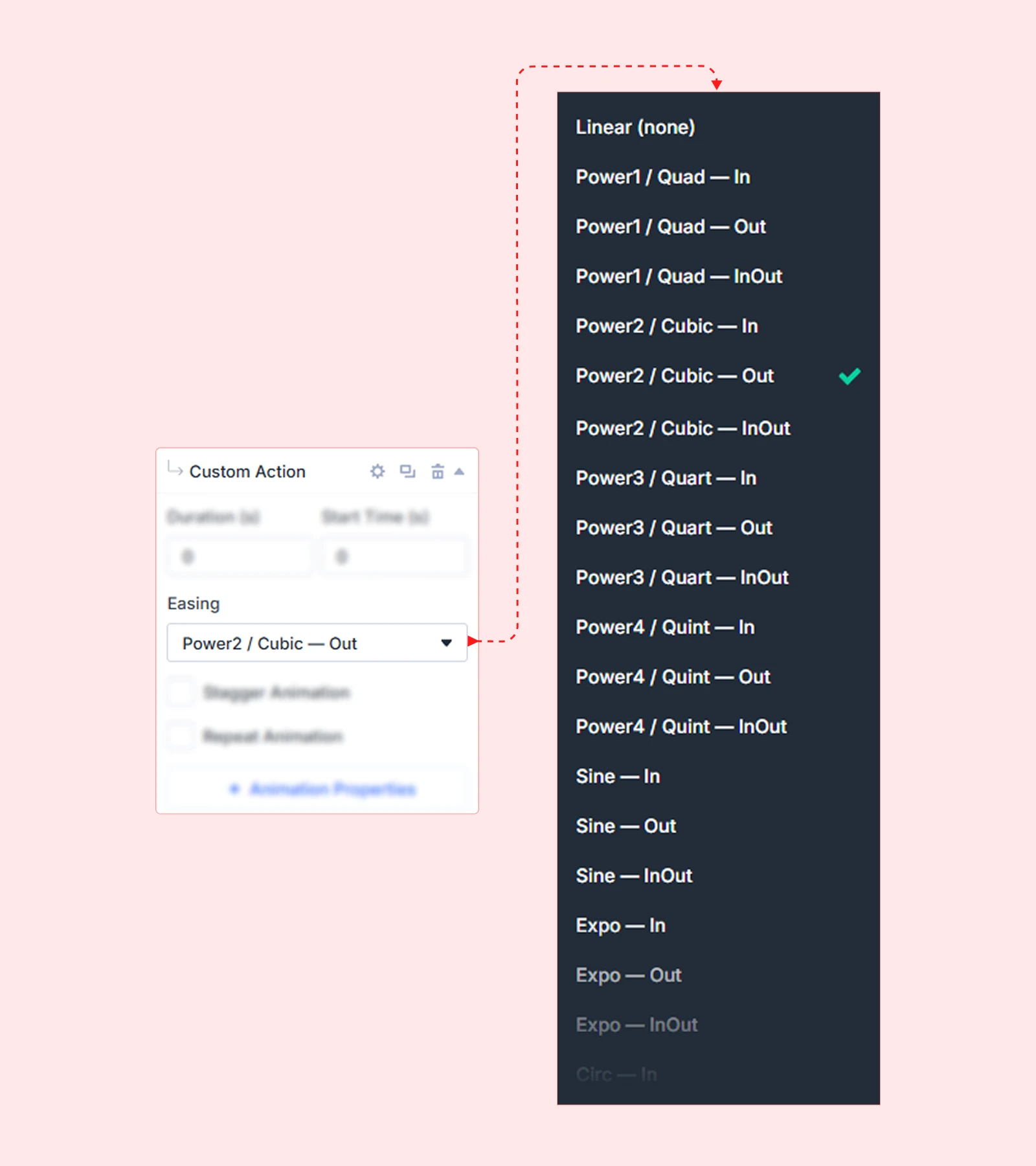
| Easing | What It Feels Like |
| Linear (None) | Moves at a constant speed from start to end |
| Power1 / Quad — In | Starts slow, then speeds up |
| Power1 / Quad — Out | Starts fast, then slows down |
| Power1 / Quad — InOut | Slow at both start and end |
| Power2 / Cubic — In | Slightly stronger slow start |
| Power2 / Cubic — Out | Smooth, natural slowdown |
| Power2 / Cubic — InOut | Smooth start and finish |
| Power3 / Quart — In | Very slow start |
| Power3 / Quart — Out | Strong, smooth finish |
| Power3 / Quart — InOut | Slow start and strong finish |
| Power4 / Quint — In | Dramatically slow start |
| Power4 / Quint — Out | Very smooth, soft end |
| Power4 / Quint — InOut | Dramatic but smooth throughout |
| Sine — In | Gentle slow start |
| Sine — Out | Gentle slow end |
| Sine — InOut | Very soft, natural motion |
| Expo — In | Starts almost still, then surges |
| Expo — Out | Fast entry, then drifts to a stop |
| Expo — InOut | Strong acceleration and deceleration |
| Circ — In | Feels heavy at the start |
| Circ — Out | Feels heavy at the end |
| Circ — InOut | Heavy motion on both sides |
| Back — In | Pulls back slightly before moving forward |
| Back — Out | Overshoots then settles into place |
| Back — InOut | Pulls back and overshoots both ends |
| Elastic — In | Elastic snap at the start |
| Elastic — Out | Elastic bounce at the end |
| Elastic — InOut | Elastic bounce on both ends |
| Bounce — In | Bounces before starting |
| Bounce — Out | Bounces at the end (like a dropped ball) |
| Bounce — InOut | Bounces at both ends |
| Rough | Shaky, uneven motion |
| Steps (5) | Moves in 5 visible stepped jumps |
| SlowMo | Very slow, cinematic motion |
| Pro tip: Ease Out options (Cubic Out, Expo Out) work best for entrance animations. Ease In options suit exit animations. Ease InOut is ideal for elements that move between two states. |
Stagger Animation
Stagger animates multiple child elements sequentially rather than all at once, creating a smooth cascading effect across a group.
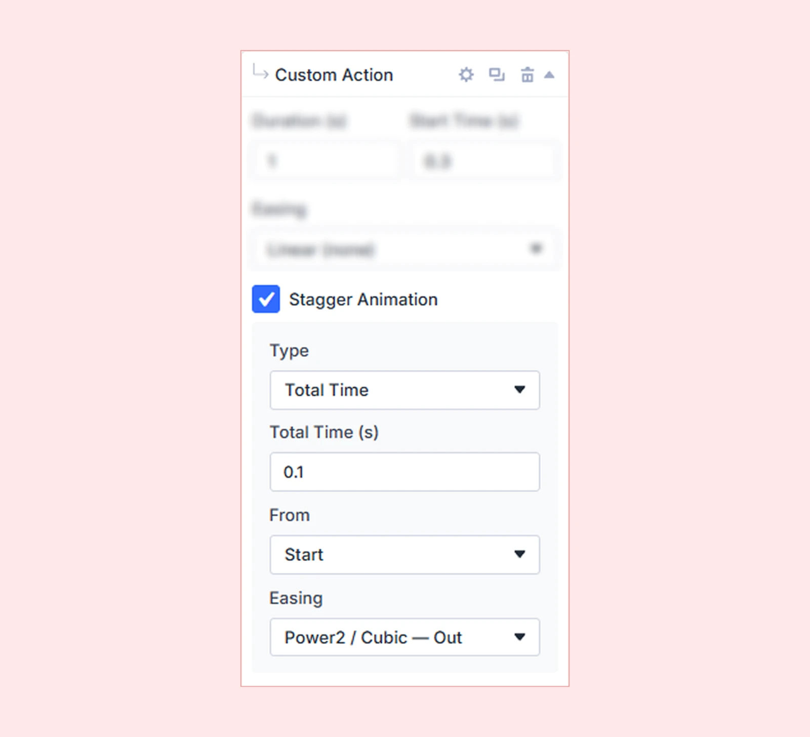
| Example: A row of cards fades in one after another instead of all appearing simultaneously. |
Enable Stagger Animation to reveal the following settings:
Stagger Type
Controls how the timing between staggered elements is calculated. Choosing a type reveals its corresponding time setting:
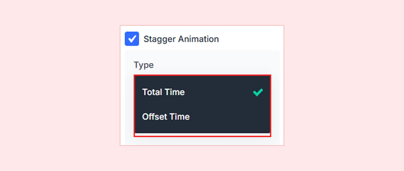
Total Time (s): Distributes the stagger evenly across all elements within a fixed total duration. For example, if Total Time is 2s and there are 4 elements, each one starts 500ms after the previous.
Offset Time (s): Sets a fixed delay between the start of each element’s animation. For example, an Offset Time of 0.15s means each element begins 150ms after the one before it.
Stagger From
Determines which element in the group animates first.
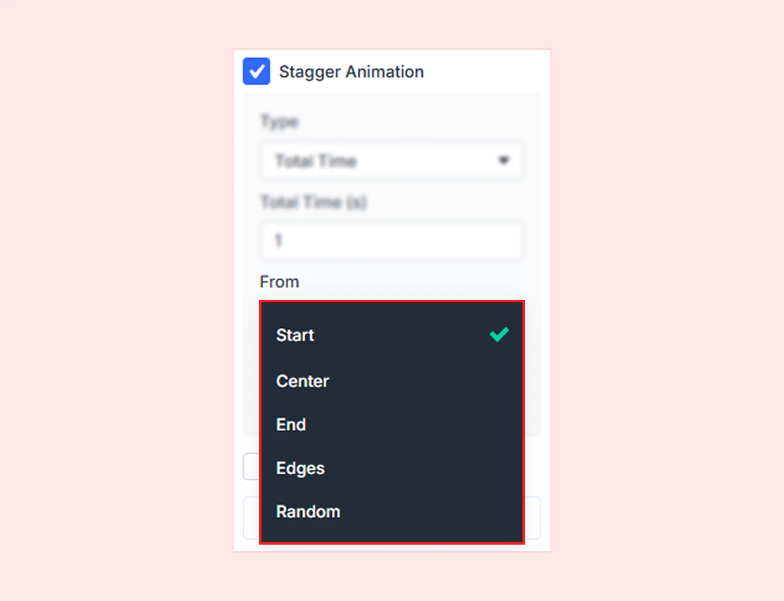
| Option | Which Element Starts First |
| Start | The first element in the group (default) |
| Center | The middle element, then outward |
| End | The last element, then backward |
| Edges | Both ends simultaneously, moving inward |
| Random | A random element each time the animation runs |
Stagger Easing
Controls the pacing of the stagger sequence itself — not the motion of individual elements, but how the timing is distributed across the group. Use it to make the cascade feel faster at the start and slower at the end, or vice versa.
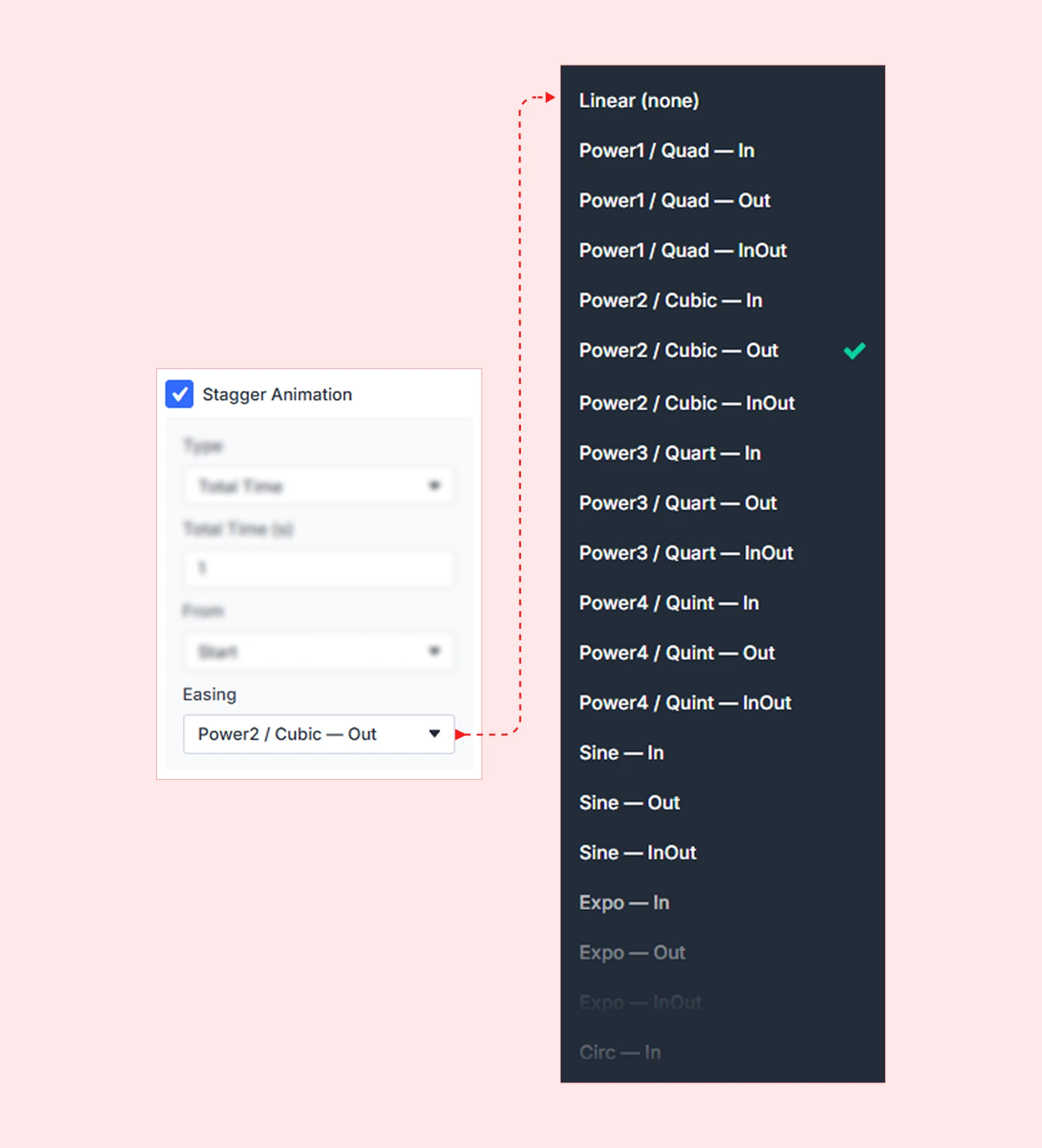
| Note: Stagger Easing is separate from the action’s main Easing setting. Main Easing affects each element’s individual motion curve. Stagger Easing affects the spacing between each element’s start time. |
Repeat Animation
Repeat Animation controls whether the animation plays again after completing and for how many cycles. Enable it to reveal the following options:
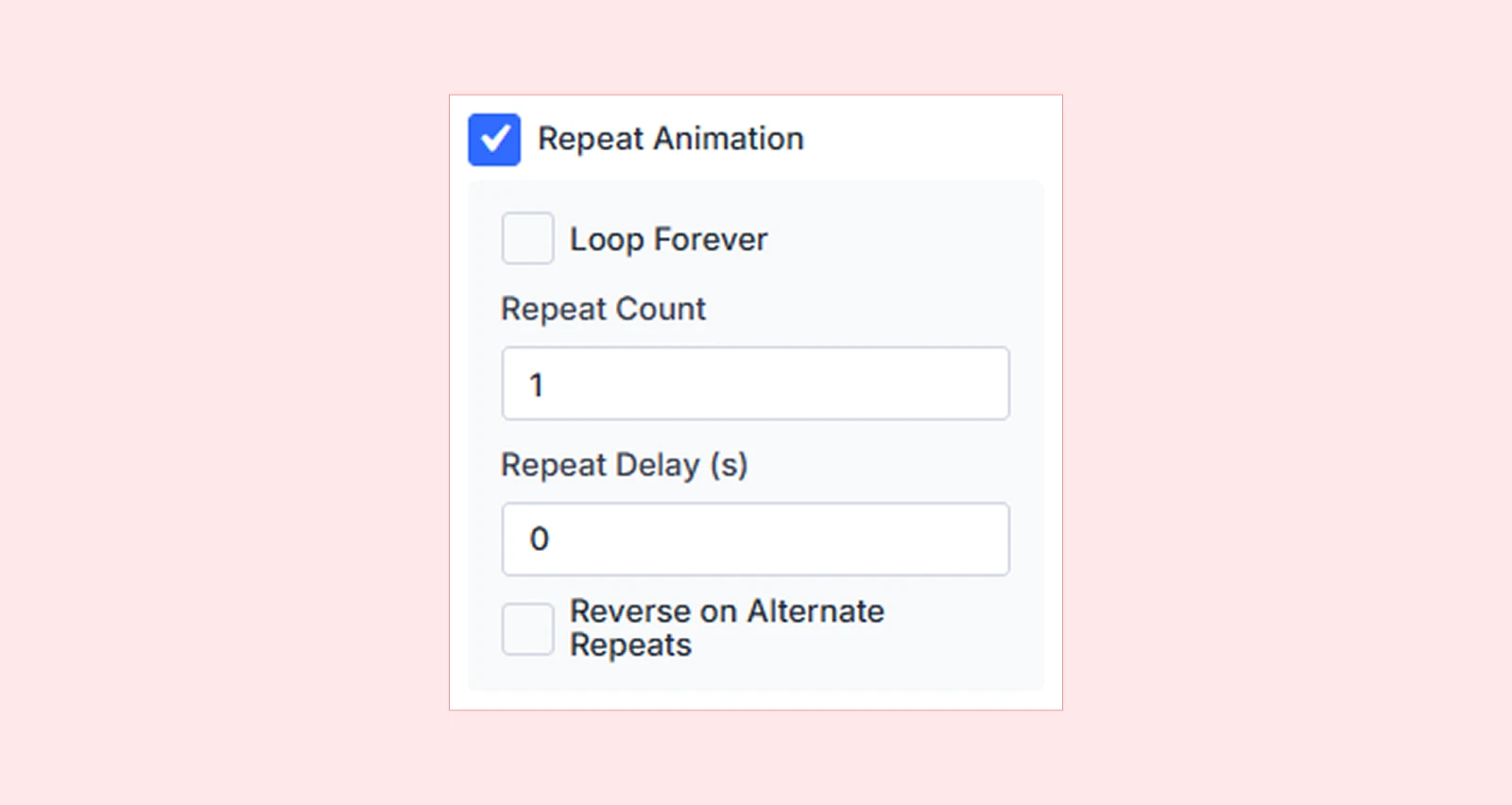
Loop Forever
Keeps the animation running continuously without stopping. Useful for loading indicators, looping icons, or decorative motion effects.
Repeat Count
Only available when Loop Forever is disabled. Sets the exact number of times the animation should repeat after its first play. A value of 1 means it plays twice in total.
Repeat Delay (s)
Adds a pause between each repeat cycle. Leave it empty to repeat immediately, or enter a value (e.g., 1.5) to add a 1.5-second pause before each subsequent play.
Reverse on Alternate Repeats
Makes the animation play forward on odd cycles and backward on even cycles — creating a smooth back-and-forth motion instead of snapping back to the start each time.
| Example: An element that pulses in and out instead of fading in, jumping back, and fading in again. |
| Pro tip: Combine Loop Forever with Reverse on Alternate Repeats and a short Repeat Delay to create smooth, continuous breathing or pulsing effects without jarring resets. |
Animation Properties
Animation Properties define what visually changes during the animation. Click Animation Properties to open the property picker and select one or more properties to animate.
Properties are grouped into three categories:
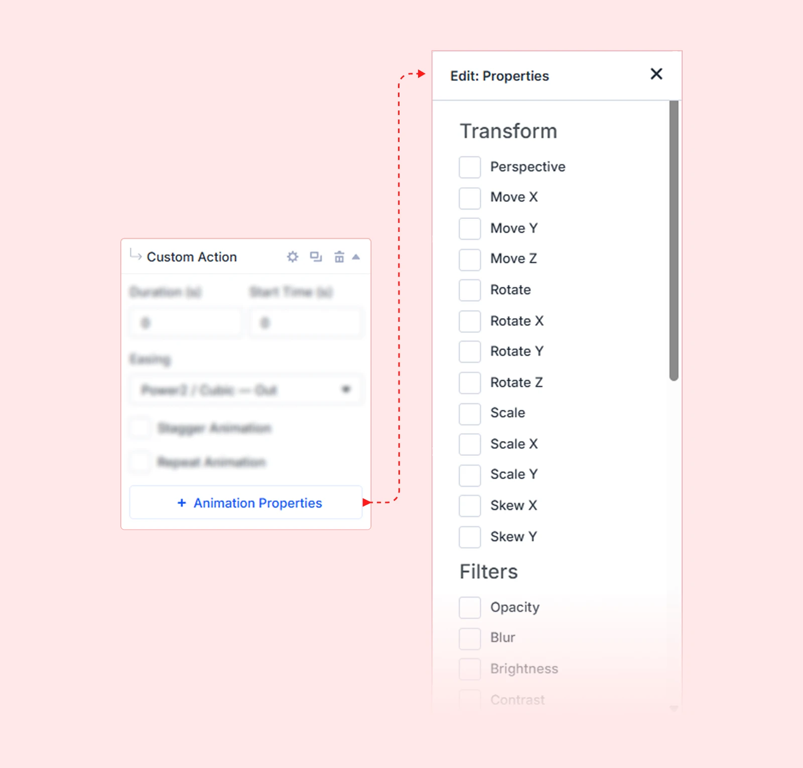
| Category | Properties Included |
| Transform | Move X, Move Y, Move Z, Scale, Scale X, Scale Y, Rotate, Rotate X, Rotate Y, Skew X, Skew Y, Transform Origin |
| Filters | Opacity, Blur, Brightness, Contrast, Grayscale, Hue Rotate, Invert, Saturate, Sepia |
| General | Width, Height, and other CSS-animatable values |
Each selected property appears in the action card with FROM and TO fields where you define its starting and ending values.
FROM and TO Values
Actions animate an element from a starting value to an ending value. You can set both, or set only the TO value and let DiviMotion calculate the FROM state automatically based on the element’s current style.

| Approach | How It Works |
| FROM + TO | You define both the start and end state. Gives you complete control over the full animation range. |
| TO only | DiviMotion uses the element’s current style as the start point and animates to the TO value. Cleaner for most entrance animations. |
| Example: Set Opacity TO: 1 and DiviMotion will automatically start from the element’s current opacity — typically 0 — and fade it in. |
Split Text
Split Text lets you animate text element by element instead of animating the entire block at once. You can break text apart and animate by:
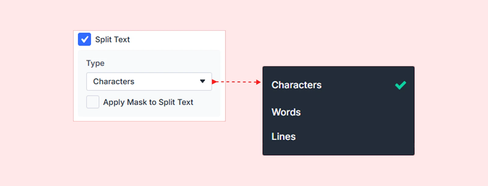
• Characters
• Words
• Lines
This makes it ideal for headline reveals, typewriter effects, and staggered text entrances that feel polished and intentional.
Apply Mask to Split Text
Hides any overflow while the text is animating. This keeps the animation clean and prevents individual characters, words, or lines from appearing outside their container during the effect.
| Note: Split Text requires the SplitText integration to be enabled in your DiviMotion Dashboard under Integrations. |
What's Next?
Now that you understand Custom Actions, you’re ready to build precise, layered animations directly inside the Divi Visual Builder.
Open the Visual Builder, add a Custom Action to a section or module, and start combining properties, easing, and stagger to craft exactly the motion you have in mind.


