

The DiviMotion Vertical Marquee module lets you display images and other content in a continuous vertical loop. You can control the scroll direction and speed, add hover effects, and more.
Important Note: The Vertical Marquee module is disabled by default. Enable it under Divi Motion > Modules.
Let's see the settings in brief and how to make better use of them
Content Tab
The Content tab includes settings for managing marquee items, controlling their movement, and customizing images and text.
Add New Item
Add New Item: Add, edit, rearrange, or remove marquee items. Each item has its own content and design settings. See Marquee Item Settings below for details.
Marquee
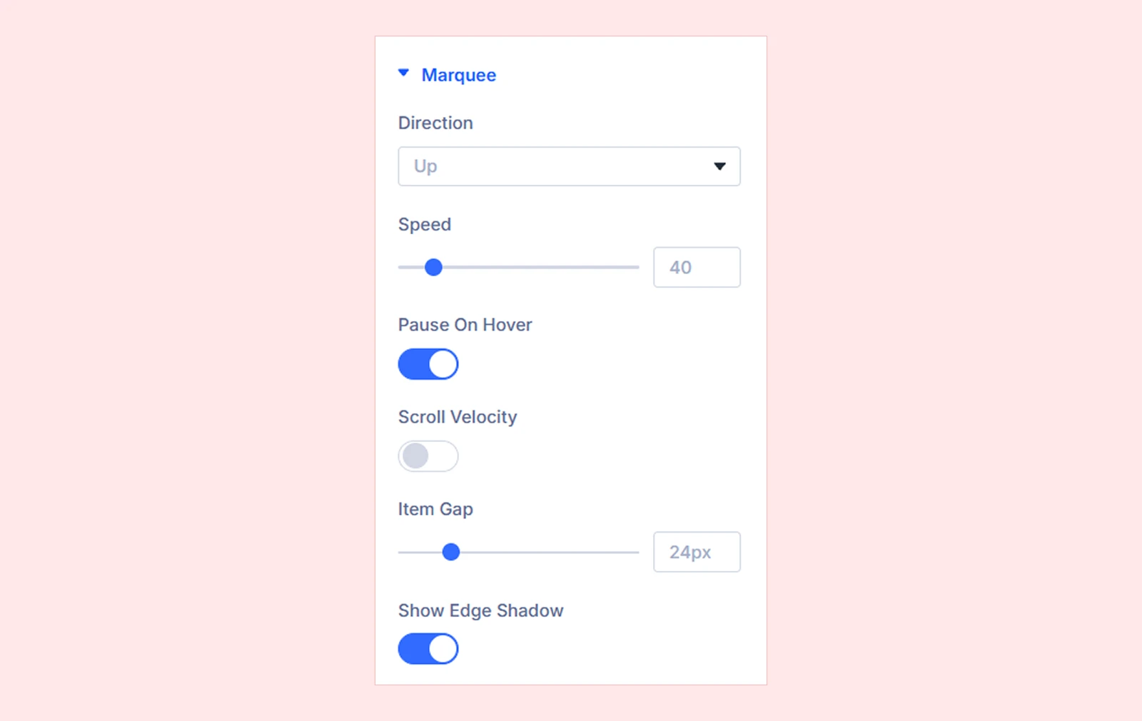
- Direction: Choose whether items scroll Up or Down.
- Speed: Adjust how fast items move in pixels per second.
- Pause On Hover: Pause the marquee while a visitor hovers over it.
- Scroll Velocity: Adjust the marquee's speed and direction based on page scrolling. It returns to its normal speed when scrolling stops.
- Velocity Strength: Adjust how strongly page scrolling affects the marquee's movement.
- Item Gap: Adjust the space between marquee items. Supports responsive values.
- Show Edge Shadow: Add a fading effect at the top and bottom of the marquee.
Image
This section lets you customize the size, hover animations, and visual effects of images within marquee items. (These settings do not affect separate Image modules added through Add Element.)
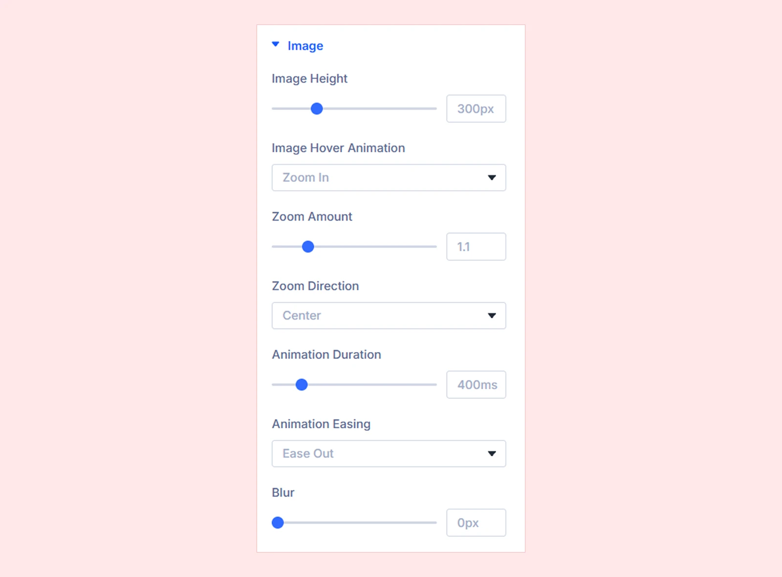
- Image Height: Set the height of item images.
- Image Hover Animation: Choose how an item's image responds to hovering. Available effects include:
- None
- Zoom In
- Zoom Out
- Rotate
- Zoom + Rotate
- Pan
- 3D Tilt
- Lift
- Bounce
- Grayscale to Color
- Zoom Amount: Set the intensity of zooming. (Available with Zoom In, Zoom Out, or Zoom + Rotate.)
- Zoom Direction: Choose the point the zoom moves toward, such as the center, an edge, or a corner. (Available with Zoom In or Zoom Out.)
- Turn Angle: Adjust how far the image rotates. (Available with Rotate or Zoom + Rotate.)
- Turn Direction: Choose clockwise or counterclockwise rotation. (Available with Rotate or Zoom + Rotate.)
- Pan Distance: Adjust how far the image moves within its frame. (Available with Pan.)
- Move Direction: Move the image Up, Down, Left, or Right. (Available with Pan, Lift, or Bounce.)
- Tilt Angle: Set the maximum 3D tilt angle. (Available with 3D Tilt.)
- Tilt Direction: Allow tilting in all directions, horizontally only, or vertically only. (Available with 3D Tilt.)
- Animation Duration: Control how long the hover effect takes. (Available when a hover animation is selected.)
- Animation Easing: Choose how the animation accelerates or slows down. (Available for animated effects except Bounce.)
- Blur: Adjust image blur, including a separate hover-state value. Supports responsive values.
Title & Subtitle
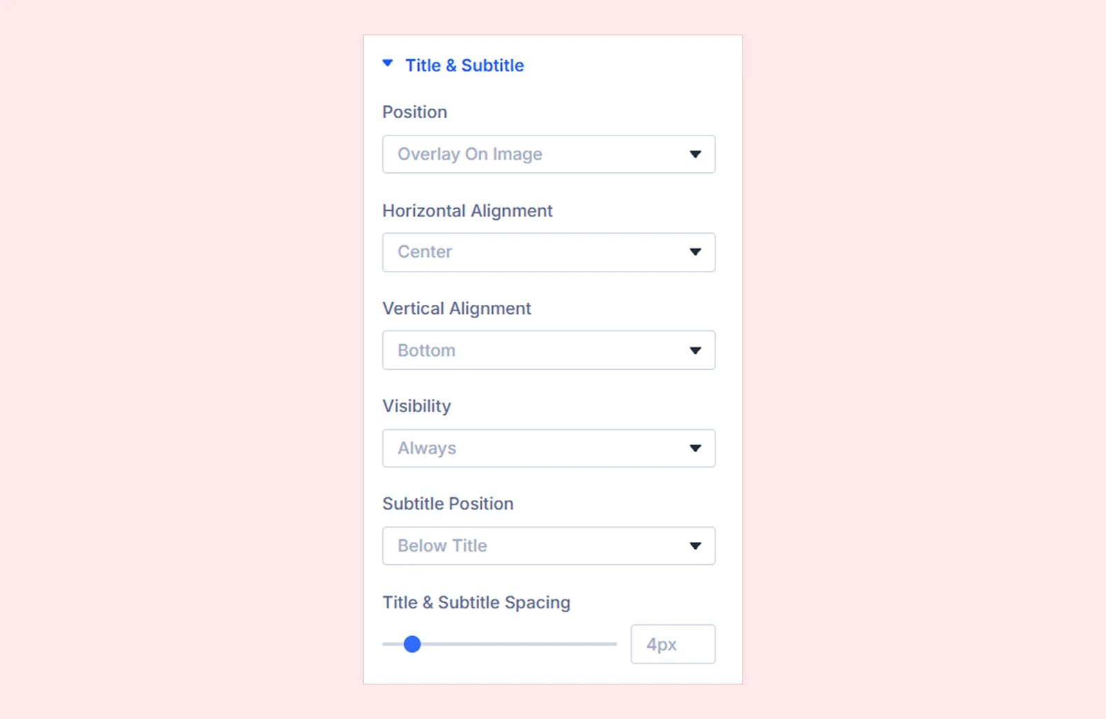
- Position: Display the text over the image, above it, or below it.
- Horizontal Alignment: Align the text Left, Center, or Right.
- Vertical Alignment: Position the text at the Top, Center, or Bottom of the image. (Available when Position is set to Overlay On Image.)
- Visibility: Display text Always or only On Hover. On touch devices, text remains visible.
- Subtitle Position: Place the subtitle above or below the title.
- Title & Subtitle Spacing: Adjust the gap between the title and subtitle. Supports responsive values.
Advanced

- Respect Reduced Motion: Replace automatic scrolling with a manually scrollable list and disable image hover movement for visitors who prefer reduced motion.
Background: Customize the module background using Divi's standard background settings.
Element Label: Enter a custom label to easily identify the module in the Divi Builder.
Design Tab
The Design tab controls the edge fade, item cards, images, text, and overall module appearance.
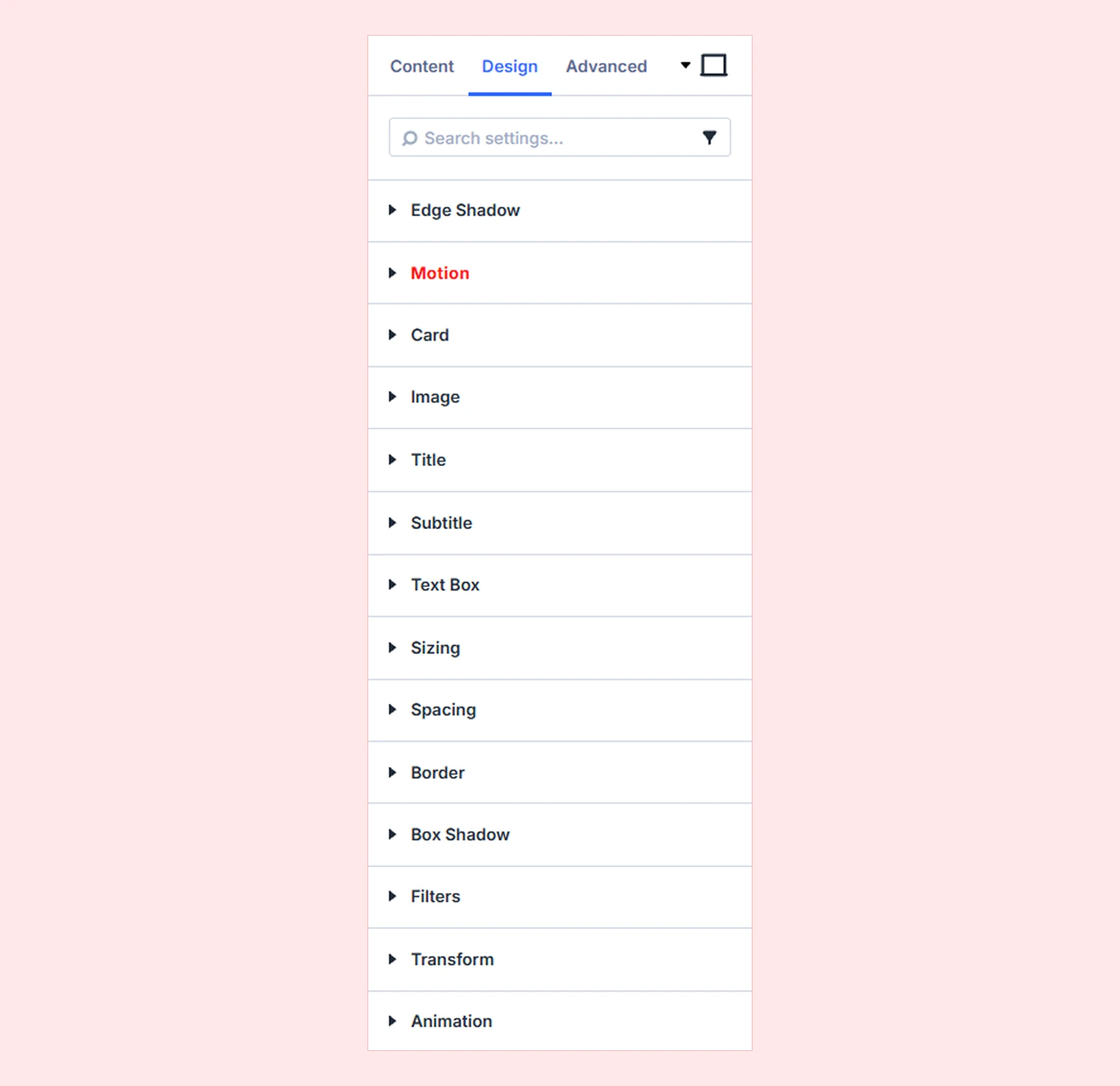
Edge Shadow

- Shadow Color: Set the color of the top and bottom fade. Use a color matching the background or transparent for a fade over gradients and images. (Available when Show Edge Shadow is enabled.)
- Shadow Size: Adjust how far the fade extends into the marquee. Supports responsive values. (Available when Show Edge Shadow is enabled.)
Motion: Configure custom interactions for the module using triggers and actions.
Card: Customize the background, spacing, border, and box shadow of all item cards using Divi's standard settings.
Image: Customize the border and box shadow of item images. The Overlay settings also let you add a color or gradient over each image.
Title: Customize title typography using Divi's text settings.
Subtitle: Customize subtitle typography using Divi's text settings.
Text Box: Customize the background, spacing, border, and box shadow of the area containing the title and subtitle.
Sizing: Adjust the module's width, height, and alignment.
Spacing: Set the module's margin and padding.
Background: Customize the module background.
Border: Adjust border style, color, width, and rounded corners.
Box Shadow: Add and customize shadow effects.
Filters: Adjust visual effects such as brightness, contrast, saturation, and opacity.
Transform: Scale, rotate, move, or skew the module.
Animation: Apply Divi's standard module animation effects.
Advanced Tab
The Advanced tab includes Divi's standard controls for visibility, positioning, overflow, transitions, scroll effects, and custom CSS.
Marquee Item Settings
Each Marquee Item can contain an image, a title, a subtitle, and additional Divi modules. Item-level settings override matching settings on the parent Vertical Marquee.
Content Tab
Item
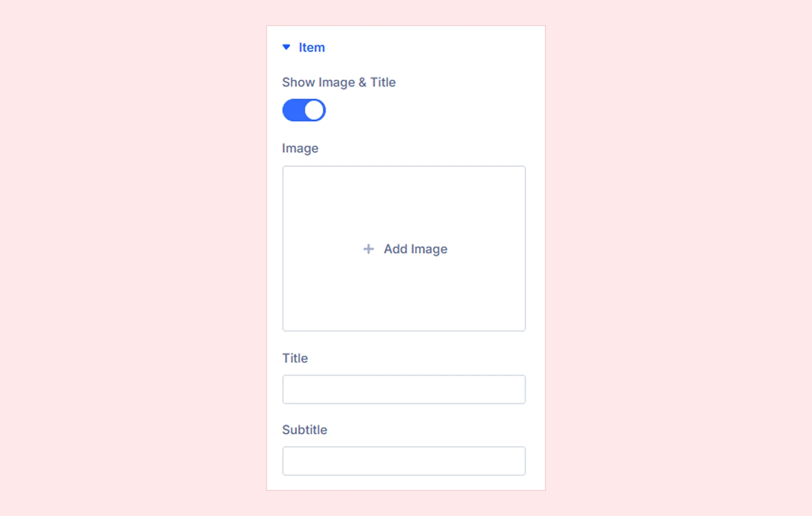
- Show Image & Title: Show or hide the item's built-in image, title, and subtitle. When disabled, only modules added through Add Element appear, and the related settings are hidden.
- Image: Select the item's image.
- Title: Enter the item's title.
- Subtitle: Add optional supporting text above or below the title.
Elements
Add Element: Add other Divi modules, such as Text, Button, or Image, beneath the item's content. These modules retain their own settings, and spacing can be adjusted individually.
Image
Customize this item's image height, hover animation, zoom, rotation, pan, tilt, animation timing, and blur independently of the parent module.
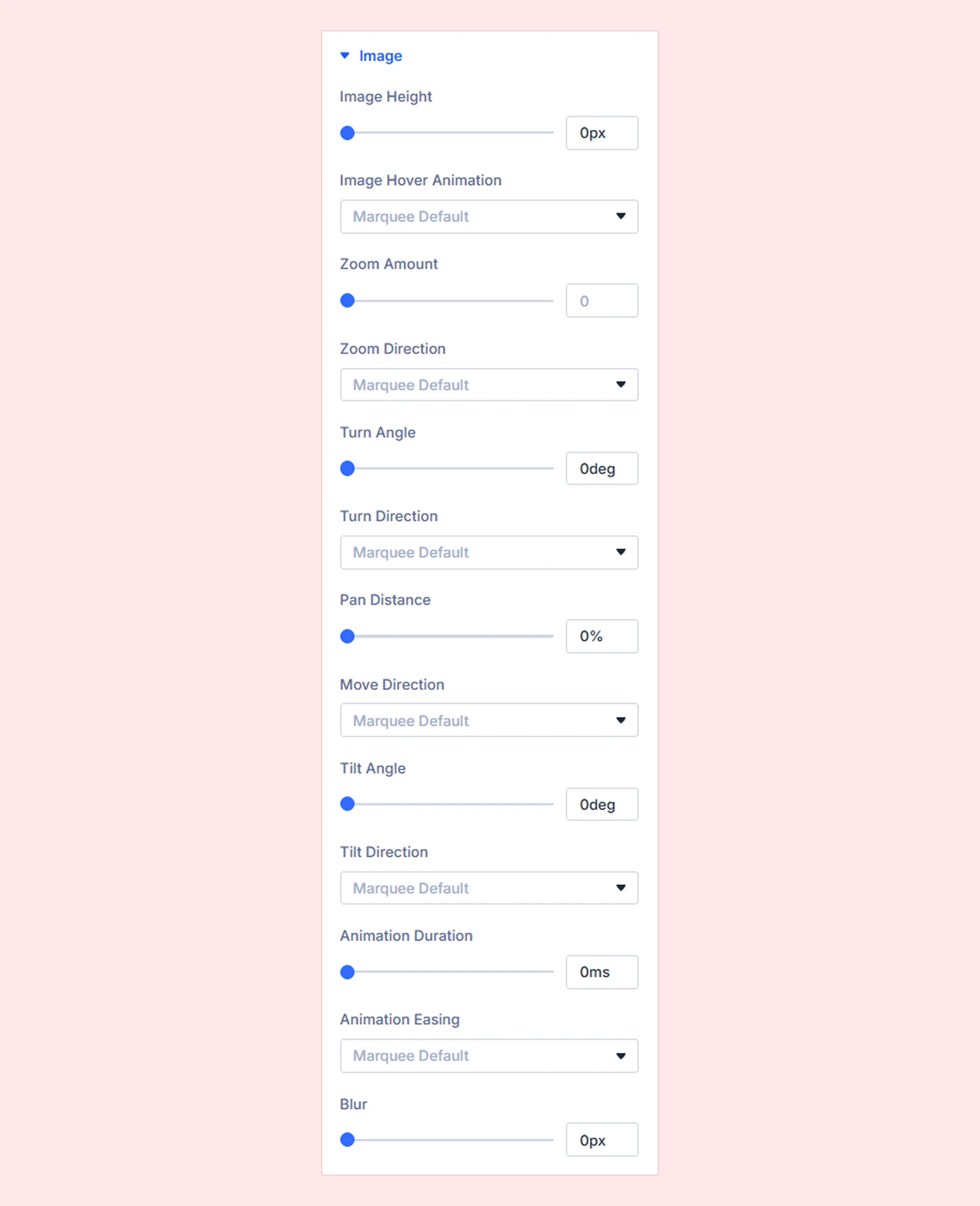
Note: Select Marquee Default or leave numeric fields empty to use the parent module's settings.
Title & Subtitle
Customize the position, alignment, visibility, order, and spacing of this item's title and subtitle independently of the parent module.
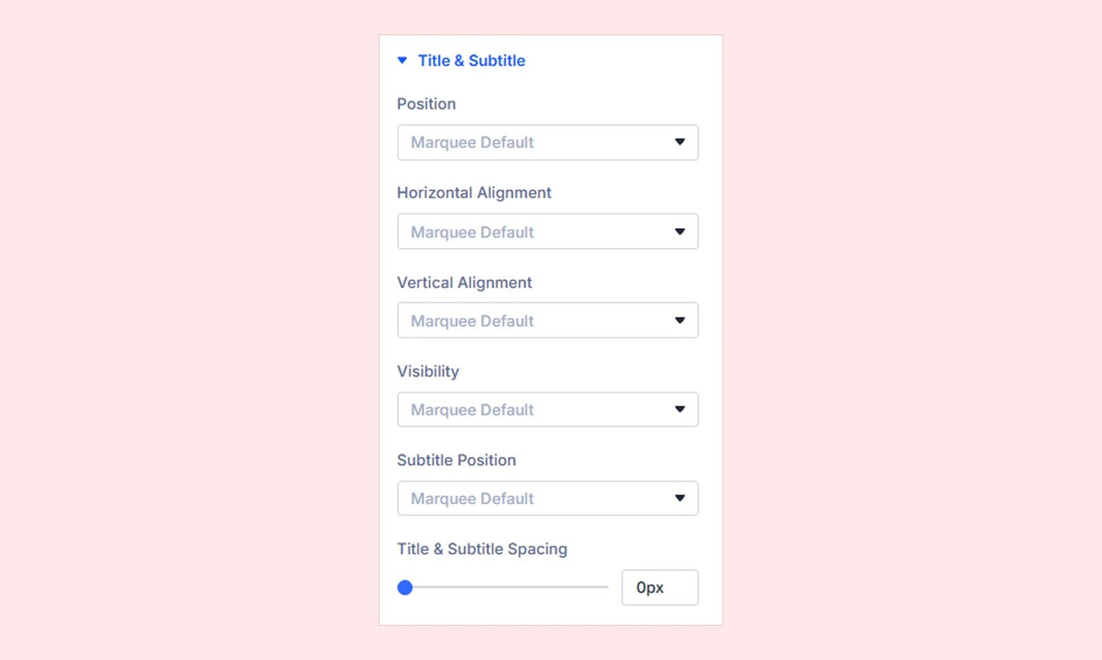
Note: Select Marquee Default or leave the spacing field empty to use the parent module's settings.
Background: Customize the individual marquee item's background.
Element Label: Enter a custom label to identify the item in the Divi Builder.
Design Tab
Image: Customize this item's image border, box shadow, and overlay.
Title: Customize this item's title typography and other available design sections.
Subtitle: Customize this item's subtitle typography and other available design sections.
Text Box: Customize the background, spacing, border, and box shadow of this item's title and subtitle area.
Background, Spacing, Border & Box Shadow: Style the item's card independently of the parent Card settings.
Filters, Transform & Transitions: Customize the item's visual effects and hover-state changes.
Advanced Tab
Use Divi's standard advanced settings to control the item's visibility, stacking order, and custom CSS.
Need Help?
If you have any questions or need assistance, contact our support team: [email protected]


