

The Custom Cursor extension lets you replace the default mouse pointer or add a cursor that follows it. Choose from animated effects, icons, images, Lottie animations, or text to customize the cursor across your website.
Important Note:
- Custom Cursor works on devices with a mouse pointer and does not appear on touchscreens.
- Text fields, dropdowns, embedded content, and the WordPress admin bar retain the default pointer.
- The custom cursor does not appear in the Divi Visual Builder. Preview it in on the frontend.
- When reduced motion is enabled on a visitor's device, animated effects become a still dot, while Lottie shows its first frame.
How to Enable Custom Cursor
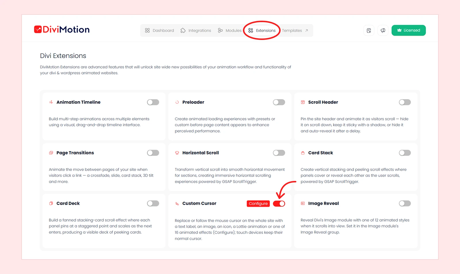
- Navigate to WordPress Dashboard > DiviMotion > Extensions.
- Enable Custom Cursor.
- Click Configure to open the Custom Cursor settings.
Custom Cursor Settings
The settings panel has two tabs: General to choose the cursor and Appearance to customize how it looks. Only the settings relevant to your selections are displayed. Move your mouse over the live preview at the top to test your changes.
General
Cursor Mode
Cursor Mode determines whether the custom cursor replaces the default mouse pointer or follows alongside it.
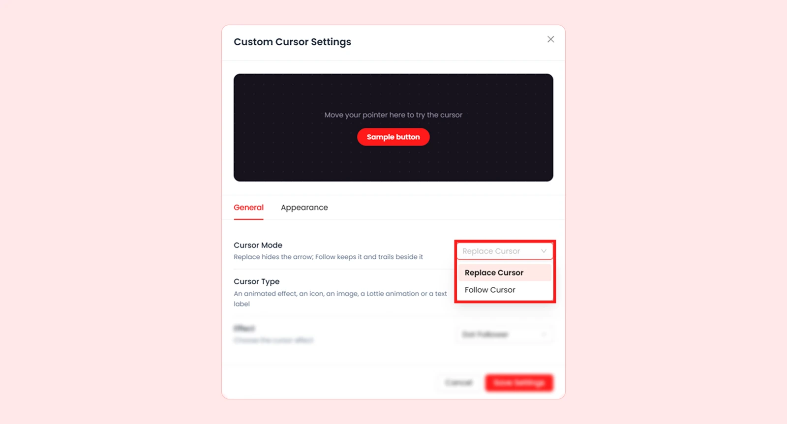
| Mode | What It Does |
| Replace Cursor | Hides the default mouse pointer and shows the custom cursor in its place. |
| Follow Cursor | Keeps the default mouse pointer visible while the custom cursor smoothly follows alongside it. |
Cursor Type
Cursor Type lets you choose what appears as your custom cursor. Five options are available:
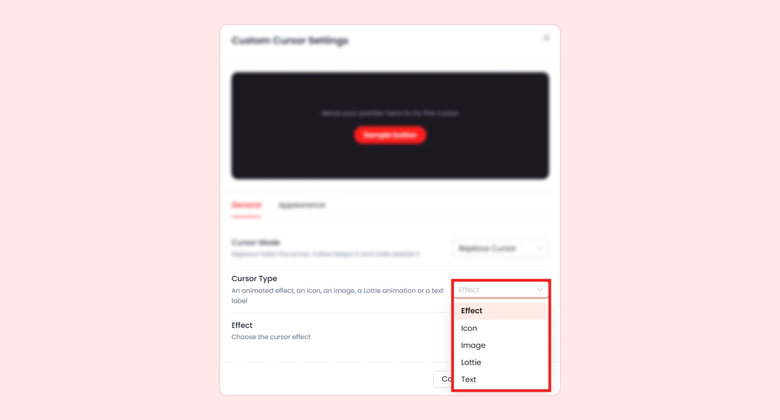
| Type | What It Does |
| Effect | Displays an animated cursor effect, such as a ring, glow, or trail. |
| Icon | Uses a Divi or Font Awesome icon as the cursor. |
| Image | Uses an uploaded PNG, SVG, GIF, or WebP image. |
| Lottie | Displays a Lottie animation from your Media Library or a URL. |
| Text | Shows a short text label, such as “View,” “Drag,” or “Open.” |
Effect
When you select Effect as the Cursor Type, you can choose from 16 cursor effects.
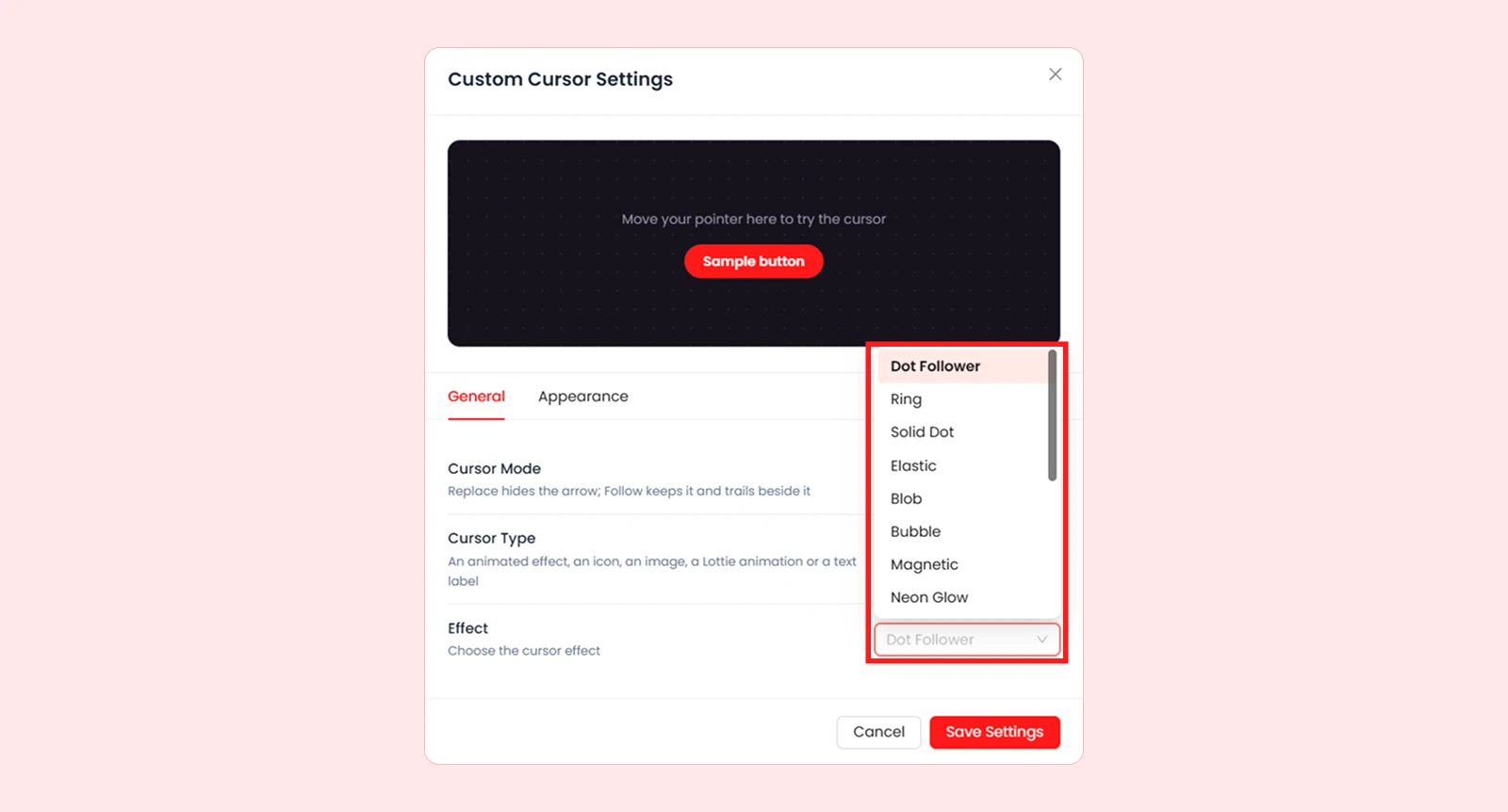
| Effect | What It Does |
| Dot Follower | Displays an animated cursor effect, such as a ring, glow, or trail. |
| Ring | Uses a Divi or Font Awesome icon as the cursor. |
| Solid Dot | Displays a filled circle. |
| Elastic | Adds a dot and ring that stretch and spring as the pointer moves. |
| Blob | Displays a soft shape that continuously changes form. |
| Bubble | Shows a dot inside a transparent bubble that wobbles as it follows. |
| Magnetic | Makes nearby links and buttons lean toward the pointer as a ring surrounds them. |
| Neon Glow | Displays a glowing ring that gently pulses. |
| Invert | Shows a circle that inverts the colours underneath it. |
| Spotlight | Darkens the page except for a lit area around the pointer. |
| Crosshair | Displays a ring with a cross in the centre. |
| Color Trail | Leaves a coloured trail behind the moving pointer. |
| Sparkle | Creates small sparkling stars as the pointer moves. |
| Snow | Releases snowflakes that drift down from the pointer. |
| Galaxy | Creates small stars that swirl around the pointer. |
| Particles | Releases glowing particles that float upward. |
Other Cursor Type Settings
Depending on the Cursor Type you select, the following options appear:
- Text: Enter the label you want to show as the cursor.
- Image: Click Upload Image to select a PNG, SVG, GIF, or WebP image from the WordPress Media Library.
- Icon: Open the icon picker to choose a Divi or Font Awesome icon. You can search by name or filter by library.
- Lottie Source: Choose Media Library to select or upload a Lottie .json file, or URL to link to one.
Note: Lottie uploads must be valid .json files of up to 10 MB, without expressions. External URLs must allow the file to be loaded. In Replace Cursor mode, a small dot appears until an Image or Lottie file is ready, so the pointer remains visible.
Appearance
The Appearance tab controls the size, colour, and styling of your selected cursor. You can use a slider or enter a value directly. Changed sliders and colour controls show a Reset icon to restore their defaults.
Effect
These settings are available when Effect is the selected Cursor Type.
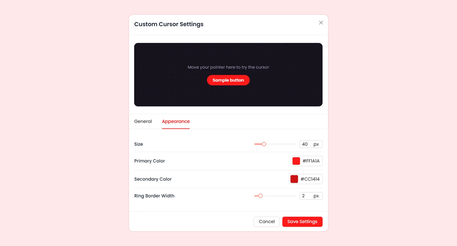
| Setting | What It Does |
| Size | Controls the effect size. For Solid Dot and Color Trail, it adjusts the dot size and for Spotlight, the illuminated area. |
| Primary Color | Sets the main colour of the effect. Does not apply to Invert. |
| Secondary Color | Sets the second colour for effects that use two colours, such as Dot Follower. |
| Ring Border Width | Controls the ring thickness. Only available for effects that use a ring. |
Note: The available appearance settings change depending on the selected cursor effect.
Image
These settings control the image's size and optional background, spacing, and border.
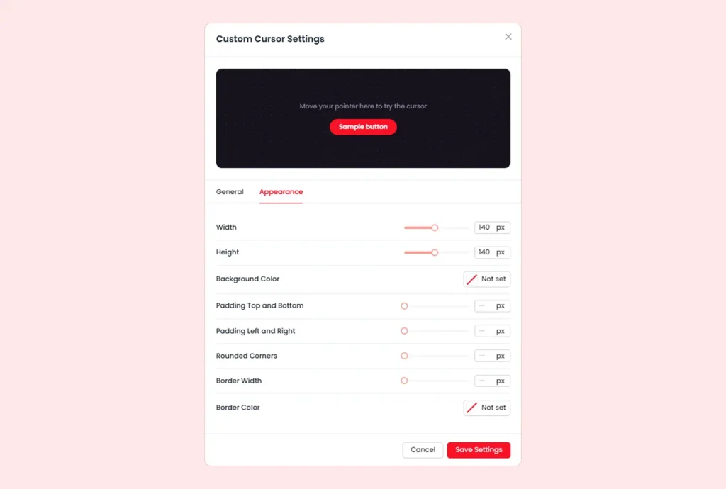
| Setting | What It Does |
| Width | Sets the image width. |
| Height | Sets the image height. |
| Background Color | Adds a background colour behind the image. |
| Padding Top and Bottom | Controls the vertical spacing around the image. |
| Padding Left and Right | Controls the horizontal spacing around the image. |
| Rounded Corners | Rounds the image and its background corners. |
| Border Width | Sets the thickness of the border around the image. |
| Border Color | Sets the colour of the border. |
Lottie
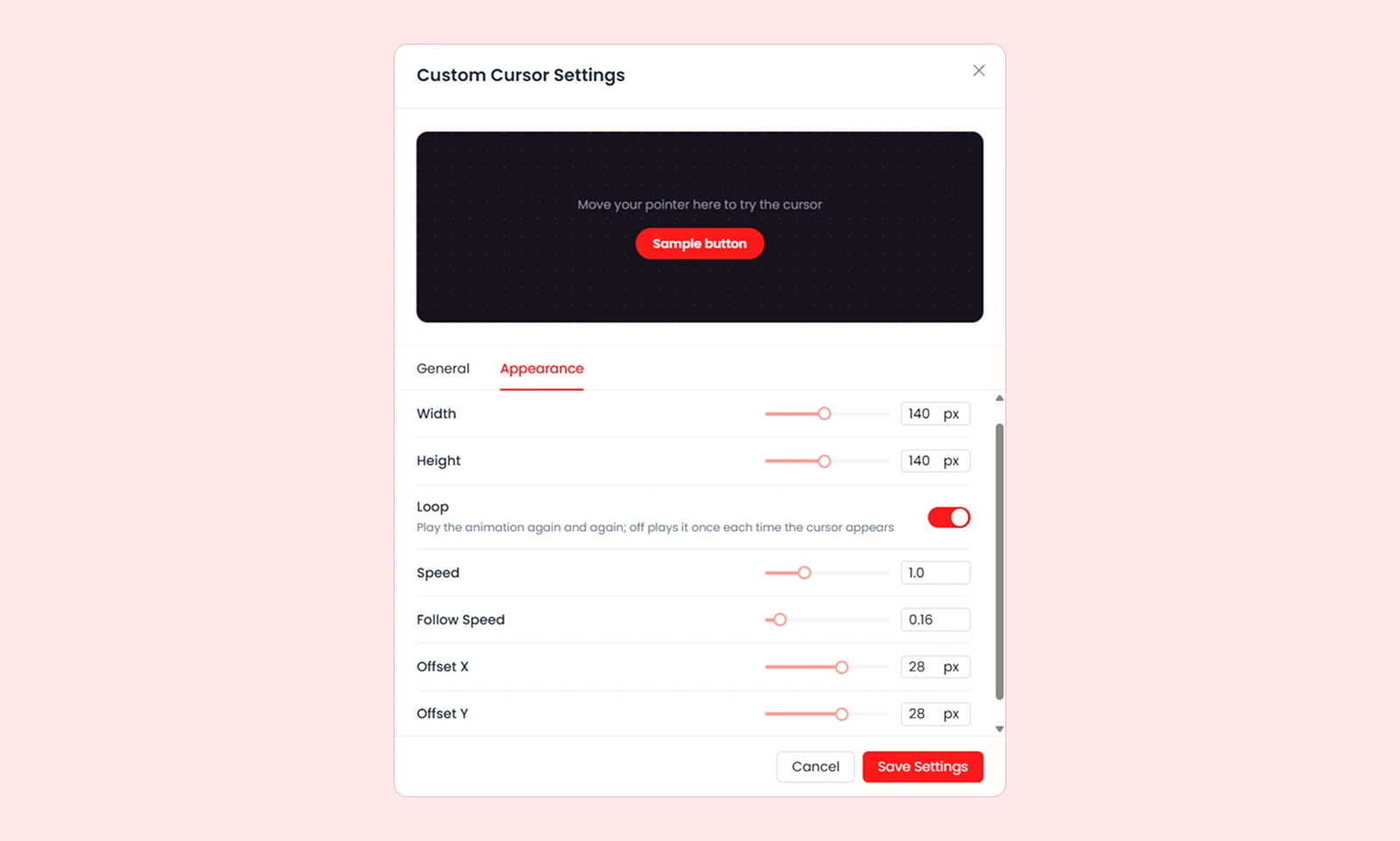
| Setting | What It Does |
| Width | Sets the animation width. |
| Height | Sets the animation height. |
| Loop | Repeats the animation when enabled. When disabled, it plays once each time the cursor appears. |
| Speed | Sets the playback speed from 0.1 to 3. The default 1 is normal speed; 2 is twice as fast. |
Icon
These settings control the icon's size, colour, and optional box styling.
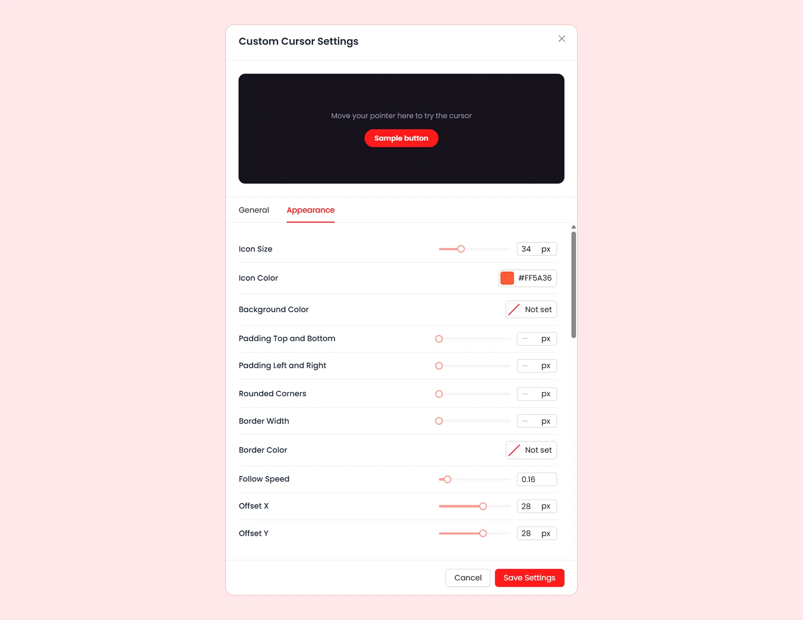
| Setting | What It Does |
| Icon Size | Controls the icon size (14–80px). |
| Icon Color | Sets the icon colour. |
| Background Color | Adds a background colour behind the icon. |
| Padding Top and Bottom | Controls the vertical spacing around the icon. |
| Padding Left and Right | Controls the horizontal spacing around the icon. |
| Rounded Corners | Rounds the corners of the icon's background. |
| Border Width | Sets the thickness of the border around the icon. |
| Border Color | Sets the colour of the border. |
Text
These settings control the text cursor's colour, size, weight, and optional box styling.
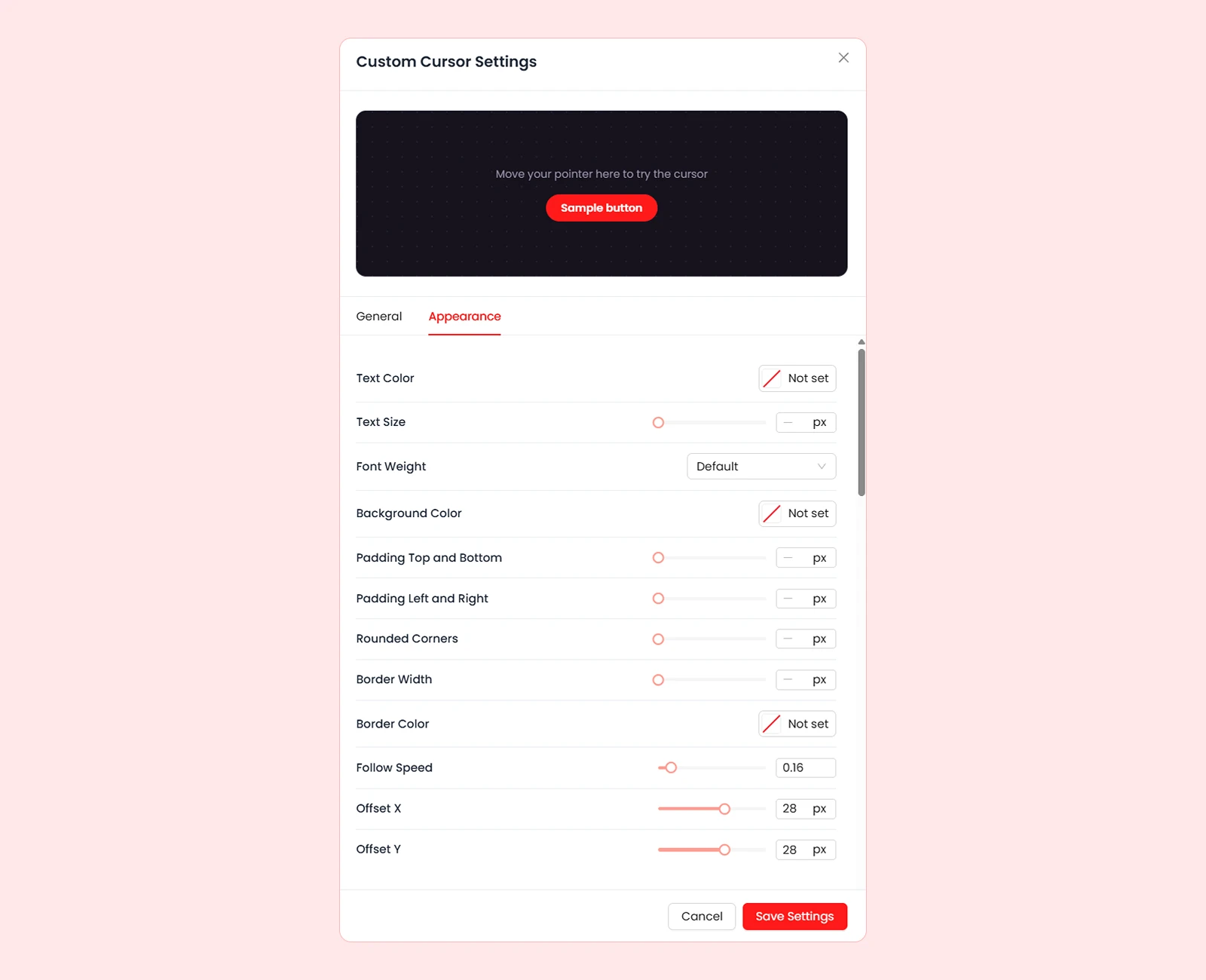
| Setting | What It Does |
| Text Color | Sets the text colour. |
| Text Size | Controls the text size. |
| Font Weight | Controls how light or bold the text appears. |
| Background Color | Adds a background colour behind the text. |
| Padding Top and Bottom | Controls the vertical spacing around the text (0–100px). |
| Padding Left and Right | Controls the horizontal spacing around the text (0–100px). |
| Rounded Corners | Rounds the corners of the text's background (0–999px). |
| Border Width | Sets the thickness of the border around the text (0–20px). |
| Border Color | Sets the border colour. If not set, it uses the text colour. |
Follow Motion (Follow Cursor Only)
These settings appear only when Follow Cursor is selected as the Cursor Mode.

| Setting | What It Does |
| Follow Speed | Controls how closely the custom cursor follows the normal pointer. Lower values create more delay; 1 follows instantly. |
| Offset X | Moves the custom cursor left or right of the pointer. |
| Offset Y | Moves the custom cursor above or below the pointer. |
What's Next?
After saving, open your website on the frontend and move your mouse to test the cursor. Try different types and appearance settings to find a style that fits your website.


